Category Archives: Uncategorized

Thoughts on In Our Own Image

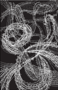
In the foreword of the book In Our Own Image by Fred Ritchin, he mentioned an interesting phrase called “fluidity of the digital”. After finishing reading both the foreword and the last chapter of the book, my interpretation of what he meant by this phrase is that compared to conventional photographs, digitals or digitalized images have a much bigger flexibility in ways to depict and present objects, therefore it opens up a bigger passageway for creativity as well as constructing and conveying imagery information.

Here is a picture that found which I think illustrates Fred’s concept of “fluidity of the digital”.

In this photo, most objets can also be captured by a convectional photograph. But in a digital image, we would have the ability to combine multiple elements and reconstruct them and eventually create a new image that otherwise would be almost impossible to display in a non-digital photo.

Fred admits that there are downsides to the malleability of digitals. For instance, a digital image might be considered “fake” because it can be potentially already been changed and modified according to the creator’s will. And for viewers who had not seen the original image, it is often hard for them to differentiate the artificiality of what’s been presented and thus causes the lack of trust from the public on this type of media. However, Fred argues that just because a conventional photograph is usually characterized by its “fidelity”, it is far from conveying what is real and certainly does not represent the truth. Imagery language, just like writing, can draw information from different sources and articulate the relations between them. Therefore, the true value of digital images is that it, if its potential explored, could provide us with more new worldview differing from the visible reality that conventional photography otherwise could not. So the importance of incorporating the form of digitals is that , in Fred’s words, “offer flexible and expanding possibilities in both the analog and the digital environments” instead of leaving photography as something “monolithic”.

Comparing with other medias such as videos, books or even virtual reality, I think one of the advantages of digital images is that it is more direct and efficient in terms of conveying information while maintaining the feature of allowing much creativity. Videos focus more on changes of image through time, books requires imagination of both the creator and the viewer, virtual reality emphases on an immersive experience of the receiver of information, they all have their own unique features. But because of the similarity between digital and conventional photography, we need to take more effort to fully appreciate the potentials and value of digital image.


Sound Visualization

The piece of music that I chose for this project is called “すずめ”, a theme song of the Japanese movie すずめの戸締まり by Makoto Shinkai, composed by Noda Yojiro.

Due to copyright, I can not download the audio file of this song. Here’s a link to the music video: 【新海誠「铃芽户缔」中日字幕完整版主题曲/RADWIMPS「すずめ feat.十明」】 https://www.bilibili.com/video/BV11B4y177kr/?share_source=copy_web&vd_source=40c899b1eceb837c10a11f2e65e4d0b3 

My initial choice of music was “Lavender Haze” by Taylor Swift, but then I realized my visual design is solely based on the title but not the rhythm of the song, so I later switched to the current one. The inspiration of the design was smoke. To me, smoke is capable of representing not only a small, detailed and nuanced image, but also a grand, endless space. The song “すずめ” begins with a small and soft humming, and then turns into a sleek and delicate singing, so I incorporated elements of long, smooth and elegant curves based on the first half of the song. Into the two thirds of the song, the sound of both voice and instruments gradually builds up and then explodes into a strong and stunning chanting, so I tried to create an image that also provokes people to extend their imagination outside of the frame. And because the movie contains a good proportion of shots of the sky and depicted the intricate connections of the celestial system, I want to make the shapes of the curves look random and natural, intertwined but with distinct branches. Here’s a sketch of my design:

To make solid letters create a texture similar to smoke, I used “proximity” and “similarity” from the Gestalt Theory. First I drew several curves as the basic shape of the image, and then I added additional lines that are almost parallel to the original ones, adding dynamic to the image. Then I created two more layers, using the similar method to create lines that will later insert letters that represent more transparent “smoke”. And for the fonts of the letters, I used three to four different types (though hardly visible), but to maintain unity, I specifically chose fonts that has nice and slim curves. After hours of clicking, typing and adjusting, this is what I managed to create:

It has the resemblance of smoke, I thought, but it is indeed composed by solid letters, and it’s really hard to make the complemental lines look as transparent I hoped. But because I’ve already pored my heats and soul into it, it would be painful to just delete them and start over. As a result, the lines of letters looks a bit all over the place and doesn’t really have a clear visual emphasis.

Then I tried to made some adjustments. I deepened the swirl in the left center and a few curves around it, simplified the lines at the right bottom, and increased the gapes between letters in the upper left and right corner (in hopes of making it look bit more transparent-like). But it was an excruciating process just the same because I had to delete the lines one by one and redraw them bit by bit, so even it took me another few hours to revise it, it still looks pretty much the same:

To be honest, I personally prefer the original. But the second one seems to fit the requirement of this assignment more, so it would still be my final version.

Pioneer Plaque Assignment

My Partner Xiangyi and I decide to choose traffic signal lights system to introduce to heptapods. 

Traffic signal lights 🚥,  are tools used in human civilization to direct traffic operation and ensure traffic security and order. Traffic lights are usually set at intersections, where two roads cross, with the same red, yellow, and green🔴 🟡 🟢lights hanging in on all the sides of the intersection.

Signals for motor vehicles and no-motor vehicles 🚗:

Such signals are meant for vehicles. In traffic light with arrows responding the direction, there are 3 lights showing to the left⬅️, forward⬆️and right➡️, while in the traffic light with circular lights, the three lights from left to right correspond to left, forward and right in turn. The red light means no passing, that the corresponding direction is not allowed to proceed once the red light is on. Conversely, the green light indicates passage permitted. The yellow light shows a warning that the light is about to change from green to red, alerting oncoming traffic to slow down.

Pedestrian crossing signals🚶‍♀️:

:

Pedestrian traffic signals are often set on the four intersecting roads, adjacent to the vehicle traffic lights, with two corresponding signals for each road, eight in total. It is used to guide pedestrians through the intersection with rules basically the same as above. However, in such traffic signal lights, there are only two states-stop and forward without need to turn, so instead of showing 3 different directions, the shape of the pedestrian lights simulate human posture, with red no-passing pattern showing pedestrians in a standing position, and the green permitting pattern showing pedestrians walking. 

Rationale for color selection:

According to optical principles, red lights has a long wavelength, penetrates air well, and attracts more attention than other signals, so it is used to convey prohibition. Green is used as a pass signal, because red and green are the most different, therefore easy to distinguish. In addition, for humans, red expresses strongest hot or intense feeling, followed by yellow, while green has a cool and calm connotation. Therefore, people often use red to represent danger🚫, yellow to represent warning⚠️, and green to represent safety✅.

Some other general information

In addition, on many traffic lights, in order to remind pedestrians and vehicles to be careful, a countdown timer is set to show the remaining time before the color of the light switch, so that people can get ready ahead of time.

In different cases:

Such traffic light system is designed base on human beings’ body structure, that our visual organs grow on one side of our body, so only the side that can be observed by our eyes, that is, the part our body is facing, can be regarded as the “front”. However, as Ted Chiang described in “Story of Your Life”, the hetapods have completely different body structure- radially symmetric, use seven limbs to sense the surroundings, and seven eyes ringed to see. This may cause the traffic light  system quite confusing to hetapods, since every side around means front to them, so they might receive much traffic light information from more than one direction at the same time( like a panoramic photo). But anyway, the rule remains the same: always follow the green lights and stop at the red ones.

Notes on reading Story of Your Life

At first I thought this is a normal autobiography and then I realized it is a piece of science fiction. It was interesting to read something this detailed and theory-based while acknowledging that the story is not real. 

In the part where “I” was asked to obtain information from a single recording of aliens, “I’ said that recordings alone are not sufficient to disclose anything, and it really relates to what I’ve learned so far in Communications Lab which is that we need multiple layers of information to communicate. And there’s also the methods for communication. Near the end of the story, “I”described how learning the aliens’ language has changed her way of thinking and therefore the way she conceives the world. And though human and aliens sees the same material world, we view it very differently. But no matter how much difference there is, every perspective is valid. This inspired me to try to approach things in different methods and interpret things around me in more than one point of view in the future.

Hello world!

Welcome to Web Publishing @ NYU. This is your first post. Edit or delete it, then start creating your site!

Online help is available via the Web Publishing Knowledge Site (wp.nyu.edu/knowledge) and the ServiceLink knowledge base (www.nyu.edu/servicelink). Through ServiceLink, you can find step-by-step instructions, as well as tutorials.

Digital Accessibility

As content creators who create and publish text, images, video, and audio, you must adhere to the NYU Website Accessibility Policy (https://www.nyu.edu/digitalaccessibility/policy) when creating and publishing digital content.

Web Publishing-specific Digital Accessibility Best Practices and examples of how to ensure your content are compliant are available at https://wp.nyu.edu/digitalaccessibility

If you have additional questions, contact the IT Service Desk for assistance. Support is available 24/7/365. For more details, visit www.nyu.edu/it/servicedesk.