The piece of music that I chose for this project is called “すずめ”, a theme song of the Japanese movie すずめの戸締まり by Makoto Shinkai, composed by Noda Yojiro.
Due to copyright, I can not download the audio file of this song. Here’s a link to the music video: 【新海誠「铃芽户缔」中日字幕完整版主题曲/RADWIMPS「すずめ feat.十明」】 https://www.bilibili.com/video/BV11B4y177kr/?share_source=copy_web&vd_source=40c899b1eceb837c10a11f2e65e4d0b3
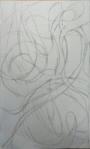
My initial choice of music was “Lavender Haze” by Taylor Swift, but then I realized my visual design is solely based on the title but not the rhythm of the song, so I later switched to the current one. The inspiration of the design was smoke. To me, smoke is capable of representing not only a small, detailed and nuanced image, but also a grand, endless space. The song “すずめ” begins with a small and soft humming, and then turns into a sleek and delicate singing, so I incorporated elements of long, smooth and elegant curves based on the first half of the song. Into the two thirds of the song, the sound of both voice and instruments gradually builds up and then explodes into a strong and stunning chanting, so I tried to create an image that also provokes people to extend their imagination outside of the frame. And because the movie contains a good proportion of shots of the sky and depicted the intricate connections of the celestial system, I want to make the shapes of the curves look random and natural, intertwined but with distinct branches. Here’s a sketch of my design:
To make solid letters create a texture similar to smoke, I used “proximity” and “similarity” from the Gestalt Theory. First I drew several curves as the basic shape of the image, and then I added additional lines that are almost parallel to the original ones, adding dynamic to the image. Then I created two more layers, using the similar method to create lines that will later insert letters that represent more transparent “smoke”. And for the fonts of the letters, I used three to four different types (though hardly visible), but to maintain unity, I specifically chose fonts that has nice and slim curves. After hours of clicking, typing and adjusting, this is what I managed to create:
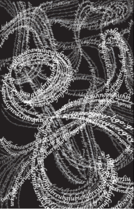
It has the resemblance of smoke, I thought, but it is indeed composed by solid letters, and it’s really hard to make the complemental lines look as transparent I hoped. But because I’ve already pored my heats and soul into it, it would be painful to just delete them and start over. As a result, the lines of letters looks a bit all over the place and doesn’t really have a clear visual emphasis.
Then I tried to made some adjustments. I deepened the swirl in the left center and a few curves around it, simplified the lines at the right bottom, and increased the gapes between letters in the upper left and right corner (in hopes of making it look bit more transparent-like). But it was an excruciating process just the same because I had to delete the lines one by one and redraw them bit by bit, so even it took me another few hours to revise it, it still looks pretty much the same: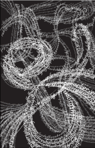
To be honest, I personally prefer the original. But the second one seems to fit the requirement of this assignment more, so it would still be my final version.