For this project we created three individual machines: a seesaw, a surfer, and a zoetrope.
Cam C – Seesaw

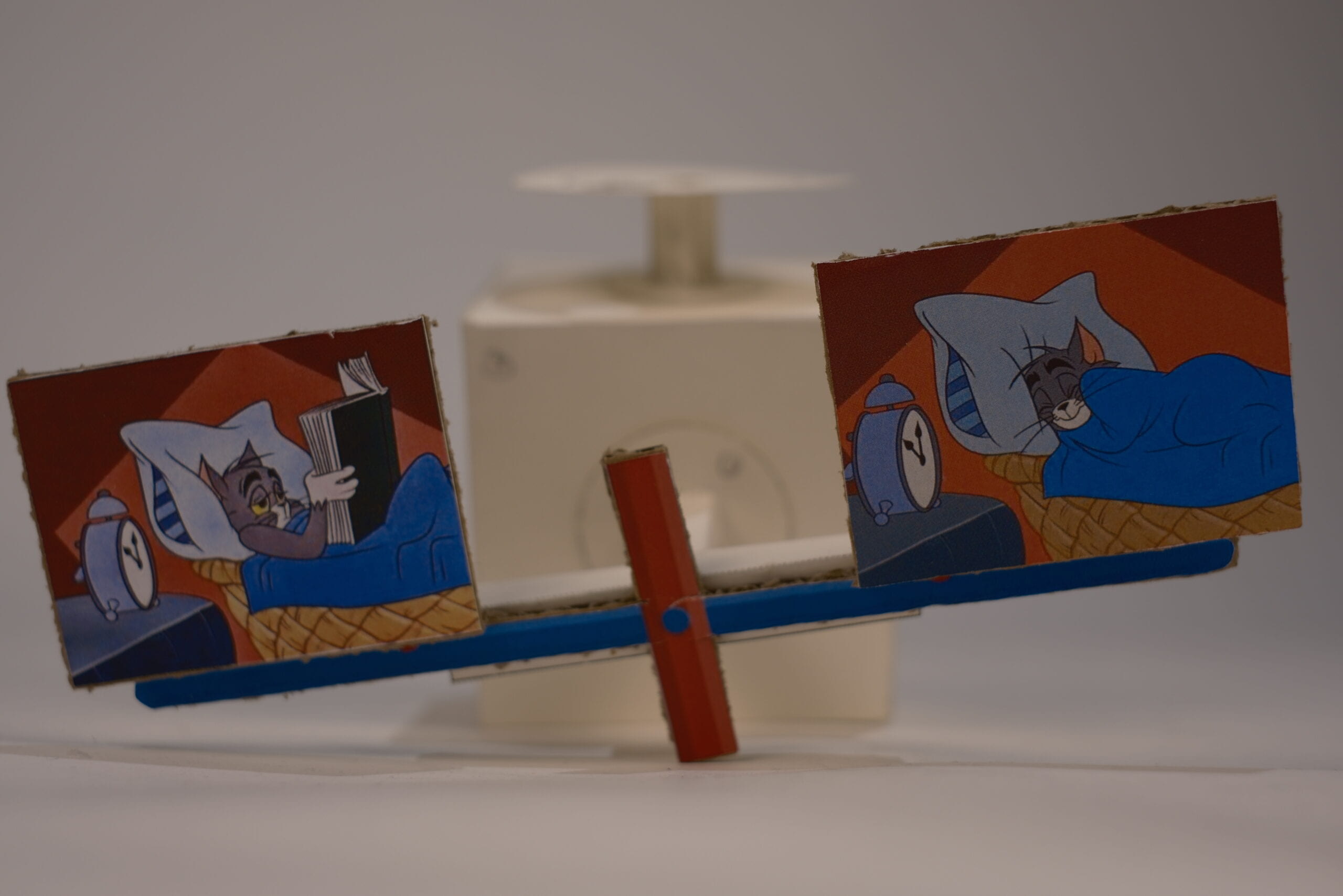
This one has a T-shaped support that wiggles back and forth. We at first wanted to attach two dancing figures on each sides of the “T” but realized it doesn’t look quite like the movement s of dancing in effect, but more like two figures rocking back and forth. We also thought about simply using one figure and attack the two feet on each side, but if the material is flexible enough it would not be able to support the body either. So we switched our perspective on its utilization and decided to present the “T” facing forward instead of upward, and it would look like something similar to a seesaw. (We also thought about having the T facing either to the right or left hand side and make it be the movement of a fortune cat’s waving hand, but the range of the movement is a bit too small for a waving hand so did not adapt the idea.) We use these two photos of Tom in the idea to represent the balancing study and rest. To sleep, or not to sleep? That is the question.
Crank B – Surfer

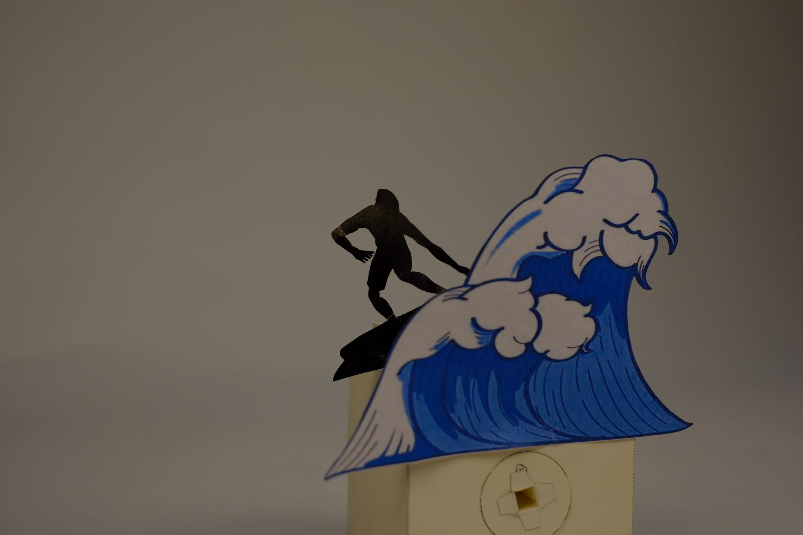
This one was the easiest to make among the three, because it didn’t took us very long to decide what design to go with it and our idea worked very well. The finishing work moves very smoothly. Only that we did not consider the direction of the wave and the surfer to fit with the crank because one side need to be left out for the handle, so it looks a bit like the surfer is surfing in a wrong side of the wave.
Geer B – Zoetrope


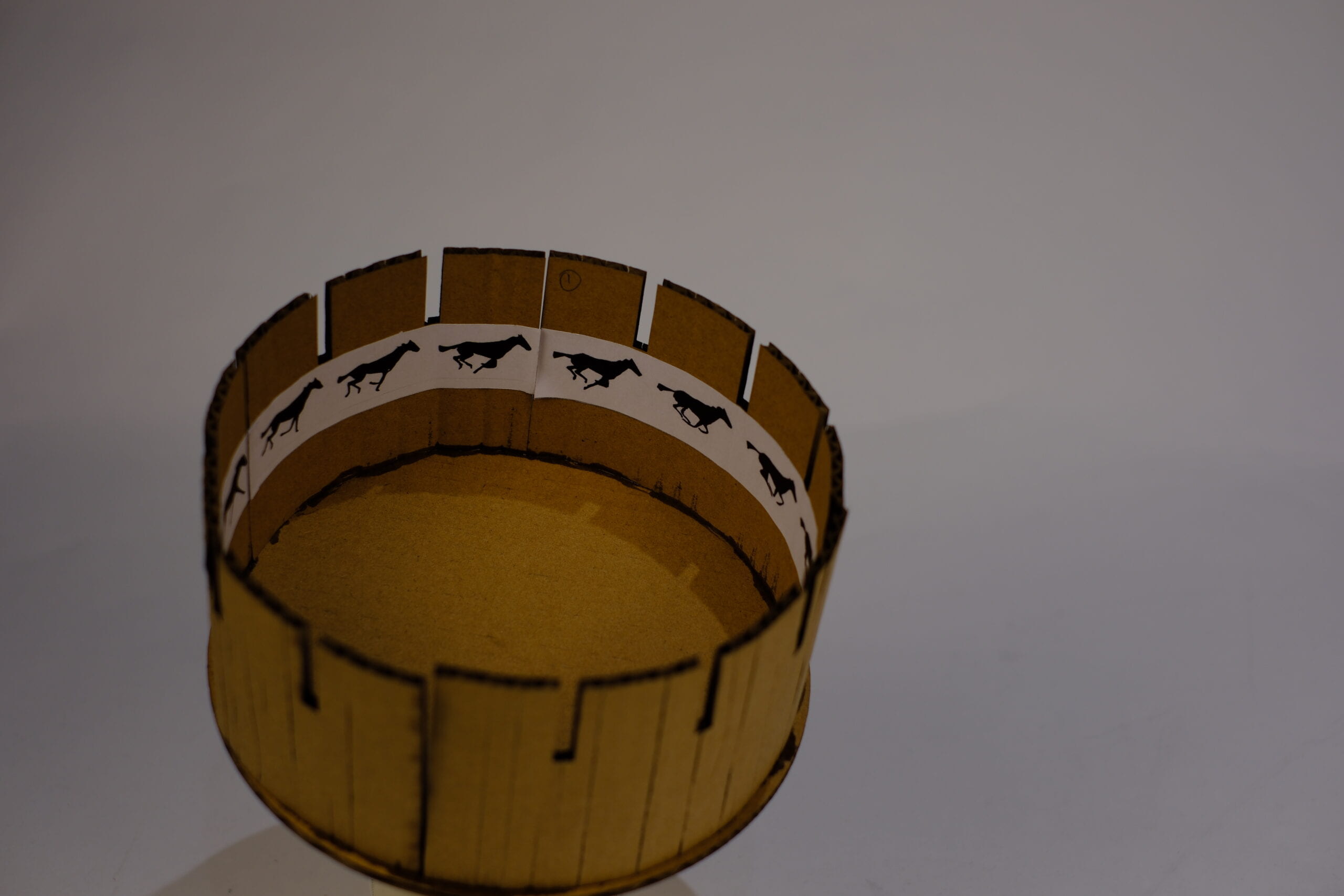
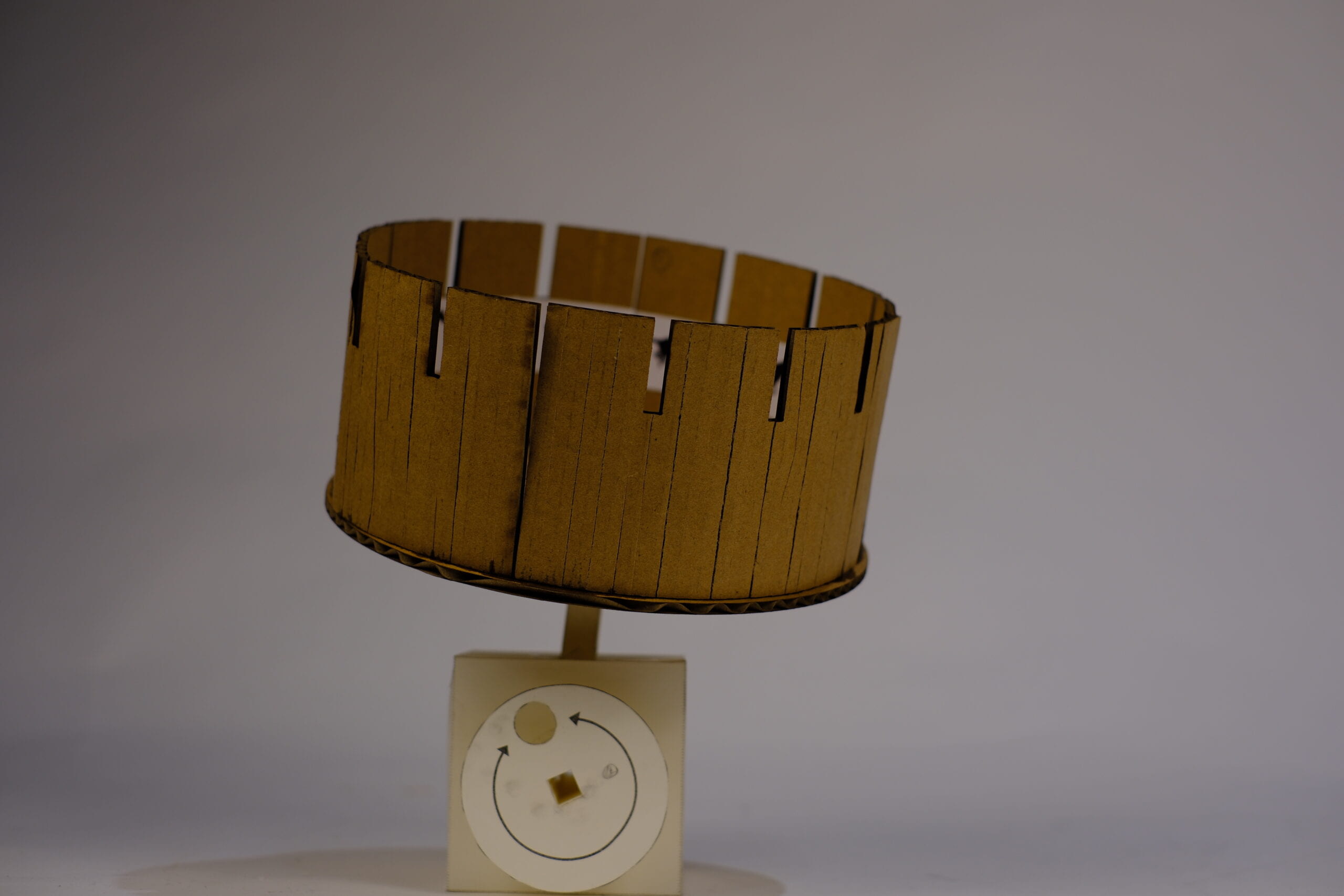
This one was meant to look through the gaps of the cardboard and will see a moving image of a running horse when spinning. This was the most complicated one to make. I sure it would work a lot better if the beer weren’t made out of paper because the cardboards ended up being too heavy for it so it constantly tips to one side while spinning and prevents it from working smoothly, which makes it hard to create the animation. While making the circular base we accidentally made it slightly smaller and had to cut out a few images when attaching them. So the lesson is to make things bigger in the beginning if not entirely sure with the size (at least in this case). But we both really like the idea of this geer’s design because neither of us want to settle with something like a music box or carousel that is meant to be spinning.