I had the idea of the project when I was taking a walk around the campus. I first thought it would be interesting to walk 顺拐-ly ( a Chinese expression for walking with arms swinging in the same direction as the same-side leg), and then I thought it might be interesting to have people walking under the command of another only that the instruction for direction are the opposite of the intended direction. But then I figured the space inside and near the classroom might be too limited for doing so, thus I turned it into drawing on a piece of paper.
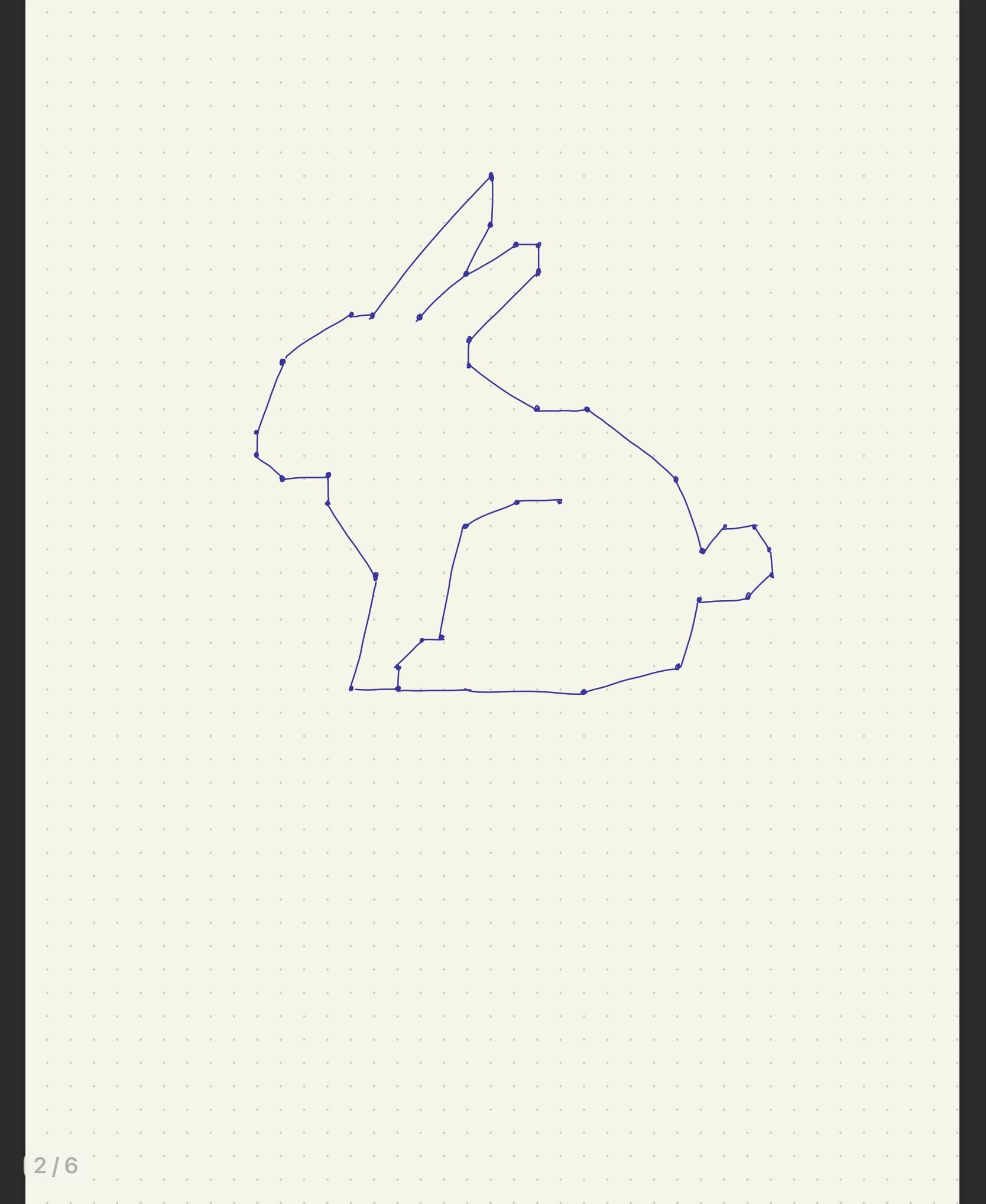
When designing the shape to draw, I first come up with this bunny. But when considering practicability of drawing such a precise and relatively complex shape, having diagonal lines (and with this bunny probably too many diagonal lines), the interactions would sound too cumbersome as it needs to include both the vertical and diagonal direction and lengths.
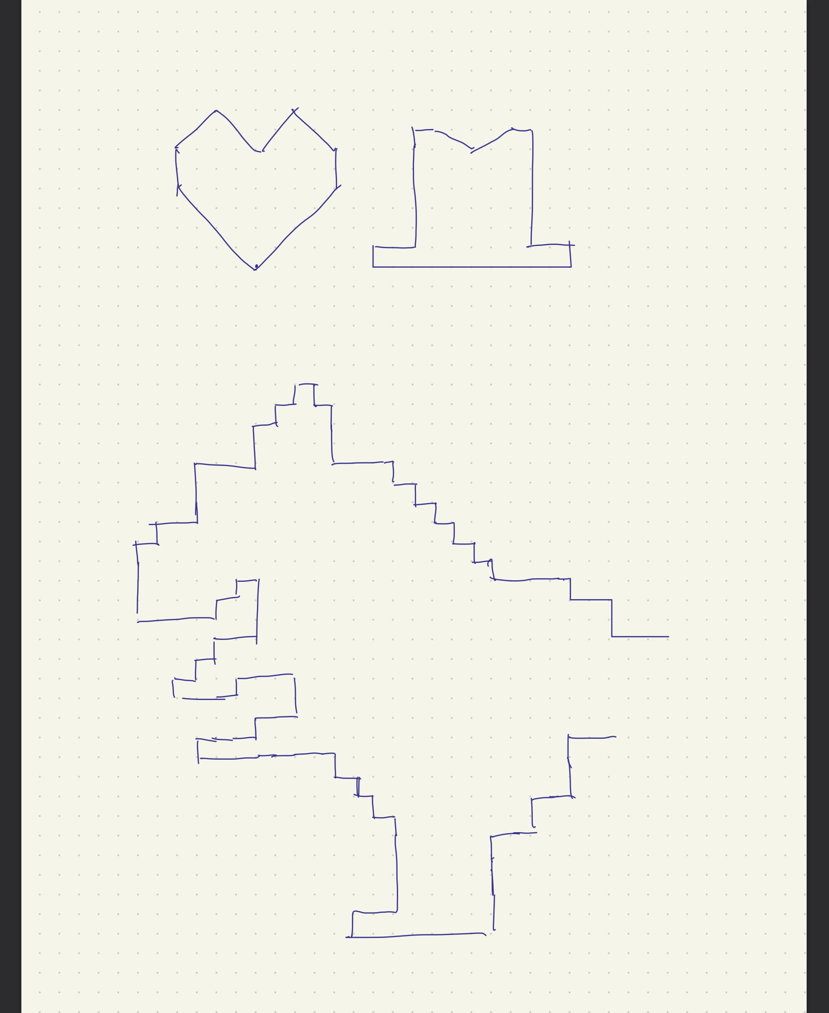
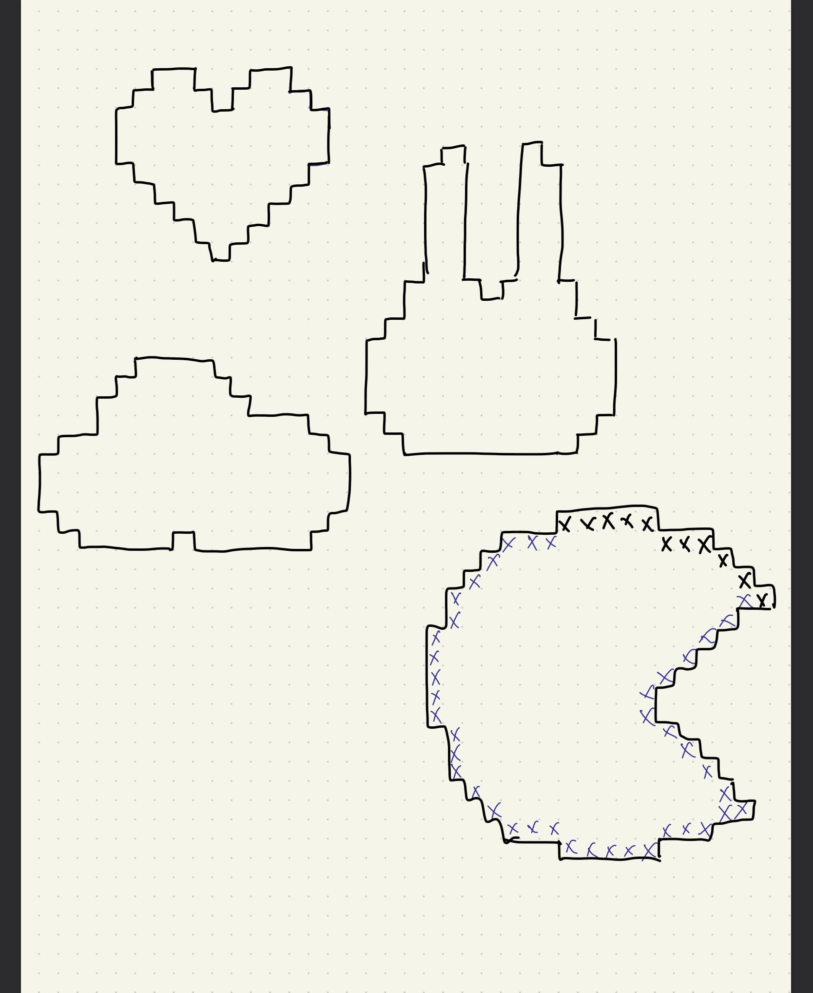
So I then tried to design a shape consists only lines going up, down, left, or right. The first shape I drew was a heart, but when testing what it would be like to draw it through verbal instructions, I realized the convex part of a shape will always be drawing in either left or right all the time which would a lot less fun when doing it. And also because it is a symmetrical shape, to would be way predictable. I then drew this cloud shape, which looks a bit better, but despite that it is asymmetrical, the concave ins’t big enough and there’s would still be the always-the-same-direction problem.
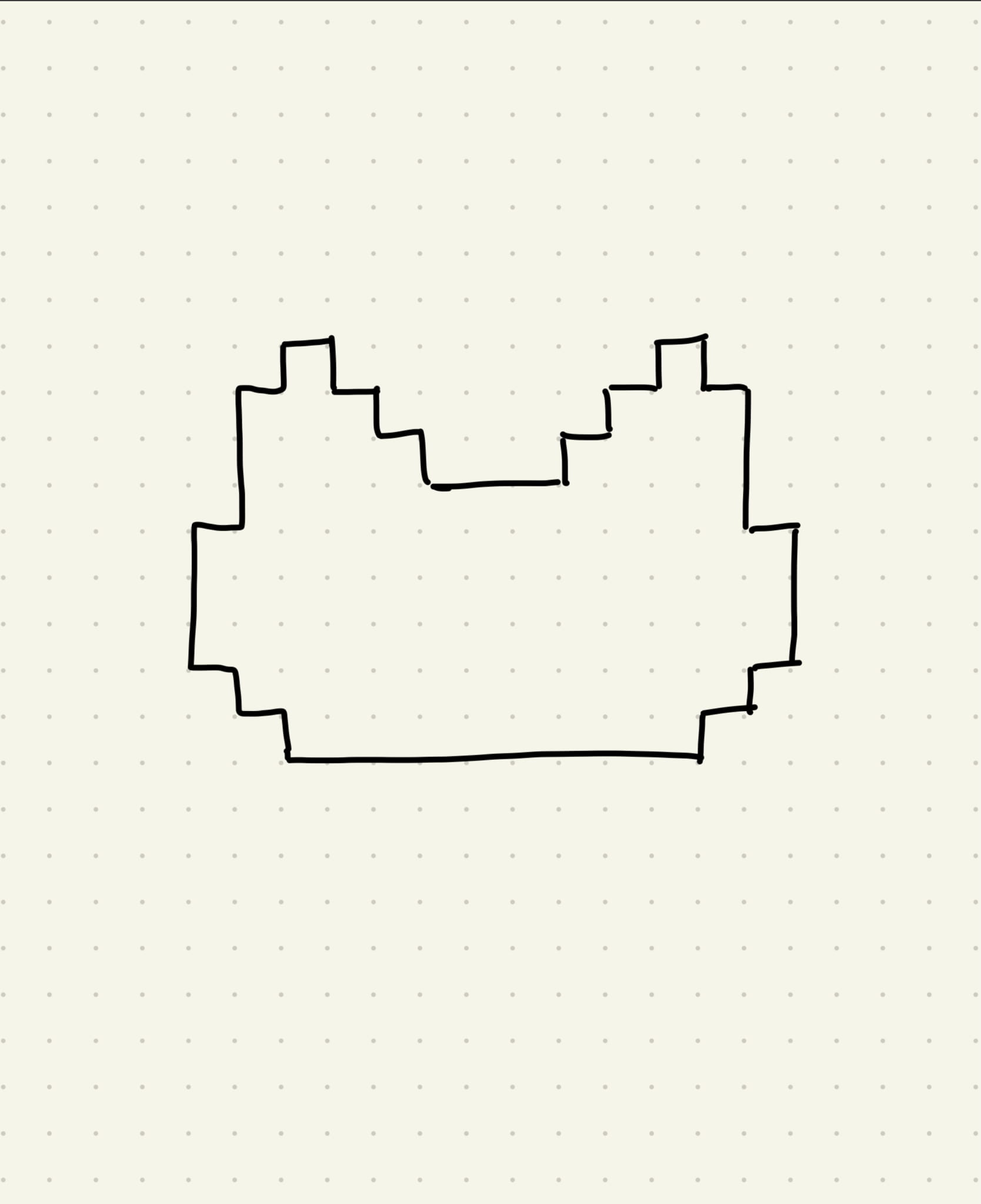
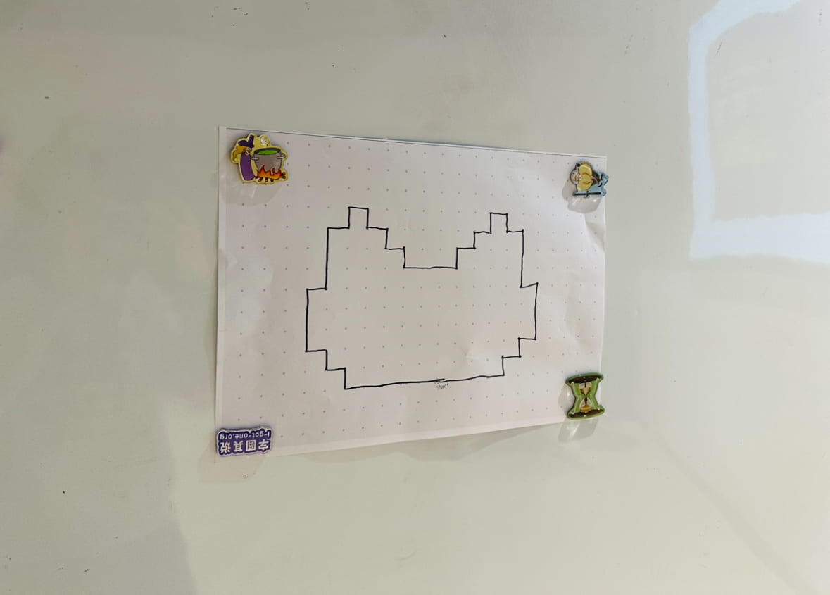
 In the end, I drew this cat-like shape because the pointy ears would help to create enough concave so that there will be enough variations to the instruction and the shape is also somewhat good-looking.
But still, the shape seemed a bit too easy to draw, so added a 60 second time restrain to make it more challenging . But telling from actual the presentation, I probably should’ve made harder, whether in the complexity of shape or the length of time, since the participants accomplished drawing the shape quite effortlessly. Though my estimation of setting a 60 second bar was quite accurate because it took them about 65 seconds, but because I timed it in a way that I was the only one who could see the clock, looking back, it would’ve been much better if everyone could see the time, especially the person who is drawing. I should also so enough user testing before presenting to improve my projects next time.
Here’s the finished piece of the presentation:
Here’s a video of the presentation: