Monthly Archives: February 2024

Assignment 1 Documentation

I got the inspiration for this project in the Spring Festival break on the flight back from my hometown. It was around five o’clock and I was able to see the entire sunset in the sky from beginning to end. My partner was keen on using music at first to represent the “beginning and middle and end” but after I’ve introduced this idea of mimicking a sunrise or a sunset we were quickly on board with the theme.

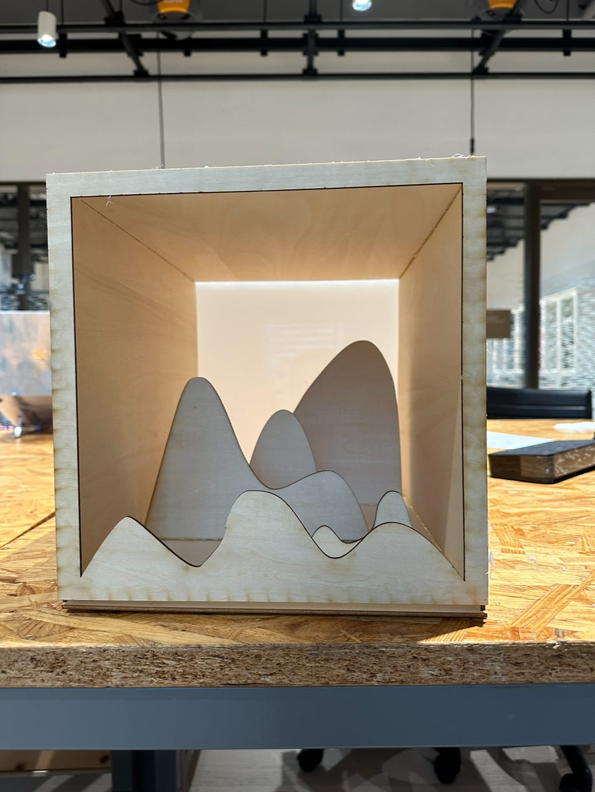
We had many versions of ideation on how to present the process. I first suggested making a half transparent cube where we would put the lights inside and maybe have some paper cuttings stick to the upward side of the cube to indicate the context of it recreating a natural phenomenon. My partner later came up with a better idea of making a 3-dimensional landscape that beings more depth to the visual effect, which we eventually adapted for our project.

Before laser cutting we had a long discussion on what material we should be using. We thought about transparent or dark acrylic, but in the end settled in simply plywood because I believe using transparent material for the entire body of the project would just “get light all over the place and not be able to keep them in the frame where we want to focus”.

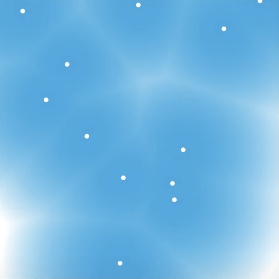
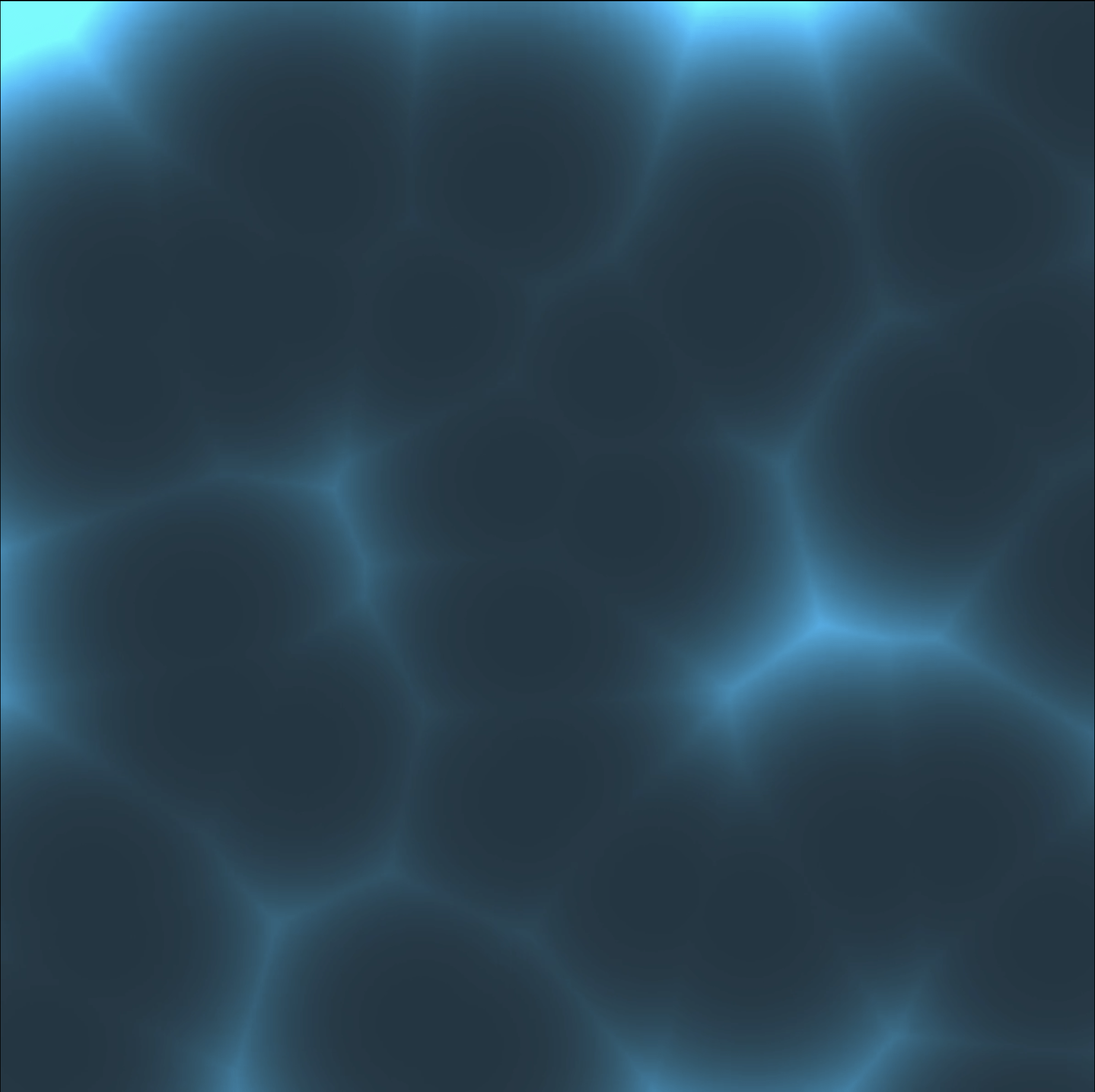
On the day of our appointment in the fab lab I had to build the box (picture below) alone because my partner had another project she to rush and get done. She made a beautiful graph for the hills but sadly the length of the rectangle pieces don’t fit together very well, so when I was sticking the outer square frame I stuck them together in a way that the crack is at the bottom was at the bottom so it wasn’t very obvious (and it even looks a bit like a river at the foot of the hills). And I added the white acrylic last minute to defuse the matrix’s light, and it worked very well.

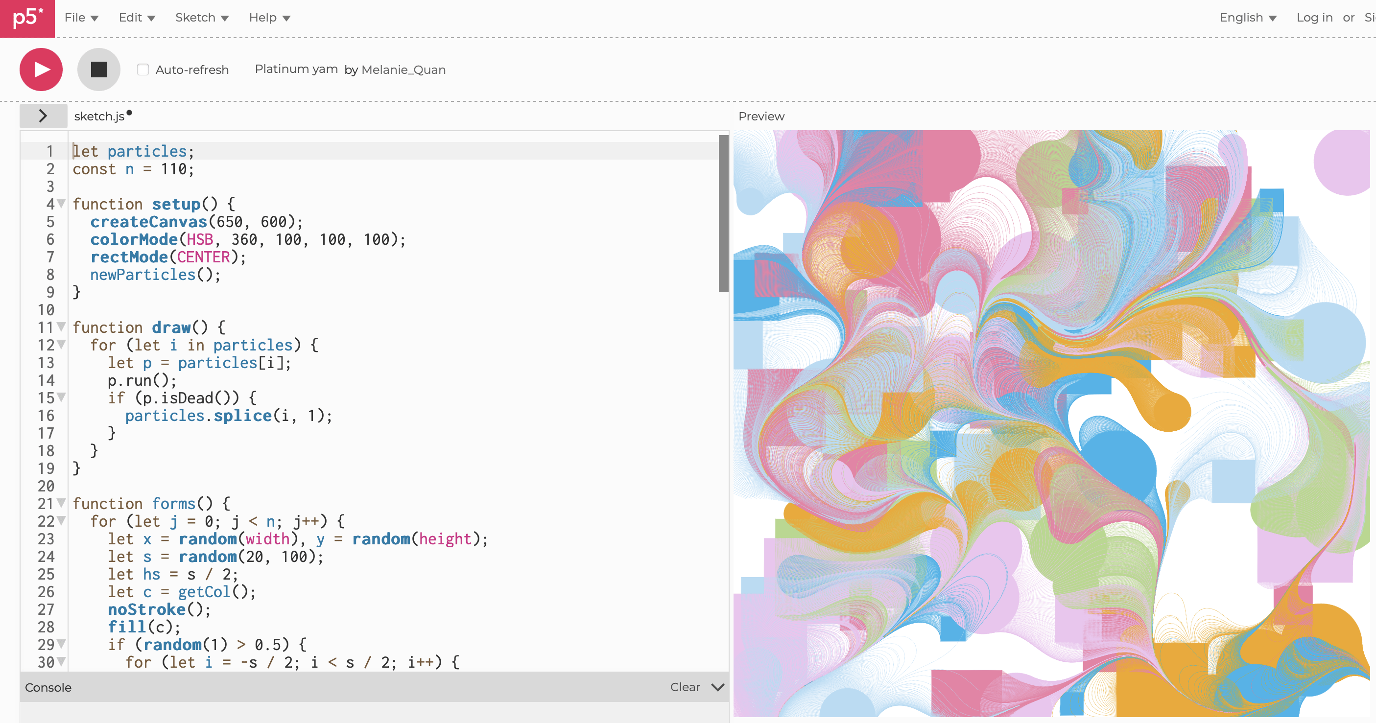
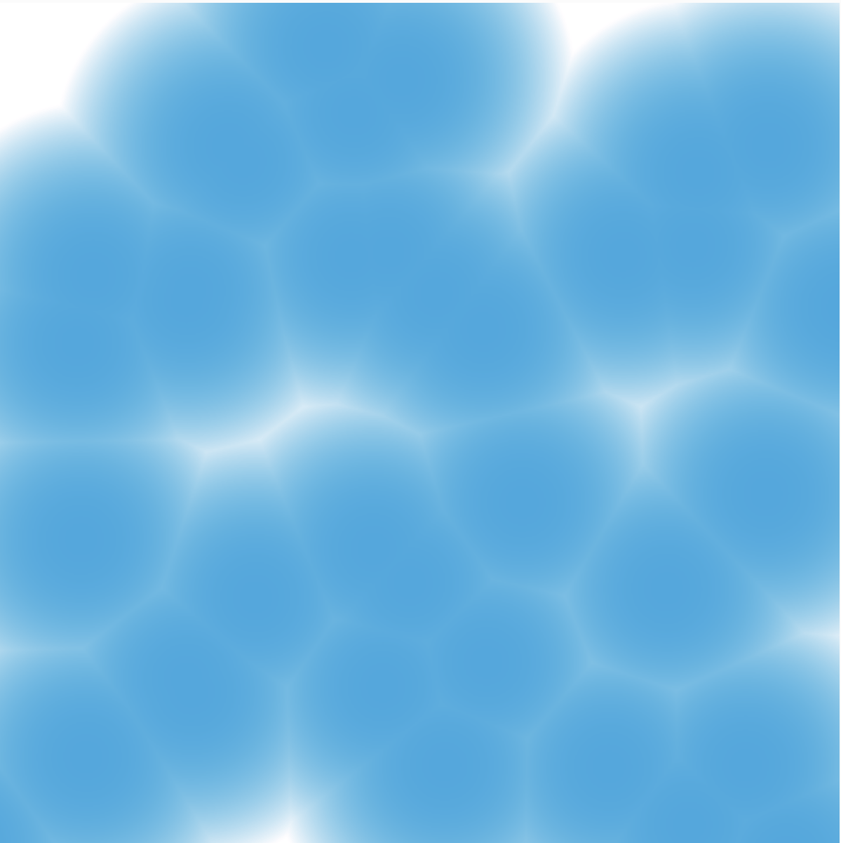
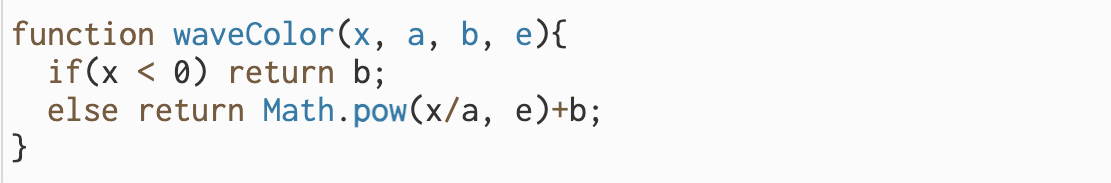
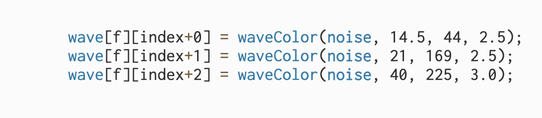
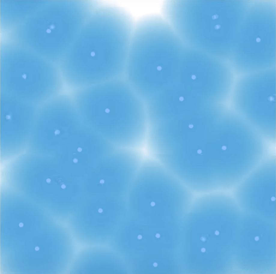
For the code we referenced this code. We first tried many example codes including “fire” and “pacific”, but they weren’t suitable enough to be edited to achieve the effects we wanted. For instance, I managed to get the “pacific” code into a gradient pink but couldn’t make it shift between red and orange. We then turned to our browser and found this very smooth red – orange – light blue gradient. Based on the reference code, we made the time span shorter, cutting it down from 30 min to 2 min. There was also one problem we spend a ton of time of was the timing of color shifting. Though the transition is very smooth, about more than 50% of the time it stays in Red. We experimented with numerous way of either changing the function or the numbers in the functions, but it’s either the same or finish the transition form red to blue in less than 2 seconds. I tried to make the number as specific as possible, so that it falls in the perfect spot, and I eventually discovered I had to use two decimal digits to make the timing suitable. This was the most time consuming and challenging part because it also takes a long time for every try and we had to look at the lights directly for a long time.

If we had more time on the project, we would make the box longer do the lights could be hidden inside the project instead of just hanging on the computer behind the box. But overall really like the shadows and the subtle reflections the hills created, and we realized our idea in a relatively satisfied way. 

Here’s the code we used:

#include "FastLED.h"

#define NUM_LEDS 64

#define DATA_PIN 3
#define CLOCK_PIN 13

CRGB leds[NUM_LEDS];

void setup() {
  // Uncomment/edit one of the following lines for your leds arrangement.
  //FastLED.addLeds<TM1803, DATA_PIN, RGB>(leds, NUM_LEDS);
  //FastLED.addLeds<TM1804, DATA_PIN, RGB>(leds, NUM_LEDS);
  //FastLED.addLeds<TM1809, DATA_PIN, RGB>(leds, NUM_LEDS);
  //FastLED.addLeds<WS2811, DATA_PIN, RGB>(leds, NUM_LEDS);
  //FastLED.addLeds<WS2812, DATA_PIN, RGB>(leds, NUM_LEDS);
  //FastLED.addLeds<WS2812B, DATA_PIN, RGB>(leds, NUM_LEDS);
  FastLED.addLeds<NEOPIXEL, DATA_PIN>(leds, NUM_LEDS);
  //FastLED.addLeds<APA104, DATA_PIN, RGB>(leds, NUM_LEDS);
  //FastLED.addLeds<UCS1903, DATA_PIN, RGB>(leds, NUM_LEDS);
  // FastLED.addLeds<UCS1903B, DATA_PIN, RGB>(leds, NUM_LEDS);
  // FastLED.addLeds<GW6205, DATA_PIN, RGB>(leds, NUM_LEDS);
  // FastLED.addLeds<GW6205_400, DATA_PIN, RGB>(leds, NUM_LEDS);

  FastLED.addLeds<WS2801, RGB>(leds, NUM_LEDS);
  FastLED.addLeds<SM16716, RGB>(leds, NUM_LEDS);
  // FastLED.addLeds<LPD8806, RGB>(leds, NUM_LEDS);
  // FastLED.addLeds<P9813, RGB>(leds, NUM_LEDS);
  // FastLED.addLeds<APA102, RGB>(leds, NUM_LEDS);
  FastLED.addLeds<DOTSTAR, RGB>(leds, NUM_LEDS);

  // FastLED.addLeds<WS2801, DATA_PIN, CLOCK_PIN, RGB>(leds, NUM_LEDS);
  // FastLED.addLeds<SM16716, DATA_PIN, CLOCK_PIN, RGB>(leds, NUM_LEDS);
  // FastLED.addLeds<LPD8806, DATA_PIN, CLOCK_PIN, RGB>(leds, NUM_LEDS);
  // FastLED.addLeds<P9813, DATA_PIN, CLOCK_PIN, RGB>(leds, NUM_LEDS);
  // FastLED.addLeds<APA102, DATA_PIN, CLOCK_PIN, RGB>(leds, NUM_LEDS);
  //FastLED.addLeds<DOTSTAR, DATA_PIN, CLOCK_PIN, RGB>(leds, NUM_LEDS);
}

void loop() {
  sunrise();

  FastLED.show();
}

void sunrise() {

  static const uint8_t sunriseLength = 30;

  static const float interval = ((sunriseLength * 6.0) / 270) * 1000;

  static uint8_t heatIndex = 0;

  CRGB color = ColorFromPalette(HeatColors_p, heatIndex);

  fill_solid(leds, NUM_LEDS, color);

  EVERY_N_MILLISECONDS(interval) {
    if (heatIndex < 255) {
      heatIndex++;
    }
  }
} 

NOC W04 – Summer Pool


For this project I referenced this video I found online. I find making this project a very interesting one because besides applying what I’ve learned from the past week I also learned using pixel index and mathematical functions to create colors that resembles bubbly liquid.

I first started out creating the dots on a blue background that are in the middle of the “ripples”, using loadPixels () with a for loop. Then for colors, I used a graph generator to create suitable functions that would intersect the dot, which it’s position is when all the RGB is 225 white, and the values of the RGB’s respective functions’ intersection on the y axis combined is a blue. I had to also adjust the function modal that I choose and also the function and the velocity of the slop(?) of of the function, e.g. to make it steeper so that she shape or the lines of the reflection of the “ripples” would be clearer and more obvious. It is quite compicated for my level but I mostly followed along the video lol.

The biggest obstacle I encountered was to make a change to the velocity or the speed of the “ripple”. I tried many ways, but all failed (haha). I first tried to use a “shortcut” by using decay, but while the code is running fine, there’s no sign of the ripples slowing down at all no matter I value I use. 

I then tried to use multiplier, but what I get is a black canvas.

I later tried using it on the vector, but then I get this weird image of the blue haze clustered together on the left upper corner and spread out through the canvas quickly and then running on repeat. I tried to fix it but only succeeded in changing the speed of the spread.

I then tried to make it interactive, make the x axis and y axis wave move asynchronously by changing the intensity of the two waves, and also making it more interactive by adding the mouse and the key to control it, but I kept getting “not declared” when everything seems to be in order. 

So I finally gave up. While I was writing this I had an idea of adding a layer of bouncing hoops in random colors to mimic the swimming hoops in a pool, but my time was running out so did not incorporate this. If I had more time I would definitely give it a try. Disclaimer: the first three screenshots above is from the video because I forgot to take screenshot while the early stages of coding…

Here’s the link of the code.

Here is another color of the pool!

NOC W03 – Kong Ming Lantern

This project is inspired by the recent Spring Festival Vacation, and Kong Ming Lantern is something I always relate to as festive and celebratory. I referenced the codingtrain example code of balloons when writing the code.

I first had the circles into random size and I made the RGB’s red random to create a blinking effect to mimic the glow of natural flame inside a real lantern. 

I then increased the amount of “lanterns” on the canvas, changed the background into a dark grey to mimic the night sky, and used both vectors and force to make the lantern hover and when mouse is pressed they will hover quicker and wobble a bit more, as if there is a stronger current underneath to lift them higher faster.

But at this point, they look more like bubbles than lanterns, so I used vertex to draw a trapezoid.

Too small, and I made them bigger. 

But they still look odd. The beauty of setting lanterns is that it is always done with a group of people in a very open space, and the difference in distance makes them visually vary in size. But with the shape turned into trapezoid, the random radius no longer works and all the lanterns look the same.

I tried to reincorporate the circles to keep it visually interesting but they just look too messy and weird together.


I then made the random radius a constant and then drew the trapezoids by multiplying the radius. This worked to get the varying sizes. And I then added a “glowing candle” in each of the lamp using the similar method to recreate the flame inside. And I also added a flickering effect to the yellow flame to match the lamp’s glitching color.

I later adjusted the shape of the lantern and the velocity of the vectors again to make them look more visually pleasing. Though the shift in movement of the lanterns in the finished work doesn’t look super obvious, and this is also a problem I struggled on, but I settled on the final version because if the movement is too fast when the mouse is pressed then it won’t resemble a Kong Ming Lantern anymore.

Here’s a video of the running code:


Here is the p5 website to the code.

Reading Reflection 1: Light and Space

From the first reading we see the difficulty to the development of light art and why. And in the second reading, while it uses most of it’s space describing specific pieces of art work, there’s a sensible development from the first reading, and what I’ve found most noticeable was the development in technology, that as time passes, artist get to obtain more tools and materials to experiment and play with, bringing more diversity and going on further explorations. I think this in some way helped to gain attention for light art, because along with more explorations, it revealed its potential, and light just starts to feel more exciting.

In Light as Sculpture Medium, it mentioned Robert Whitman who passed away early this year. I looked up some of his works, and I noticed that he often uses projection. Despite a lot of them are not light centered, I find the utilization of projections adds a layer of diversity and flexibility in his work. For example in a performance he created called “American Moon”, projection was incorporated as a part of it. In this way, the narration takes more than the form of seeing actual objects and performers moving around but also moving images in light, which provides audience with different sensational experience, and it breaks the spacial constrains of performance, that with a piece of cloth or any surface, it could generate even more narration that other wise would be hard to present.

Performance "American Moon"


Another artist that was mentioned in the reading Phenomenal was Lucio Fontana. I didn’t remember who he was but was reminded immediately by the iconic cuts on papers when looking up. Though seemingly has nothing to do with light and space with the material in these well-known art works consist of only paper, the shape and shadow it creates is made possible by light and a distortion in space, that is, a slit of concave in an originally smooth surface. 

Light allow us to perceive space, and space provide light with transformative shape. Light as a rather flexible “material”, I think can help art to explore more forms of presentation and ways of expression, and sometimes help create art works that teases the human sense and create intriguing distortions of the perception. 

Project 1 – Draw the Line

I had the idea of the project when I was taking a walk around the campus. I first thought it would be interesting to walk 顺拐-ly ( a Chinese expression for walking with arms swinging in the same direction as the same-side leg), and then I thought it might be interesting to have people walking under the command of another only that the instruction for direction are the opposite of the intended direction. But then I figured the space inside and near the classroom might be too limited for doing so, thus I turned it into drawing on a piece of paper. 

When designing the shape to draw, I first come up with this bunny. But when considering practicability of drawing such a precise and relatively complex shape, having diagonal lines (and with this bunny probably too many diagonal lines), the interactions would sound too cumbersome as it needs to include both the vertical and diagonal direction and lengths.

So I then tried to design a shape consists only lines going up, down, left, or right. The first shape I drew was a heart, but when testing what it would be like to draw it through verbal instructions, I realized the convex part of a shape will always be drawing in either left or right all the time which would a lot less fun when doing it. And also because it is a symmetrical shape, to would be way predictable. I then drew this cloud shape, which looks a bit better, but despite that it is asymmetrical, the concave ins’t big enough and there’s would still be the always-the-same-direction problem.

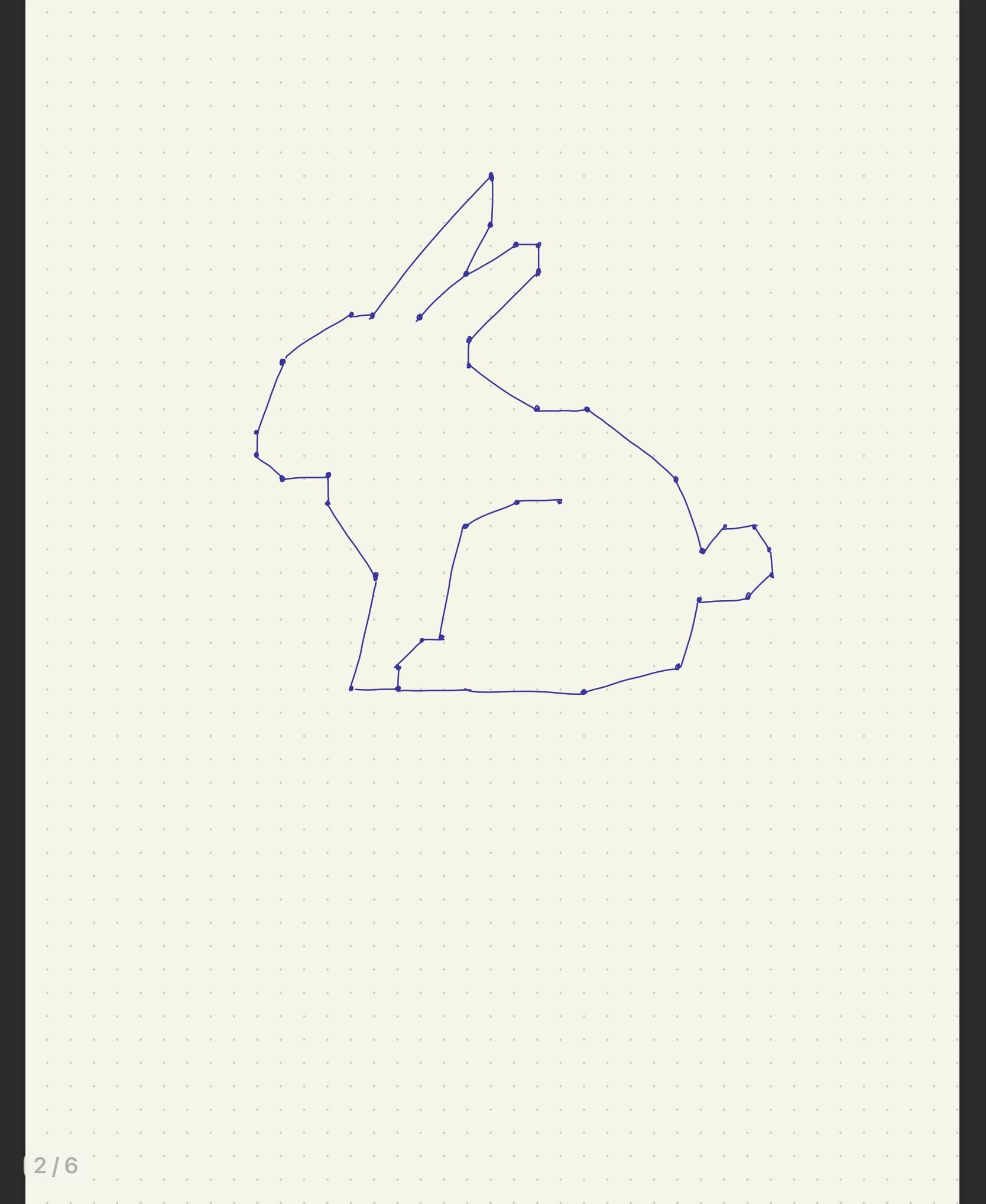
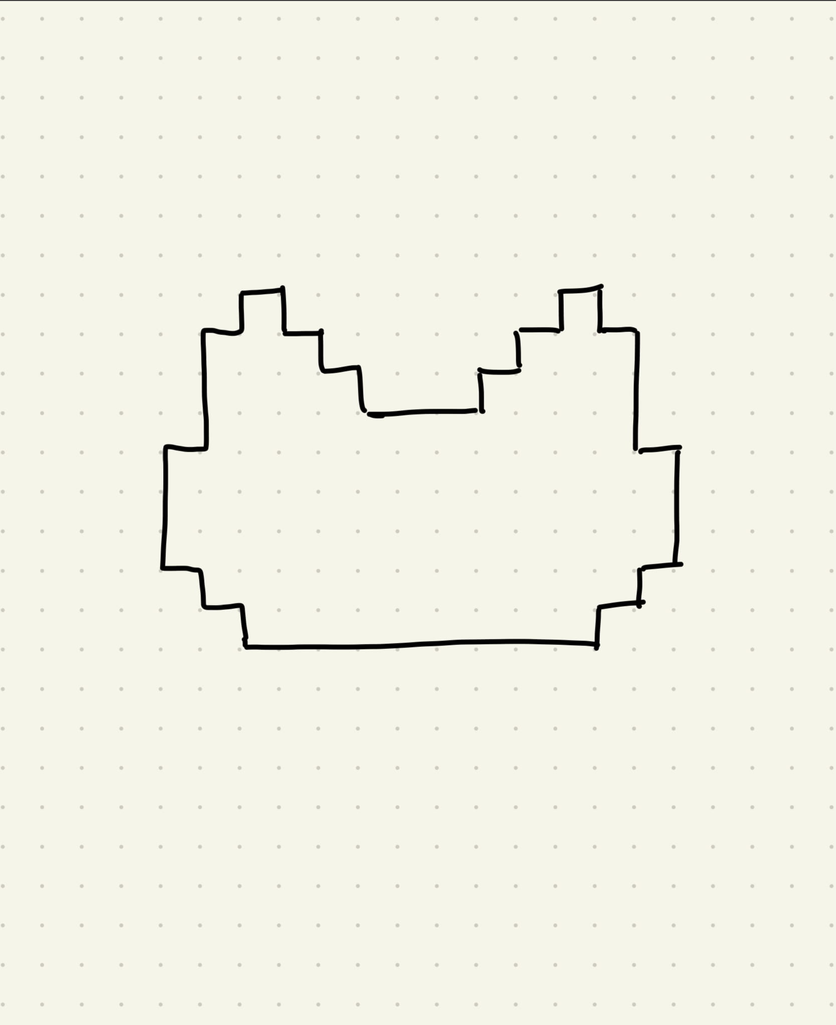
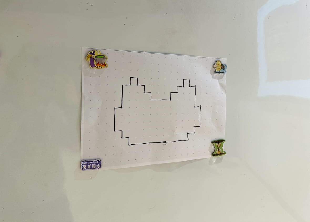
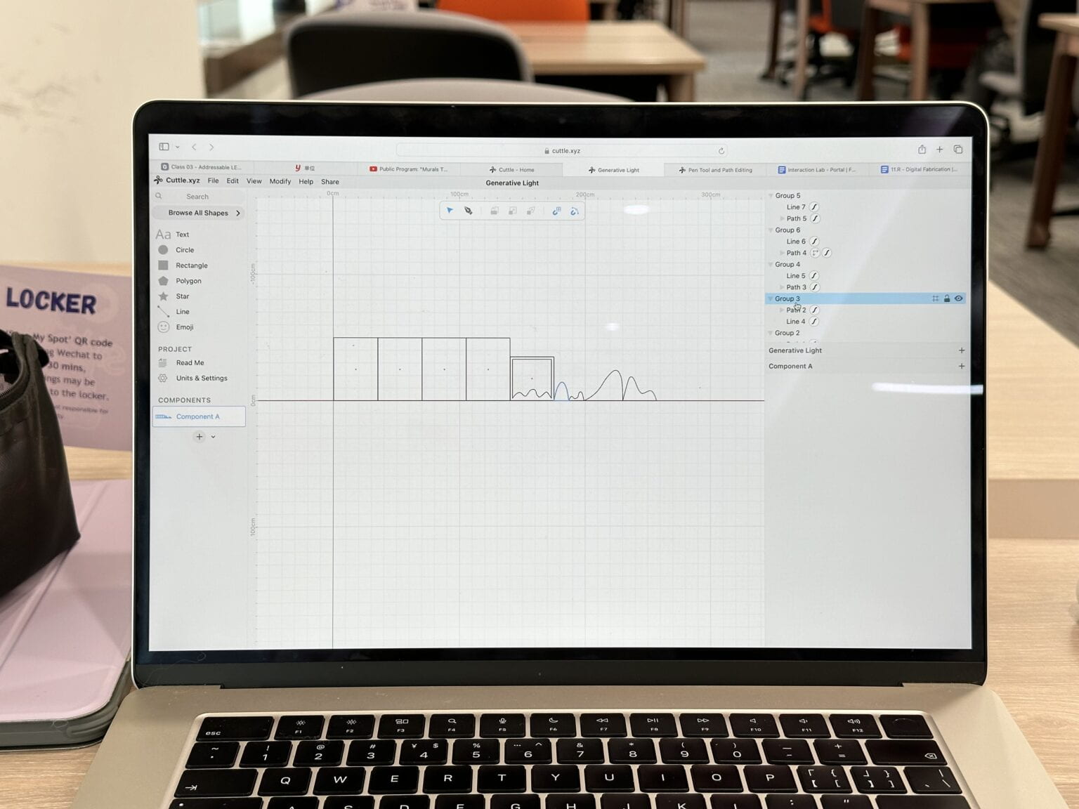
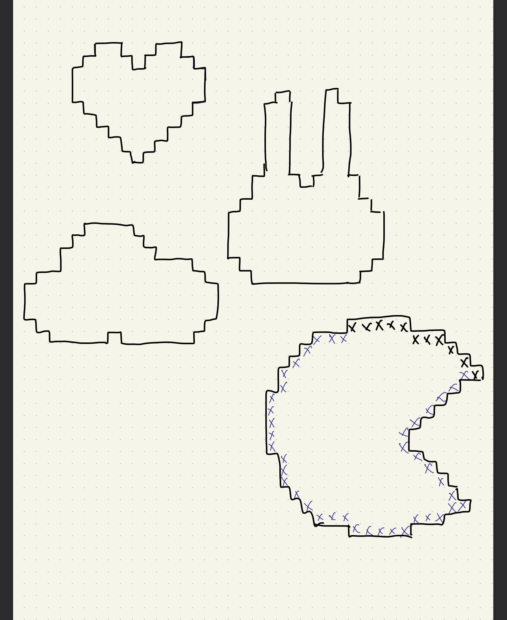
In the end, I drew this cat-like shape because the pointy ears would help to create enough concave so that there will be enough variations to the instruction and the shape is also somewhat good-looking. 

But still, the shape seemed a bit too easy to draw, so added a 60 second time restrain to make it more challenging . But telling from actual the presentation, I probably should’ve made harder, whether in the complexity of shape or the length of time, since the participants accomplished drawing the shape quite effortlessly. Though my estimation of setting a 60 second bar was quite accurate because it took them about 65 seconds, but because I timed it in a way that I was the only one who could see the clock, looking back, it would’ve been much better if everyone could see the time, especially the person who is drawing. I should also so enough user testing before presenting to improve my projects next time.

Here’s the finished piece of the presentation:

Here’s a video of the presentation:


NOC W02 – Candy Shop

Here’s a video of the running code:


This project is inspired by the Japanese artist おかず‘s generative artwork.

The work this artist created was intended for Processing, and based on the code the artist provided in the website, I edited it into JavaScript and made some changes of my own.

I first changed the colors into a more pastel combination, and I played around with the number of particles and the size of the particles. Because I’m working on a smaller canvas so I made total number of the shapes smaller. And when I tried to make the fluid particles smaller, the effect looks almost like small tentacles stretching out of the shapes which appears less pleasing to me, so I went with the effect of bigger fluidity of particles.

I also made the lifeSpan a lot shorter because towards the end the remaining movements are very small and hard to detect, so I thought it would more computer-friendly by cutting the lifeSpan.

Here are some of the screenshots of the images it created: