The Social Dilema

How does application design harm?

I think application design does more harm than good, as application design on apps is meant to keep you there for hours which can lead to addiction and can distract you from tasks. The app that is the most successful at this is Tiktok, before Tiktok my friends and I were able to easily get off social media. We can catch ourselves be on Tiktok for 5 hours when we said 10 minutes. This is due to their concept of a for you page which is unlimited content catered to what the app thinks you like, it is very successful since you can just keep swiping and enjoying the more content catered to you. I will say stories on various platforms such as Instagram is a strategy by the company to keep users on longer. Stories are a strategy since they are only 24 hours due to this most users want to make sure they see all the stories on a daily basis which can take a ridiculously long time, depending on how many people they follow. Also when I receive calls on Instagram the call request becomes the main screen even if I’m not in the app which forces me to interact with the app each time someone calls, which can distract me from what I’m doing and guide me back on Instagram even if I don’t answer. I think this is really harmful feature since it won’t allow you the liberty of easily leaving the screen until you answer or decline the call.

How does application design help?

I think application design helps in the way that you get notifications from the apps such as Instagram which allows you to look at the information later and be updated on who’s contacting you, which keeps you in the loop. This helps you not have to constantly go on the app and refresh to see if anyone has contacted or interacted with you. I think also the feature on Instagram of being able to see other users, mutual friends, when going on their profile is helpful. This is helpful because you can decide if to interact with this person or not and know who to ask about them to if they contact you or (try to) follow you.
Week 1: Design Basics

Application Name: PicDi

App’s Purpose:

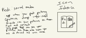
PicDi is a new social media platform idea that is based on only being used to post pictures like a diary or in informal language a photo dump. This can be a new healthy way of sharing your memories with the ones you love as only those who are mutual friends can see each other’s posts and comment on each other’s pictures, the only available features besides posting. The purpose of this is to take off the societal pressure of social media and just have fun with it since it has a more intimate focus by limiting features and social circles.

Short Look Into Thought Process:

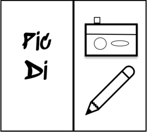
The purpose of this draft was to get the app idea and original icon. The original icon would be my base and inspiration for all my designs. I wanted to include the picture part of the app with a camera and I wanted to include the diary part with an actual diary and pencil.

Application Icons And Application Splash Screen:

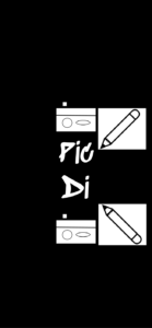
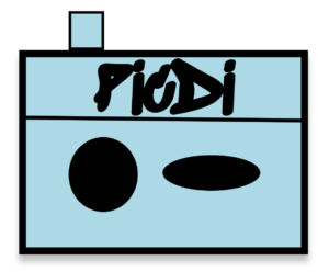
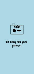
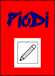
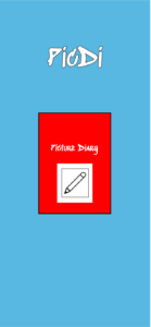
I started off by focusing on both aspects of the app, diaries and pictures, for the black and white icon and splash screen. One of the reasons I chose to do this was to be able to incorporate parts of this icon and splash screen into the other two making this one the main design. I did this by making an open diary with the app’s name on the left and with a camera and pencil drawing on the right interconnecting the two aspects of the app visually. I used the same drawings with some duplicates and text rearranged on the splash screen, the main difference was the use of a solid background on the splash screen instead of an open diary. I did this so the focus could be on the concept of the drawings which represent the app’s purpose. For the double color icon and splash screen, I decided to focus on the picture aspect of the app. I did this by making the icon the camera drawing from the black and white icon with the app’s name on it. I did the same thing with the splash screen, the only difference being the addition of the phrase “the diary for your pictures”. I did this in order to remind the user that this social media app is meant not only for pictures but to document your pictures as memories. The multiple colors icon and splash screen was focused on the diary aspect of the app. This was done by making the icon a diary with the app name and a picture with a pencil that says “picture diary” to remind the users that this social media app is a diary of pictures and to emphasize the diary aspect of the app. In the splash screen, I did the same thing but rearranged the text for space purposes. Overall, it can be said that my black and white icon and splash screen focused on both aspects of the app and the connection between them, meanwhile, the rest focused on mainly one aspect by splitting the original icon into parts.

1.  Black and White

Gestalt Principles Used: Proximity and symmetry.

I decided to use the gestalt principles only on the black and white application splash screen. The gestalt principles I decided to use were proximity and symmetry. I used proximity as a way to make the application splash screen more aesthetically pleasing and as a way to group the idea of diaries and pictures together. This is a way I’m trying to entice the reading into warming up to the application’s idea. I used symmetry by using the same “images” and making them opposites of each other or on top or below the main text being the app name. I did this so that it is enjoyable to the eyes.

2. Double Color 


3. Multiple Colors

Design And Symbolism

The language of design is essential.

The language of design is 𝓹𝓪𝓼𝓼𝓲𝓸𝓷.

The language of design is sympathetic.

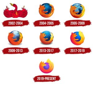
The firefox design which was first branded as Phoenix bird in 2002 is iconic to me. It is iconic to me because when thinking of the internet and technology this is one of the first programs I used throughout my childhood. Web browsers have always been very important and everyone who uses the internet probably uses a web browser once a day. Also, I personally find the fox very cute, it is one of the only logos I know with an animal on it so it is my favorite logo. 

I find the firefox logo a good design. I find the 2004-2005 logo the best as the colors are brighter and it is the most realistic. As time went by the creators kept the logo fairly similar with a few color and outline changes. It was until 2019 that the creators did a major change by completely changing the fox look into a more simple design. Although some may argue the logo has been downgraded as the makers have been looking for a more simple approach, I disagree. Personally, I like this approach as it goes with today’s times, simplicity is the winner nowadays. Firefox just changed the logo to match with times.