Application Name: PicDi
App’s Purpose:
PicDi is a new social media platform idea that is based on only being used to post pictures like a diary or in informal language a photo dump. This can be a new healthy way of sharing your memories with the ones you love as only those who are mutual friends can see each other’s posts and comment on each other’s pictures, the only available features besides posting. The purpose of this is to take off the societal pressure of social media and just have fun with it since it has a more intimate focus by limiting features and social circles.
Short Look Into Thought Process:
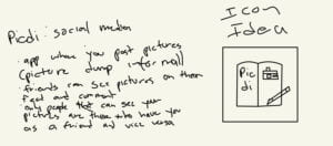
The purpose of this draft was to get the app idea and original icon. The original icon would be my base and inspiration for all my designs. I wanted to include the picture part of the app with a camera and I wanted to include the diary part with an actual diary and pencil.
Application Icons And Application Splash Screen:
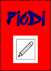
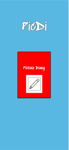
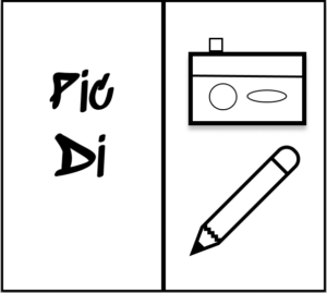
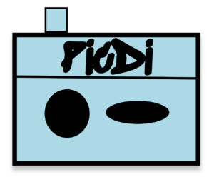
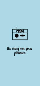
I started off by focusing on both aspects of the app, diaries and pictures, for the black and white icon and splash screen. One of the reasons I chose to do this was to be able to incorporate parts of this icon and splash screen into the other two making this one the main design. I did this by making an open diary with the app’s name on the left and with a camera and pencil drawing on the right interconnecting the two aspects of the app visually. I used the same drawings with some duplicates and text rearranged on the splash screen, the main difference was the use of a solid background on the splash screen instead of an open diary. I did this so the focus could be on the concept of the drawings which represent the app’s purpose. For the double color icon and splash screen, I decided to focus on the picture aspect of the app. I did this by making the icon the camera drawing from the black and white icon with the app’s name on it. I did the same thing with the splash screen, the only difference being the addition of the phrase “the diary for your pictures”. I did this in order to remind the user that this social media app is meant not only for pictures but to document your pictures as memories. The multiple colors icon and splash screen was focused on the diary aspect of the app. This was done by making the icon a diary with the app name and a picture with a pencil that says “picture diary” to remind the users that this social media app is a diary of pictures and to emphasize the diary aspect of the app. In the splash screen, I did the same thing but rearranged the text for space purposes. Overall, it can be said that my black and white icon and splash screen focused on both aspects of the app and the connection between them, meanwhile, the rest focused on mainly one aspect by splitting the original icon into parts.
1. Black and White
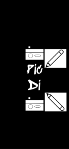
Gestalt Principles Used: Proximity and symmetry.
I decided to use the gestalt principles only on the black and white application splash screen. The gestalt principles I decided to use were proximity and symmetry. I used proximity as a way to make the application splash screen more aesthetically pleasing and as a way to group the idea of diaries and pictures together. This is a way I’m trying to entice the reading into warming up to the application’s idea. I used symmetry by using the same “images” and making them opposites of each other or on top or below the main text being the app name. I did this so that it is enjoyable to the eyes.
2. Double Color
3. Multiple Colors
