Exhibition Experience: Chronus vs. non-tech exhibition
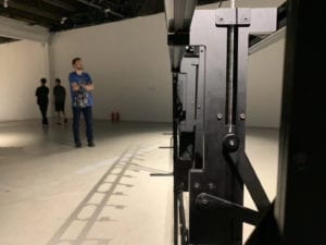
In Chronus, there’re mostly components we’ve learned in class, like motors and distance sensors. But I didn’t understand the meaning of this exhibition until I took a close look at Beholding the Big Bang, a device composed of many gears. As is implied in the title “Chronus”, this device reveals that time is eternal, no matter how this material world changes. The interaction triggered by the first gear has nothing to do with the last one, which is deeply inserted in the concrete. Another device called Rechender Raum has a similar principle. It works constantly based on an autonomous system, where human interaction has no effect on the whole operation. That’s why I feel, strictly speaking, the exhibition is not that interactive. And based on its theme, it is this kind of non-interaction that precisely reflects the intrigue and nonsense of today’s computer. However, the machine itself, as well as the technology contained in it, is still attractive to me. Those are all simple gadgets connected together, but what they present is incredible in terms of audio and visuals.
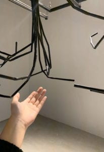
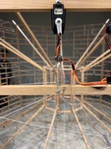
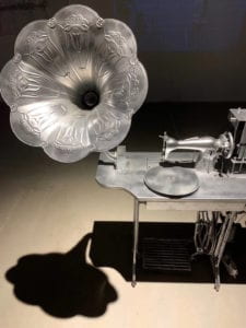
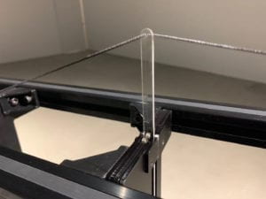
Another non-technology based artwork I visited a month ago is an individual exhibition by Qu Jiarui at Elite Bookstore, Suzhou. The exhibition shows her incredible collection of all kinds of dolls, as well as her sketches based on her life stories.
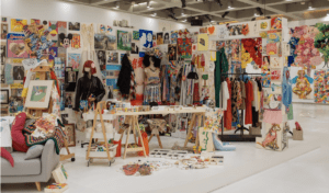
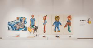
By comparing these two exhibitions, I found that both of them help build an immersing experience for the audience. The audience can only interpret the meaning behind the non-technology art. Usually, those artworks are static, and usually, there’s no interaction between them and their audience. But as we see nowadays, the combination of art and technology drags part of our attention to how the art is made, or the machine itself. It can also make possible the interaction between the artwork and its audience.
Interactive Projects As Inspiration
Project 1
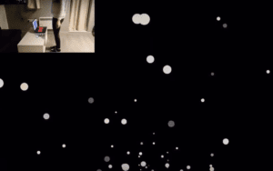
This is an interactive work I regard as successful. Initially, it shows the animation of many balls coming up. With Arduino and Processing connected, the speed of balls will change according to the distance between the user and the sensor. Also, the brightness of the room will change the background of the canvas. I consider it a successful interaction because it demonstrates clear and engaging physical interaction focusing on user experience. In this case, the installation really doesn’t matter. Both the user and the device are in a continues loop, where the device will give response whenever the user make some movement. Because there’s another input — light, it works together with the user and continuously send information to the device.
Project2
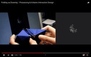
Folding as Drawing is another project I fond less successful in creating an interactive experience. The creator said that both the movement of brunching tree and paper folding are associated with each other to create a continuous pattern, expressing the concept of continuity. However, I don’t think the interaction is obvious enough. The folding process doesn’t match the drawing process. As an audience, I’m kind of confused about what to do.
What is a Successful Interactive Experience?
During group research, interaction in my understanding is a process in which an actor receives and processes the information from another through a certain medium and then gives the results accordingly. It’s sufficient to describe a basic interaction. But to be a successful one, in my opinion, the experience should (1) self-explanatory, clear, and obvious (2) put the user in a continuous loop to make responses (3) be multi-dimensional with visuals, audio and other factors involved so that the user will be more engaged.
My midterm project Plastic Sea makes the corresponding reactions based on the random choice of the user. The more bottles they pick up from the “vending machine”, the more animals will “die” (in order). For all the problems with the visual design and coding part, we both believed that the most tricky part is how to make it more engaging to the user. And to make it more engaging we must know who is the targeted user, when and where this device will be used. Right after the user test session, we put more instructions to make clear the whole idea. We didn’t use the “vending machine” at first. But later we realize that because the vending machine is pretty common in our daily life, it may help people better understand the interaction. It’s the same with those projects that I discussed above. The obvious and continuous interaction create an immersing environment for the user to be highly engaged.
In the introduction to Designing Interaction, Gillian Crampton Smith suggests that there are four dimensions to an interaction design language: words, visual representations, physical objects or space, time, and behavior. He adds that “the qualities of interaction determine a user’s overall experience of and satisfaction with it.” and “presentation is multi-dimensional, though it is mostly visual”. What he means corresponds to my third point. To make the project more engaging and more successful we need not only visual but also audible, touchable experience.
In conclusion, a successful interactive experience between some device and its user is a continuous conversation, in which the user is continuously and fully engaged.
Reference
https://meet.eslite.com/tw/tc/news/201909100005
https://www.youtube.com/watch?v=HbZKqJCxXak
https://www.youtube.com/watch?v=mM1lD8l6T-M
https://www.interaction-design.org/literature/article/what-is-interaction-design
https://www.uxmatters.com/mt/archives/2007/07/what-puts-the-design-in-interaction-design.php