What is Beauty?
Design
Our final project aims to show people that there is no single beauty standard. The audiences of our website are children since we thought that childhood is when we form our perception about beauty.
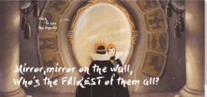
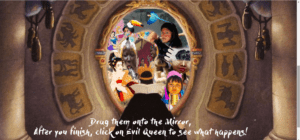
To unveil our notion, we start from the scene “mirror, mirror, on the wall, Who’s the Fairest of them all?” from the movie snow white, which most of us have seen in our childhood. This is one example that there is only one beauty standard, so we want to make change of it somehow. By clicking on the mirror, we can explore the mirror’s answer.
We choose some cultures that we think are some of the most representative in terms of solid beauty standards, including oriental beauty standards such as Chinese and Korean which aspire for fair skin, US and Brazil for tanned and chubby body, and also unique standards from tribes in Ethiopia and Myanmar to show how divergent beauty standard is. When you click on the spots, it shows you the collages we made based on our research online.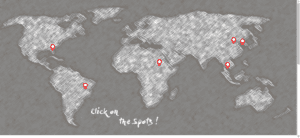
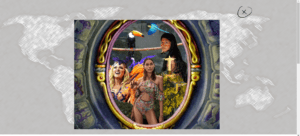
When you hover over those collages, you can fit into the culture more by listening to the audio we’ve selected. After you’re done, it asks you to scroll down and solve this little puzzle! It’s not visually pleasing but we intended to let our audiences know that this is what beauty is.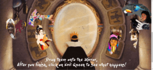
Process
To address our moral, we first did research on the beauty standards around the world on google. This might actually be a weakness of our project, since online platform even though is convenient and easily see people’s ideas, it lacks authority. If I could start this project again, I would have put more into consideration instead of simply searching online.
Based on our research, we made collages of what we think beauty in that country looks like and what is the beauty trend under influence of. I also think we made a mistake here since we didn’t make selections wisely enough that we include something while excluding others and also choose images to present certain culture, which I think betrays our purpose, just as what we had been told in the presentation. This actually makes me think of whether I’m doing the what I’m trying to convince people to get rid of. We should have thought twice or third times how does the audience actually feel about the context.
In terms of the coding process, one major problem that we’ve encountered is that the dragging function does not work on Kyra’s computer, or that is to say does not work well on Mac for some reason. This is the major problem that we encountered but we didn’t get a chance to solve that till the day of presentation. If we got enough time, maybe I’ll try out some other approaches.
From proposal to presentation, I think we have a more concrete and solid position. At first, we just think that it’s good to show people different beauty standards. As we are doing more and more research online and as we build up our website, we start to question: what is this website for? Who should it aim at? Finally, we realized that it should actually be an educational website for children. To make it feasible for children, we use simple interaction just as clicking and dragging for them to interact.
Future
What I think I would do if we have enough time, first based on the advices we received from class, we will do more research to back up our whole project. Instead of making the collages filled up the mirror, I would like to leave some where blank to indicate that that is not the only beauty standard of that culture. Last but not least, since we aim to make a educational website, I’m thinking whether all these functions can work on iPad as well, since it is the main means for children to touch on internet.