Project Reflection: World Music Playlist
Link: http://imanas.shanghai.nyu.edu/~mne234/FinalComLabProject/startingpage.html
A. Design
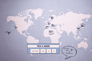
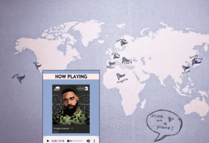
When you first open my project, there is a simple introduction page to offer quick insight into what the rest of the project will be about with a title and a start button. After clicking this start button, you will be taken to a hand-drawn/edited map of the world with specific locations marked with a flag. When you click on one of these places flags, a pop up will appear asking you about the mood you are in. Once you decide on a mood and input your answer, a song will appear in the corner and you can play it. This song will not only represent the mood you are in, but also the place and culture in which you chose before. You can pause and play the song to your liking and then begin the process again by clicking a new place to explore the music too.

B. Process
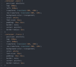
When first beginning the production of this project, there was trouble with the idea of how to simply go about it and put my ideas into reality. An interactive map that one could click and navigate through was ideally what I wanted, specifically one that I created myself. Although, my artistic skills are not the best and neither is my extensive knowledge in coding past what has been taught in class. So the project had to be critiqued in some places to make everything work. The creation of the map as an image and allowing the user to click on certain places actually worked quite well. Initially, I was worried about this aspect of the project, but was able to easily figure it out with some guidance and looking up coding techniques. The coding for the transparent buttons over the places looked like this.
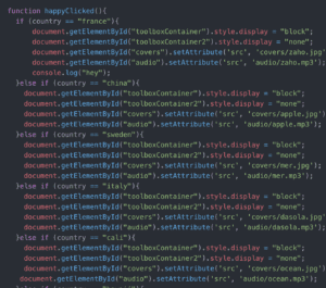
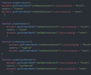
One aspect that didn’t work as well was the music player pop up. With more time spent in coding, I believe this could’ve turned out in a better style and design. I had trouble making this and the mood player pop up according to the specific place (such as block and none in the coding aspect). This took a lot of time to understand. The code ended up being written like this.
- C. Future
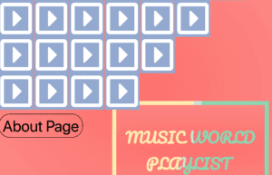
Given more time to complete the project, there are a few aspects I would like to add and change in order to further improve it. One of the first things I would like to change is the music player. I would like this to be more interactive with maybe more of a selection of songs (not just one per mood) that you could scroll through by album cover. In the future, I would change the overall style of the about page/introduction start page in order to apply more to how the project was more personal to me. The styles were different and didn’t cohesively match, as the critics mentioned, so this is something I would like to fix and work on in the future. For example, I should in the future make sure every aspect of the website (buttons, fonts, backgrounds, etc) all follow a similar aesthetic. Also, I would love if every capital city could be clicked on. Instead of just the selected countries I chose, I wish I could’ve had every capital in the world available for people to navigate music through.