WHO ARE YOU TO JUDGE – MEGAN SEE – RUDI
CONCEPTION AND DESIGN:
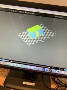
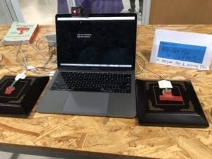
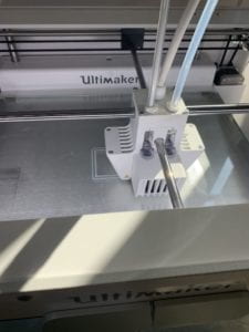
For our project, we first knew that we wanted to do something focusing on criminal justice. We decided to make an interactive “game” (if you can call it that) that educates people on the topics of wrongful convictions and life v death sentences. We had a series of cases that appeared on the screen and the user was instructed to select either a punishment or if the person we spoke about was innocent of guilty. Initially, we wanted to have a motor attached to the user either in a bracelet or a chair to simulate the electric chair (not really electrocuted) to show tell what happened to the person who’s fate they determined if they got the verdict wrong. We later altered this to make it seem more focused on the user being the judge. My partner and I did this by using sensors connected to arduino that determined whether or not they had been hit by a gavel (which is what a judge uses when making a final verdict.) We placed the sensors on two blocks as well that were meant for the gavel. After a case was presented, the user hot either the right or the left block, each corresponding with a different decision. For other parts of our presentation, we wanted it to be fairly simple in a way that would make it seem serious and professional, but still effective. We had a plain black background and white typewriter font that played on the screen so it would type out while the user was reading it. During user testing, there were a few people who asked about inserting pictures, but we decided against it to keep people focused on the text and sound since it was time-sensitive. We were also aware of the fact that the text was displayed very fast, but this was in order to make the user more anxious about their decision and feel the same pressures that someone with this responsibility has. By making them feel like the judge, a new understanding of how these convictions come about arises. After they are out, we give them the details of what actually happened in the specific case they made the wrong conviction for. This was meant for them to see how easy it is not to look at the specific parts of a case that may just prove the “criminal” innocent. We added a radar sound as our background sound. We did this to make users anxious and really feel the weight of their decision. We thought about changing it, but it worked exactly the way we wanted to in user testing so we kept it. We also 3D printed something to hold our physical timer (also from Arduino) and green and red lights that are lit up depending on if the user makes the right verdict.
FABRICATION AND PRODUCTION:
After user-testing we decided to change several aspects of our project. For one, as I already mentioned, we added the sensors from arduino so that the user could hit a gavel to make a verdict.
Before user-testing we had the screen controlled only by arrow keys with the keyPressed() function, so we had to change some code from only processing to arduino to have it take information both ways. We also had way too many wires with nowhere to hide, so we 3D printed something to hold all of our wires behind the computer. It held the lights and timer in the front and the wires went through our 3D printed objects and then out the other side, which was hidden.
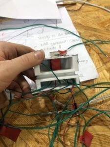
Also, at user-testing, we only had the physical timer, but we heard from several users that they also wanted to see it on the screen, so we had it displayed in both places for out final. We added sounds for when the user got something right or wrong. We painted the 3D printed object black to match the appearance of what we displayed on the screen. All of the explanations for the cases were added after user testing because users wanted to know the details on why their verdict was incorrect. We changed the font to the typewriter to match the sound and style of the project. At the beginning, we came across several issues with the sounds interrupting each other, not stopping, or playing at the wrong times. The keyPressed function when we used it caused a lot of issues when we wanted things to happen at other times than when only the keys were pressed since they controlled almost everything else. At one point the timer would also only work on some occasions and would skip on certain cases. Since we had to code every light in the timer, it made it extremely confusing when we wanted to move it from the breadboard.
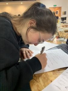
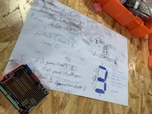
The wires got inserted incorrectly at first and it took way longer than it should have to fix. This made some of the numbers appear as if they were repeating but really it was just that one light out of the seven wasn’t lighting up.
CONCLUSIONS:
Ashley and I wanted to find an interactive way to inform people about criminal justice issues, mainly wrongful convictions and issues regarding the death sentence. We wanted our users to be the judge when making a verdict. By doing this, we hoped to put them in the judge’s place to be able to see how the details in the cases that proved them innocent were missed or manipulated. I think that our information was executed well, but there were definitely parts of our design that could have been better if given the time. One issue we had was the text writing out too fast. We wanted it to be fast so that the user would feel the anxiety and make a rushed decision, just like how judges often react to pressures in court, but instead, people got stressed and thought it was an accident rather than being intentional. At the final IMA show, we found that many adults when using out projects weren’t completely sure if it was over after the “check your assumptions” page. If we had the time, I think adding something to restart it with a button would have been a better indicator. We did have sounds and lights for when they were wrong, but they didn’t know that when they were wrong the entire thing was over. Also if they wanted to retry the game, they would have to wait for all the text to type out for the first few questions and wound up waiting for a long time. We decided to make it so that you would have to wait so that people wouldn’t hit it more than once after one question and have it skip too fast and miss the next question completely. Other than minor issues in the end, people said that they learned something and they enjoyed how they learned the information we were giving them. We got the responses we wanted overall, and users at the IMA show were eager to play again. I defined interaction before this project as something that can give incentives and rewards to a user to attract them to it, giving information and then receiving feedback. I think that my partner and I did a much better job on this project in that aspect. The users wanted to get to the next level; their incentive was to win. By making them want something, they were eager to read the information we were hoping to educate them on and needed to understand it in order to succeed in the game. They had the ability to make choices (verdicts) as a judge, making them feel as though they really had that responsibility, and then the output was informing them how that action would have affected society (because we used true events). I think that the sounds, colors, style, and way they used it (with the gavel and hitting it) all made it feel as if they were truly the judge and made them more immersed in the project. Since this is a topic that I am very passionate about, I was very pleased with the reactions of the project. I saw people engaged and excited while interacting and learning about the criminal justice system. Some people did seem a little bit hesitant at first to try the project if they had no knowledge of it before, so maybe if it was more private they wouldn’t feel too much pressure to pick the “right” answer. One thing I definitely learned from this project is that the small things matter!! Even something that you might not think of at first, for example, the speed of the text, made people feel very different about their interaction. The timer on the screen having one digit, or 4 digits when counting down also changed the agency of the user. The things that were most important at the end were some of the smaller things I wouldn’t have thought of at the beginning or by myself without user-testing. Overall I am very proud of this project and I think i successfully made it interactive, although there’s always room for improvement, I think by the end I knew what things I would have liked to change if I had time to make it better for the user. I felt like I made an engaging way to learn about a very deep and serious topic that many people would typically steer away from.
https://github.com/ashlelayy/IXLFinalProject/blob/master/WhoAreYouToJudge
^our final processing code