Documentation:

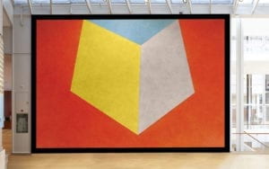
Tilted forms with color ink washes superimposed.
December 1987
Color ink wash
Courtesy of the Estate of Sol LeWitt
First Installation
Royal Scottish Academy, Edinburgh
First Drawn By
David Higginbotham, Linda Taylor, Jo Watanabe
MASS MoCA Building 7
Second Floor
I chose this image of Sol Lewitt’s Wall Drawing 552D because the sheer size of his drawing seemed very impressive when viewing the painting as a whole. The colors of the drawing complement each other very well, and provide stark contrast against the background of the wall drawing. Sol Lewitt describes these wall drawings as not quite a cube, yet still inspired by the geometric formations of one. They also adhere to the idea of flatness not seen in a 3D figure like a cube, which provides an interesting interpretation of what a cube could look like.
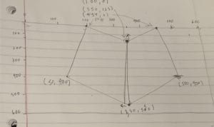
I wanted to draw in Processing an image that would emulate the drawing, mirroring the different shapes and colors that compose Lewitt’s wall drawing. I first sketched out the drawing on paper, first creating a grid for the drawing, then marking down the coordinates of each figure. Using both triangles and quadrilaterals, I ensured that each point was aligned with each other, so as to not disturb the linear integrity of the piece. After creating the figures in Processing, I fine-tuned the points in order to better match the overall picture. My final creation is linked to the motif in that its colors and shapes are quite similar, though there are subtle nuances in the overall structure of the drawing, such as the size of the shapes relative to the background. I believe Processing was a good means of realizing my design, as the shapes were linear and not too abstract, making it easier to draw in Processing.


