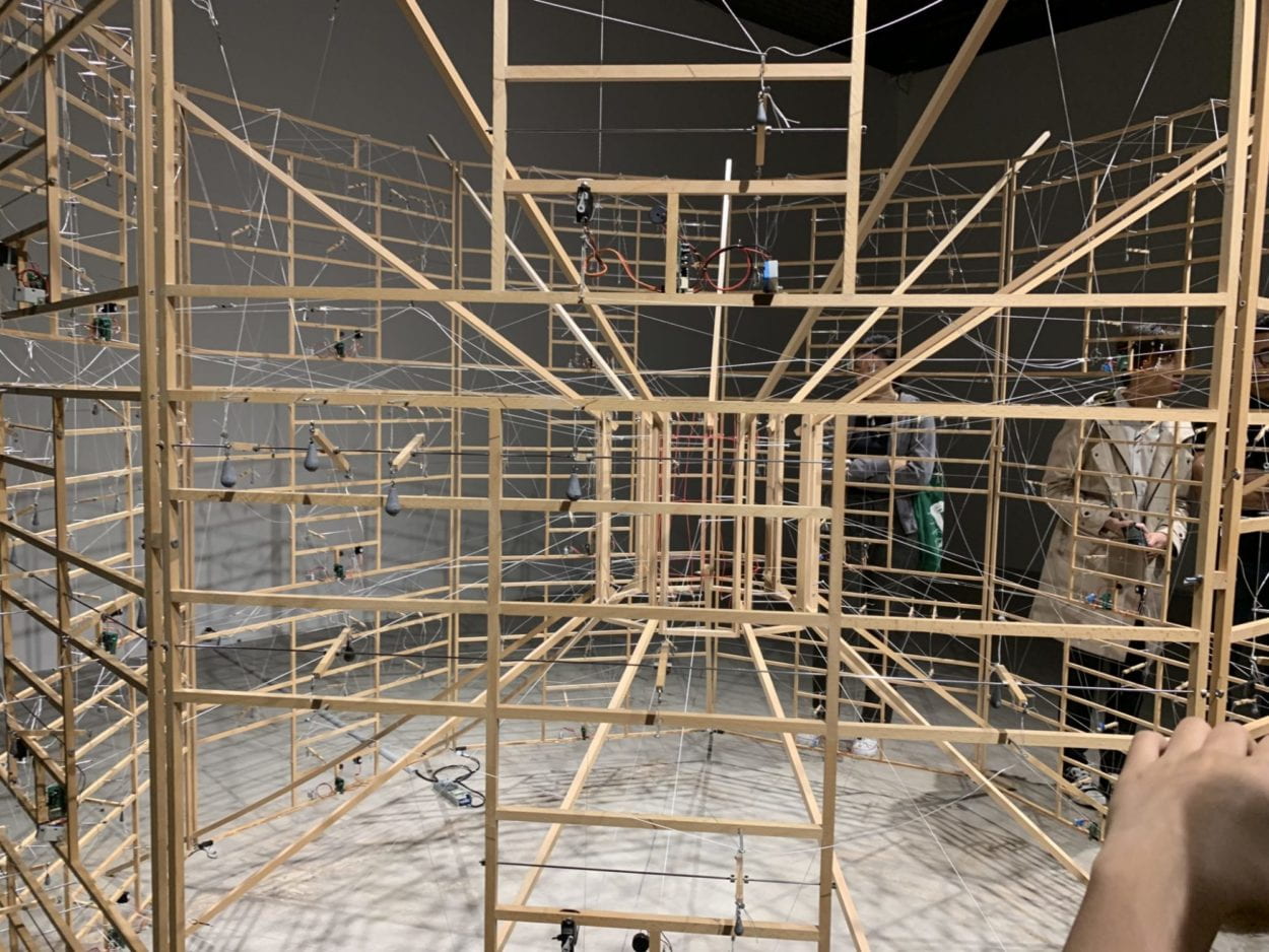
The Chronus exhibition, Just What Is It That Makes Today’s Computers So Intriguing, So Nonsensical, proved incredibly inspiring, as its physical conception was compelling in both its final rendering and the process behind creating its design. Each of the installations was captivating in its own way, presenting something similar to that of a performance with its kinetic movements. The sculpture I found most enthralling at the exhibition was Rechnender Raum, by Ralf Baecker, which is described as doing “the immaculate deed of measuring and adapting space with a neural network built of beechwood sticks, rubber bands, fiber strings and servo motors, turning the logic of a consumer computer inside out” (Chronus Art Center). Its use of servo motors in the final installation as part of its physical rendition proved very intriguing, as we would typically hide the physical motors and wires in our own projects. Instead, Baecker decided to include the servo motors as part of the physical art sculpture, which overall added to its unique final presentation.

Compared to other exhibitions of non-technology based art work, this exhibition was much more engaging with the visitors in terms of creating a unique experience between the artwork and the viewer. Typically, the viewer examines a flat, usually 2D painting or drawing, not actively engaging with the viewer in the sense of using different moving parts as part of its installation. The Chronus exhibition provided a way for every visitor to perceive the sculptures as something entirely different, as each moving part results in a different perception of what the sculpture is and what it represents. By seeing each component of an installation move and interact with the other elements of the installation, it provided for a more immersive experience with the installation itself, instead of just simply viewing the artwork as a whole.

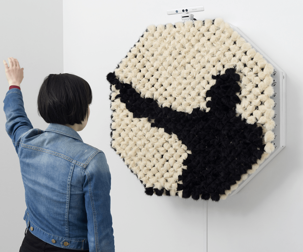
When researching two other interactive projects, I first looked into NYU Professor Daniel Rozin’s interactive art. I stumbled onto his work through a small feature documentary created by WIRED magazine. Rozin’s work mainly involves the use of motors, sensors and different materials, all acting as different types of mirrors. Specifically, I chose the PomPom Mirror, which makes use of 464 small motors, an Xbox Kinect sensor, and 928 faux fur pom poms. The piece itself detects movement from the user, which translates to a mirror image projected onto the pom pom material. The piece itself is deceivingly complex, requiring Rozin to create his own software for the piece, and individually programming each of the motors to move in a unified manner. I believe that Rozin’s art proves itself to be a successful example of an interactive experience as it has no learning curve. I believe that Rozin’s PomPom mirror displays interactivity through its cyclical process with corresponding to the user’s input. When the user moves, the piece responds to their input, thereby changing the overall piece as a result of the user’s interaction. The piece itself poses no type of difficulty, the design is intuitive and easily accessible; the only interaction necessary for the viewer is their own movement.

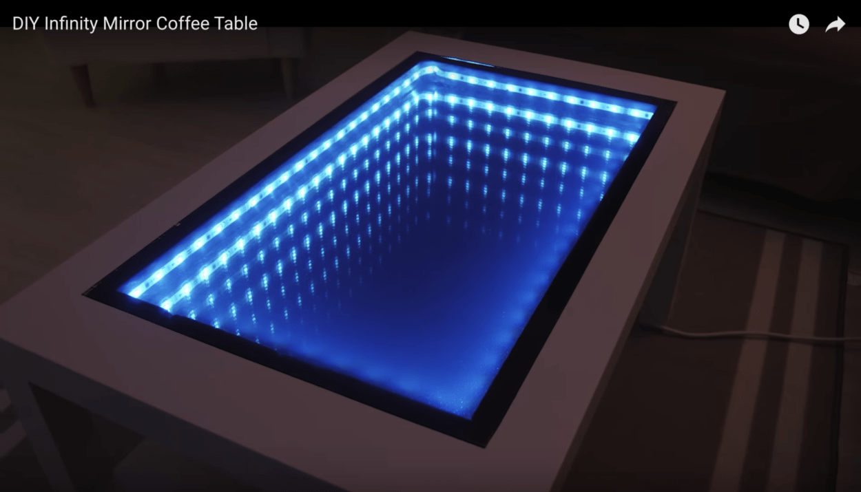
Additionally, when researching for more interactive projects, I found a walkthrough for a D.I.Y Interactive Infinity mirror table. The table itself made use of mirrors and lights, creating an illusion of a table with an empty center. The illusion itself proves to be an interesting piece; however, when compared to Rozin’s work and other interactive projects, the table fails to be as successful. Although the table is visually striking, the interactivity of the table falls short. Aside from the ability to change color, the table does not pose any form of interactivity. Unlike Rozin’s PomPom mirror, the table itself does not react to any real time input from the user, only changing when a button is pressed. Although interactive in certain aspects, the infinity mirror table proves to be a less successful example of interactivity within a project.
During the group project, I defined “interaction” as two participants working and influencing each other, or how one participant responds to another participant’s input. Based on the initial definition and my experience developing and executing my midterm project, I redefined my interpretation of interaction to reimagine it as a cyclical process. When conceptualizing what the midterm project could be, many of our original renderings proved very isolated in its process, with the user interacting with the device, then the device reacts to the user, then ending the overall interactive cycle. When creating our project, we wanted to produce something closer to a process between the two participants, an ongoing process of interaction, with constant input and output from both users. For an interactive experience to be successful, it has to be — quite obviously — an experience, in which the “experience” does not end after one user interacts and the device interacts. Instead, the two have to be constantly in action, interacting with each other to create a more immersive experience. This is most similar to The Art of Interactive Design, which most clearly defines interaction as “a cyclic process in which two actors alternately listen, think, and speak,” through comparing the act of interaction similar to a conversation (5). I think that more precisely, however, interaction is typically composed of three steps: input, output, and processing, as outlined in Introduction to Physical Computing (Igoe & O’Sullivan, 20). Interactivity is defined upon the notion of the physical experience between involving two people involved, who collectively react with each other.
Works Cited:
http://www.smoothware.com/danny/contact.html
https:// www.youtube.com/watch?v=OasbgnLOuPI