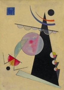
I chose Vasily Kandinsky’s Bright Unity because I love the way he plays with shapes and colors. I think the abstract nature of his art allows a lot of room for interpretation by the viewer in terms of what meaning is derived from the particular arrangement of objects.
I wanted to use Processing to create my own representation of Kandinsky’s work, using similar objects and designs while not copying his piece exactly. As far as my methods, I began with some of the larger shapes that didn’t require as much attention to placing. From there, I added in all of the other intersecting elements that needed to be coded specifically to meet or overlap at particular points on the grid.
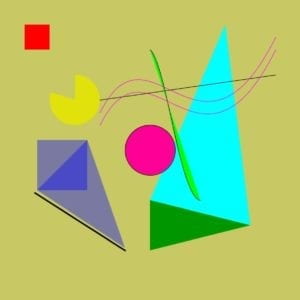
My final creation is similar to the original in that it uses a variety of shapes and lines, some overlapping or in parallel with each other. Like Kandinsky, I used a large triangle as my central focus, then build on it from there.
The primary differences are in the complexities of the final products. Because of the time constraints, my drawing doesn’t feature as many shapes as the original. I was also unable to include some of the more complicated objects, like the blue and orange arcs that taper off or the sectioned off circle and triangle pattern on the bottom right side.
Drawing in Processing was a very productive means of realizing my designs. For the most part, it was easy to create any sort of shape that I wanted, although I did have a little trouble with creating a semicircle, and ended up with the yellow Pac-Man shape instead. The drawing process was intuitive, but it did require a bit of effort to make the calculations of where to place each point, especially because I wanted many of the shapes to be perfectly lined up, or overlapping, or moving parallel to each other. I found that I ran the code after every new shape or color I tried to include, just to troubleshoot and see if it looked the way I wanted to. There were a few times when I wasn’t sure if the coordinates I was inputting were exactly where I wanted the shape to end up, so I would approximate the positions, then correct based off of the display. All in all, I enjoyed playing around with the different possibilities of the software, and how easy it was to change locations, sizes, colors, etc. of the objects.
Credits: