- Tip Tap Slap – Justin Wu and Julie Huang – Professor Marcela
- CONCEPTION AND DESIGN:
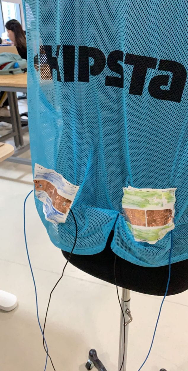
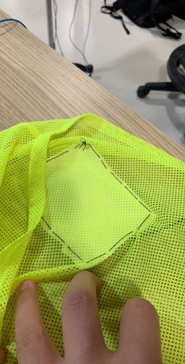
While creating this project, Julie and I contemplated on how we can differentiate ourselves from other music rhythm projects, and we decided our interface will be the x-factor. We chose the best way to recreate such an experience is to make the interacting process as organic as possible. In our game, users do not use regular buttons. Instead, we want users to use hand-eye coordination and body taps to imitate people dancing and bopping to the music. We decided our controllers will be on a separate piece of clothing and not set on a different platform like an arcade game. Instead of just using your hands and eyes to play a music rhythm game, our unique controller design is more natural and encourages our users to immerse themselves in our game. We did not want to use traditional buttons as it will protrude on our choice of clothing, so we heeded Leon’s advice on creating a conduction tape button. By utilizing a conduction tape button, our buttons will be able to remain flat on our choice of clothing, creating a natural feel for our users. Moving forward, we had to carefully choose our selection of clothing, we wanted to stay in the natural/organic theme and wanted a light piece of clothing. We ultimately decided to go with a soccer pinnies/scrimmage vest. The pinnie is light, and users will feel as if they are not restricted. The lightweight material on the pinnie will not obstruct our cables, attached to it. The combination of the pinnie and flat button worked best for our project as it is convenient. Our interface is as natural as it can be because users can wear it and feel normal. We wanted to frame our users to believe it is a more engaging remake of a music rhythm game, so we moved away from traditional buttons and a traditional setup. All in all, Julie and I aimed to create a game that elicits creativity from the inside out by tweaking the conventional arcade setup.
- FABRICATION AND PRODUCTION:
Before the User Testing session, Julie and I initially named the project “Tip Tap Snap.” The music rhythm game was supposed to be competitive and integrative, and we wanted to include a photo taking function. The most significant difference between “Tip Tap Snap” and “Tip Tap Slap” is our user interface. We started the project by coding the game as we felt the user testing session will be extremely constructive and we wanted to remain as flexible as possible. However, before the user testing session, we also used a recitation period to discuss our ideas with our peers, and it turned out to be extremely helpful. The three classmates, I was partnered with, were incredibly insightful. They questioned the purpose of our photo taking function and was skeptical that it would create value for our project.
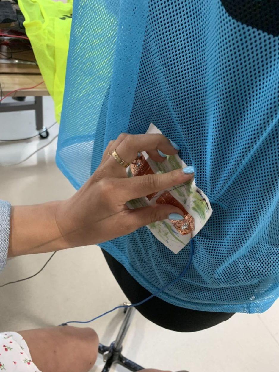
After the discussion, Julie and I both decided to drop the picture taking aspect of our game and include another game changer. We decided to add buttons, but there were two issues. First, we had to purchase suitable buttons and ensure it will arrive in time. Second, we did not want to tape buttons on our pinnie as it will neither be comfortable nor compact. As a result, we proceeded with Leon’s suggestion and made conduction tape buttons. However, we had to create makeshift conduction tape buttons for the user testing session as we did not have time. Our project was about 70 percent complete for the user testing session, but Julie and I were curious about what feedback our potential users can provide us. During the user testing session, many users were fascinated by our user interface and asked many questions. But many users also complained about the speed of the game, they lamented that the game was too fast paced and it was hard to touch four buttons. Professor Marcela also pointed out the positions of our button were quite awkward around the chest area, and some people might feel uncomfortable touching the chest buttons. Some users also indicated the glove design was not as comfortable as it could be. Julie and I were glad users were fascinated with our project but more glad we knew what we had to improve on.
Moving forward, we made better buttons by soldering the cables and sticking the conduction tape to fabric instead of paper. We also used a sleeve design for the top button instead of using the original glove design. By stitching the material with the conduction tape and using a sleeve button design, we upgraded our hardware presentation. Next, we killed two birds with one stone by moving the two chest buttons to another pinnie. This way we make our game collaborative while also solving the awkward button positions. After working on the necessary improvements, we decided to further enhance the user experience. Therefore, we consulted Nick regarding our cable organization as he raised concerns about it during the user testing session. Nick directed us to a pull-up function that will allow us to reduce the number of cables attached to each button. After implementing the pull-up function in our game, we cut down the total number of wires from the original 12 to 8. Overall, Julie and I made several changes to our project, from changing the layout game to the user interface and even button positions. These changes range from small to big but every move had its purpose and all sum up to help us improve our game and provide a refreshing user experience.
Initial Button Layout: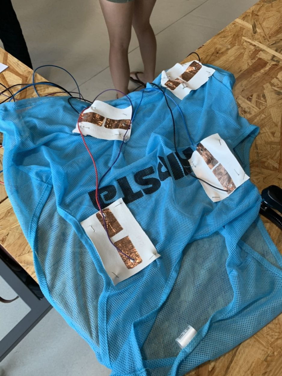
Original Design: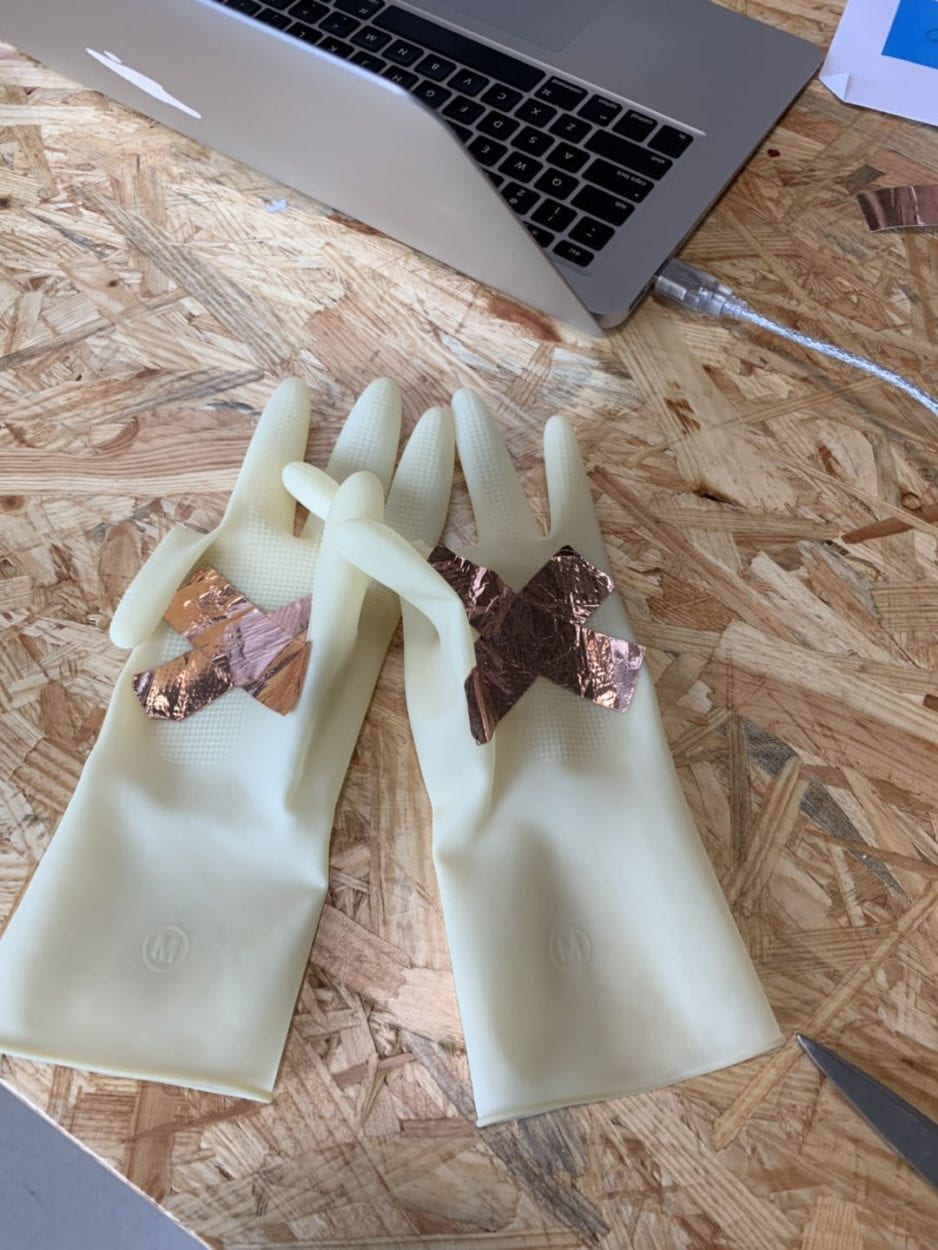
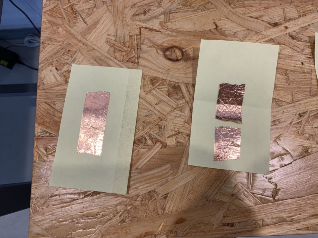
User Testing Video:
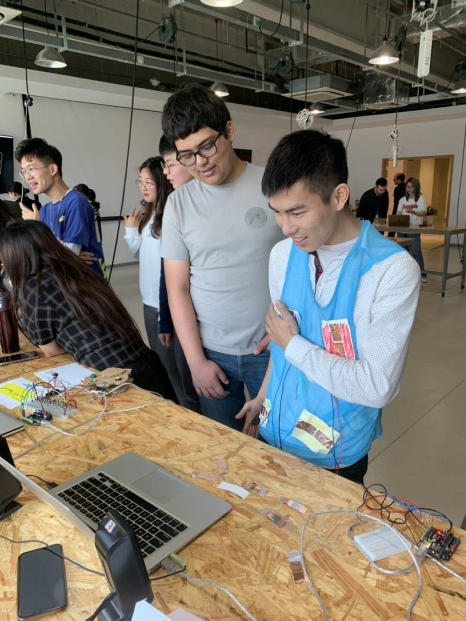
Improved Design:
- CONCLUSIONS:
- The goal of “Tip Tap Slap” is to introduce a new way to play music rhythm games. Julie and I wanted to build a game that shatters typical arcade game formats while still providing entertainment. I believe our game fits with my definition of interaction. My definition of interaction requires two parties bouncing ideas off each other, having a (1+1>2) effect, and also be a creative process. My project aligns with my definition of interaction because it requires the users to bounce ideas off the game, while also creating the (1+1>2) effect as users experiment with our seamless button design that is also creative and out of the blue. However, my project does not align with my definition of interaction as some users complain about the pace of the game and it effectively removes the (1+1>2) effect. If our project is unable to entertain the users, the creativity of the game will be futile and will not align with my definition of interaction. Based on the audience’s response and my definition of interaction, I would like to claim that the audience interacted with our project comfortably. My classmates thoroughly enjoyed the project by reacting to the audio and visual stimulus (bouncing ideas), getting more out of the game (1+1>2) than usual through the interactive design (creativity). I would make several improvements if I had more time to work on the project. I would improve on both software and hardware in order to upgrade the overall quality of “Tip Tap Snap.” First, I would begin creating a more professional starts screen that would better introduce users to the experience. After the start screen, I would include an instructions page that will teach users how to play this game. Next, I will add more visual cues to indicate users have made a connection with the buttons. Moving onto the hardware aspect, I will want to make the project wireless. I would do so by using Bluetooth to connect the Arduino and Processing. I would focus on enhancing our hardware as the conduction tape buttons are the focus of our project. If we are able to prevent the wires from tangling, as it did during the IMA show, it will improve user experience. During the process of making this game, Julie and I encountered several obstacles and we were set back on multiple occasions. First, we underestimated the difficulty of making a music rhythm game. Then, we decided to ditch our original game design and had to improvise. During these setbacks, Julie and I tried our best to adapt and improvise. We did not think of any challenge or a change in our project as a failure. We believed every change we had to make brought us closer to a polished project. For example, the conduction tape buttons would not be in our project if we did not decide to leave the original plan behind. Our original plan was to attach buttons onto the user’s body but Leon suggested us to make conduction tape buttons to differentiate our project from other music games. Although it was not a challenge, Julie and I were skeptical but decided to move forward with Leon’s suggestion. In the end, the conduction tape button became the highlight of our project and we can say that listening to Leon’s advise was a blessing in disguise. I believe our project is special because we have had to make multiple adjustments to complete this project. Our initial plan did not work out but we were fine with it and even though we thought about starting over when we encountered hardships, we made sure to stick it through and the result paid off.