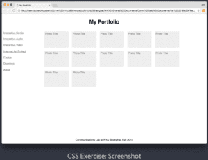
Finally got that CSS page done. The assignment, as you know, was to apply CSS styling to an HTML page that we were given, in order to look something like this:
I decided to make an exact replica of this page. As in, down to the precise RGB values used for the text and boxes. The first thing I did was to set all the fonts to Helvetica – guessing, correctly I think, that this was the font used in the example, as our professor has often used it during our class sessions.
Next, I took the suggested action of adding a temporary background color to each div, in order to see the areas encompassed by each of these div’s more clearly. I then used imagecolorpicker.com to determine the colors used for the text and boxes, and applied these in my code. However, the hyperlinks in the navi-box on the left still displayed blue or purple (default colors for hyperlinks, before and after being pressed). I found the solution after some googling. By changing .navi-box a:link and .navi-box a:visited, I was able to change the hyperlinks into the color I wanted, rather than having them revert to the default hyperlink colors.
After that I had to convert the content and content-box div’s into flex areas. I followed the guidelines laid out in the slides, but encountered an issue where all the boxes’ colors would take up the same space (effectively creating just a single box), while the boxes’ text were lined up in rows and columns as I had intended, but below the navigation section (on the left, with the links) instead of next to it. After some trial and error, I found that my mistake had been placing most of the flex information in the .content-box sub-div, rather than in the overarching .content div. Once I moved the code detailing flex information (such as flex-direction, flex-wrap, and justify-content) into .content, the boxes displayed normally.
From there, it was just a matter of fine-tuning, to get the specifics just right to look as close to the original page as possible. I removed the temporary background colors from the different div’s, as they were no longer needed since everything was already roughly in place. I added margin to the right of the navigation and content sections (in the case of content, this was to generate a “line-break” for the content boxes, as too many were being displayed on one line), margin above and below the header, a large margin above the footer, and padding around the navi-boxes. I also included a small margin and even smaller padding for the content boxes – the margin for separation between boxes, and padding for separation of the content box’s text from its border (without padding, the text would be right up against the border, which was not the case in the sample website).
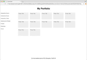
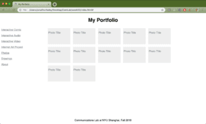
The one problem I could not find a solution to was to justify the content box’s text against its upper-left corner. With the boxes I created, the text is left-justified, with a very small space (produced by padding) between the box’s left edge and the left side of the text, but a significantly larger space between the box’s top edge and the top of the text. In the sample website, the space at the top is also very small (as you can see in the screenshot at the beginning). After a good deal of time spent googling the issue, I couldn’t find any way to resolve it, or at least none that worked, so I left it there. It’s the only major discrepancy I can find between the original sample website and the copy I’ve created. Below is the sample website again, and below it a screenshot of my created website. See for yourself: how close did I get to the original? Click HERE to visit the page itself.
.
.
.
.
.
.
.
.
Side note: The screenshot on top (the original sample website), taken on a professor’s computer, apparently has different screen dimensions from my own computer, which took the screenshot on the bottom (my copy website). So for example, the position of the boxes relative to the “My Portfolio” header is the same for both websites, but the margin between the boxes and the hyperlinks on the left (the .navigation section) is a little larger in order to preserve the boxes’ position relative to the header and to the center of the screen.