Step 1: Choose an image to be my motif
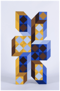
I chose this image because of its expression and processing of the color. The matching and reconciliation of its color give me a disordered sense of space. Various concave-convex forms depend on the audience’s imagination.
Step 2: Draw my image in Processing
For my work, I wanted to imitate this sense of space but explore more possibilities of colors instead of only yellow, blue and brown. Also, the creator of the image I chose only put a single color inside a shape so I wanted to add more. To achieve this, I used the Simple Linear Gradient example for reference.

I first copied and pasted the function for drawing the linear gradient. It creates a function called setGradient to set the drawing method.
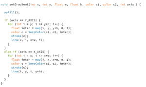
Then I implant the parameter that I wanted.

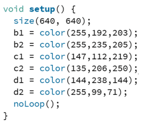
After that, I put the size and color I wanted in the setup.
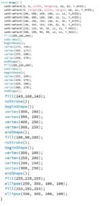
Finally, I used the setGradient function to draw the background and four rectangles. For the diamonds and echelons, I used beginShape() and endShape(). It was a little bit troublesome to write a lot of vertex().
Step 3: Evaluation
Because of the time limit, I only drew one piece in processing but it started to have a little sense of space like the image I chose. Though the forms are simple, they are definitely more colorful. I do think drawing in processing was a good means of realizing my design, but not the best. On one hand, I could better control the exact locations and colors for different forms. On the other hand, I felt that I was limited by those numbers and functions and could not give full play to my imagination. Because I was drawing in a computer program, everything seemed so digital that I could not draw in a more optional way. What I drew in processing looks “standard”, but not “natural”.