CONTEXT AND SIGNIFICANCE
Back to the Group Project, we focused on the change of input. Instead of emphasizing the use of our body, we wanted to trace back to the source, which is our brain. However, the output was not much obvious because daily life activities are so normal that you get used to it and will not have a strong perception. So this time, my thought was to focus on the output, making it more clear to give the user stronger feedback. At the same time, I upheld the idea of breaking the conventional image of an input. I wanted to use an implicit signal from our body that you can not see directly and my goal is to make this implicit signal be seen in an indirect but interesting and meaningful way. My definition of interaction is: a responsive process includes two or more subjects to get input, digest and produce output. After half a semester understanding the meaning of interaction through various projects, I start to have my evaluation of an ideal interactive product. I think it is more important to focus on “responsive”, “input” and “output”. Users will more value these three elements when they are using an interactive device. The significance of my project is the enhancement of these three elements as I mentioned before, breaking the conventional image of input and making the output more clear to show the responsiveness. My project is designed as a heart rate game but means more than a game. In our daily life, the regular medical examination is sometimes boring, especially for children. My project is of its special value because it provides a possibility of adding more fun to the medical examination. It would be much better if the heart rate examination can be a funny game.
CONCEPTION AND DESIGN
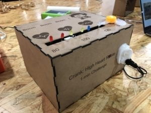
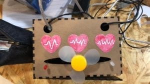
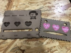
To help the user better understand how to use our project, my partner and I designed a couple of user-friendly components. We laser cut our project name in the front in order to tell the user that this device is related to your heart rate and somehow we need your high heart rate. On the top, there are words “Boom! Boom! Boom!” with a picture of a person covering his chest to emphasize the connection with heart rate. Below the words and picture, we put three patterns of heart with gradually intensified heart rate. Corresponding to this are a motor and LEDs, below which is also a gradually intensified number of the heart rate. All these hints are designed to tell the user that if his heart rate rises, LEDs will light from the left to the right and finally the motor will rotate. Also, we designed the ear stuck in the front with the heart rate sensor clipping on the earlobe to show the user that he needs to clip the heart rate sensor on his earlobe in order to detect his heart rate. We chose the cardboard to laser cut because it is easier and quicker. We once thought about using plastic or glass to be the external packaging. However, the most important reason why we gave up was that we did not want to show the messy inside of the box.
FABRICATION AND PRODUCTION:
The biggest challenge we faced is the heart rate sensor. It is really a tricky sensor. In the beginning, no matter what we changed in the code we just could not keep it working after the motor was active. However, Eric helped us found the problem that the heart rate sensor would somehow recognize the rotation of the motor as the user’s heartbeat. To solve this problem, we had to make it stop detecting once the motor was rotating. So we changed the original plan of using couples of the motor to use LEDs instead and put the only motor in the end. By coincidence, LEDs are actually better because they can bring stronger visual impact to the user, or we can say stronger feedback. Expect the heart rate sensor, other parts of building circuit and coding were quite smooth. We successfully fixed the code we copied online into our own code and make the whole device work well.
User testing gave me so many ideas for improvement.
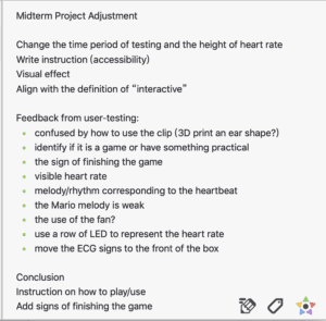
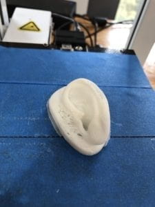
The biggest problem we found in user testing is that most people did not know where to put the heart rate sensor. One student mentioned that we can use 3D-printer to make an ear model for a visual explanation. We took that advice, put it into practice in the second version, and found that it became much more effective. With an ear model stuck in the front, later users have come to know where to put the heart rate sensor without our words explanation.
The second problem was that the feedback of increasing heart rate was not strong enough. There were only three outputs and we mistakenly put the motor in the middle so that most users did not know what they should do to interact with this project without our explanation. One faculty advised me to use a row of LEDs from the left to the right to make the rise of heart rate more visible. We also took that advice and the result has proved that the advice is effective. Later users understood what they were supposed to do with our project.
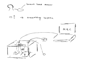
The basic evaluation for me to account for and justify the various production choices I made for my project was to see whether the choice was suitable for it as a complete device but not only a project in the college. For example, we chose to put the main body of our project inside a box because every commercial product in the market are well packed but not directly showed what’s inside.
CONCLUSIONS
Our goal was to design a game that if your heart beat increase, a couple of things will happen, including the light of LEDs, the rotation of the motor, and the song playing by the buzzer. I do think our project results align with my definition of interaction. Two subjects, the user and the device, were contained in a responsive process that includes getting input, digesting and producing output. My audience produces output, which is his heart rate, and offers it to the device as the input. The device digests it and gives feedback like the light of LEDs to be the output of the device and the input of the audience. Then the audience digests this feedback and has his own emotions and thoughts. This is how my audience interacts with my project.
The Ultimate User Test
If I had more time, I will improve my project by adding a display such as LCD to show the user of their heart rate in real time. Also, I will limit the time of the game to 1 minute to make it harder and more like a game. What I have learned from failures is that I need to be more careful to find the problem and if I really can not fix it, I should call others to help. What I take away from my accomplishment is that first, the accessibility of a product is important. I know how my project works because I create it, but others don’t. Sometimes we need to stand on the side of the user to think whether my design is user-friendly to them or not. Second, cooperation with my partner is important because sharing out the work will notably increase our efficiency. Third, there are multiple ways to present data. Here we use LEDs and motor to show a user’s heartbeat. This is a visual way to show the data. Also, we can use a display to show the exact number and this is the digital way to show the data.
During the whole making process of the project, the most important for my learning process is that we should learn how to expand based on what we have already learned. To be frank, I had no ideas when I first started to build the circuit for my project. Instead of creating a new one and wasting a lot of time, I chose to expand the circuit that I had learned because it has the same component of my project, which is the motor.
So I first built this circuit I learned in the class.
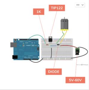
Then we started to expand both the circuit and the code. We added new components like the buzzer and the heart rate sensor, and we also updated the related code. By doing so, we finally completed our project and I do think we succeeded. For me, this strategy is both useful and meanful. I will keep using it and try to do better in the next project.