Link: http://imanas.shanghai.nyu.edu/~bc2328/commlab/audio_proj/
Our project is an audio and visual website with minimalistic styling that is used to express mixed emotions through immersing the user in audio and visual stimulation. We decided to use color and gradient in color to describe the mix and change between two different feelings while pairing it with remixes we do with sound effects and music to represent each emotion. Our website is mainly focused on allowing the user to explore the different sound and emotion pairings that are possible and to simply listen to the different pieces of audio. I think the color is a way to fully visually express the way the music pieces are suppose to make the user feel.
Screenshots:

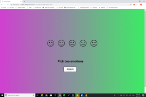
The home page that generates random gradients

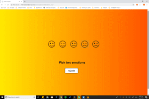
The page for the emotion Happy and Angry that creates the gradient from yellow to red
Process:
For Assets: The audio remixing for the most part was difficult to find the correct music to match the different sounds as well as being creative enough to think of the right sound effects to remix and evoke the correct pair of emotions. For the assets, me and Grace split up the different emotions and both created different remixes for each pair of emotions. I used Reaper to edit the audio while Grace used Audacity. I drew the buttons for the emotions using Adobe Illustrator.
For Coding: I coded the main buttons and home page and design through JavaScript and used the help of Google in order to figure out how to create the animated gradient background that is seen in the website. We mainly worked through Javascript and used minimal amount of HTML and CSS to create the website. Grace helped with debugging and troubleshooting the code as we tried to figure out the best user experience and way to create our website.
Problems:
I think one of the hardest things to figure out was how to create the gradient. Initially, we wanted to create a gradient waveform but had a lot of difficulty trying to incorporate the waveform code with the different audios and autoplaying. However, in the end I think that the full background gradient is actually a way to make the experience for the user even more immersive and lends to the idea of a minimalist design. I think I also struggled a lot with trying to match all the different remixes with the correct buttons and audios since there were so many options that I had to make sure that all the branches were linking to the correct audio, visual, and buttons in order to provide the correct experience and interaction. I wish I was able to create an even more complex website by allowing the user to add more than two emotions, but I had trouble adding or autoplaying two different audios simultaneously and that is why we ended up having to remix the audios separately before inputting them into the code. But, I think that the experience that we’ve created right now is also able to successfully deliver the message of using audio and visual to evoke different mixed emotions in users.
Post Mortem:
I actually really enjoy our project and think that the audio remixes are quite nice. Although some audio remixes may not fully evoke the mixed emotions as well as some of the others but I enjoy the music that we’ve made. I think that the design and visual aspect of the website seems nice and simple. It may not be complex and full of different buttons and text as other websites but I also think that this simple design is what will allow users to focus more on the audio and to hear the minuscule sound effects that we have subtlety added into the music . I do think that if I was able to troubleshoot the problem of playing different audio together at the same time that it would provide more interactivity to the website, but I do think that our project was able to focus on the music and visuals that was the main goal and key to the audio project assignment.