For my final project, me and my partner were planning to make an interactive map that would show the most recent news that is happening in the world. The main reason of the project is to increase people’s awareness and curiosity about the events that is happening in the world. For a while, we were confused about which app we should choose as the source of the news, but after careful thought, we decided to use twitter. In order for us to be able to generate the tweet and have the information stored in strings, we use APIs to help us do our job. Then, we have to figure out how the user would interact with the project. Initially, we were thinking of making it as something that you can step on, hence why our original project name was “Step into The Newsroom”. But we figure that it would be way more interesting for people to be able to interact with it by hand. I feel like it would provoke more curiosity as it resembles the interactive information board usually present in museums and exhibitions. For the map body, we were planning to laser cut it, but because the dimensions were too big, we switched to cardboard instead.
Gluing the map to the cardboard, making support for the box, and putting in buttons was way easier than making the code. The code is the most significant part of our project and the most difficult one to do. Since we had to use an API, it took me a while to figure out how everything works and how to best incorporate it into processing. I first had to make a Twitter developer account, and register my application there. Then they will give me a bunch of tokens that would grant me access to the tweets. What I notice from the API is that it would take a while for processing to get the tweet, transform it into JSON format, and then display it as a string. It was a hard process to endure, but after we figured that out everything becomes easier. In order to make the interaction more interesting, i added a twitter sound to further emphasize that we are getting real data from twitter, and also a webcam function to make it seem like they were the ones making the tweet. The project before user testing looks like this:
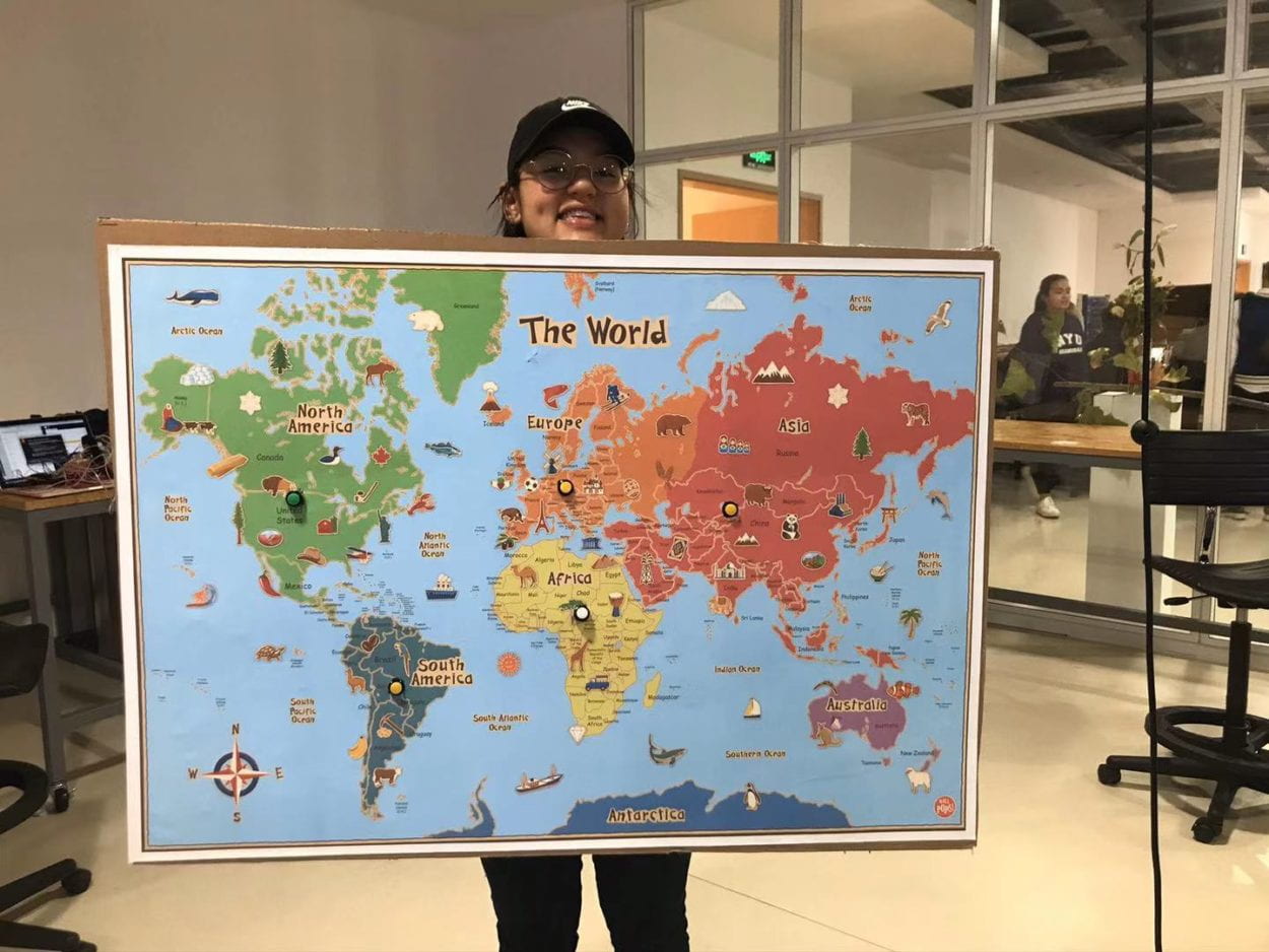
After user testing, we gained a lot of useful feedback. The most important one is that some people were saying that they did not understand the use of webcam in the display. One of them suggested that we should have a map and make the speech bubble pop up in places in accordance with the buttons that is pressed. Both I and my partner thought that was a great idea, so we incorporate it into our final project. Another thing that is also important is the fact that some user is confused whether the buttons work because the lag in the display took a while to load. So we decided to add a loading screen! The end result of our project looks like this:
In conclusion, I feel like the project was really satisfying to make and interact with. It serves its purpose as an educational tool that would help people be more interested in things that are happening in the world. The feedback from the users was really good and they felt like they had just traveled the world and become more exposed to the issues that are happening in the world. Our project definitely aligns with our definition of interaction as it incorporated all of the elements that i used to define interaction (read, think, and speak) and most importantly it attracts people to use it again and again like a cycle. It is not a one-time interaction that stops after its done, but rather something that will surprise you each time you interact with it. If i had more time, i would definitely work on the physical display of the project. It would be convenient to make it more sturdy and able to work with a considerable distance from the screen (rather than being connected with a cable to the computer). Our project had made a considerable impact to people because what they’re feeling after using our project clearly solves the issue that we raised before.