Week 5 -Wireframe+Mockup+User testing – Milly & Daisy

For this week, we keep working on improving the wireframe, mock-up and carrying out the user testing.

We test the first version of the wireframe at class. Feedback including:

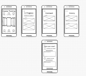
  1. A little bit confusing about the course tracking page. What does the picture placeholders stand for? It might be better to put the “history” and “in progress” in different places since they have different meanings and priority to the users.
  2. Confused about the search page – what does the information stand for?
  3. Back button issue (often run into situations when don’t know how to cancel or go back)
  4. Too many choices may distract the new comers.

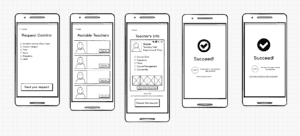
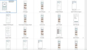
Wireframe V.1.0

For the second version, we added the navigation bar on the bottom of the screen as well as putting more pictures and details on the pages to make it more understandable. Referring to several APPs, we also changed the course tracking page to the “my account” page.

Feedback for v.2:

  1. The navigation bar has too many features and it may confuse or mislead the user. Besides, it shows on some pages while doesn’t show on other pages, which makes it troublesome to go back or cancel.
  2. The user is not sure about the function of different icons on the navigation bar. Some users are also distracted by different pages like the available teacher and the request page.
  3. The request function as the core part of our app is not emphasized in this wireframe and the connection between the “plus” sign and the request function is not very clear
  4. The instruction for new users should be more user friendly. Instead of using words, it’s better to use image illustration.


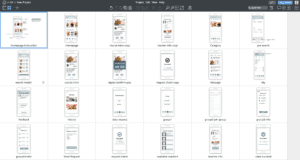
Screenshots of v2.0

Improvement on v.2:

  1. New navigation bar – delete “category”, “plus” and add “my course”
  2. Put research page on the top(homepage), refine the searching function into two main categories
  3. Refine the request process – a new confirmation page with previous request information, new request successfully page with info of people with similar request
  4. Rearrange course tracking – highlight the course in progress and show the course history in a folded way

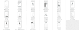
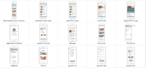
Screenshots for v3.0 (editted after user testing)

Feedback for v.3:

  1. Keep working on highlighting the core features of the app – quick request, location advantage. For example, putting the “nearby workshop” before the “popular topic”.
  2. The users want to get more straightforward feedback when making the decision.
  3. Layout of the homepage – using more images to attract the users and put the search part in a mask layer (folded when enter the page, pop up when clicked)

According to the feedback above, we mainly redesigned the homepage and the course request function to emphasize our app’s special feature. This flow has been designed more logical and clear to follow. We added the search and request functions to the initial part of the homepage with a folded button. Following is the recommended workshops nearby and popular topics of courses. In this way, we would both satisfy the users with the strong will and clear mind as well as those not having a clear idea about what to do. As for the search and request part, we select the necessary info requirement to ask our users to choose, after that, they would be led to a general result page where they could sort the results according to the filter they value the most. Besides, the brief intro of each result would contain the name, price, distance and time. What’s needed to be noticed is that after the  request confirmed successfully, users could not only check the progress under “MY COURSES”, but also could see it on the homepage, where would appear a instant message to remind the users.

Theme Color,Name & Logo Design

Since the wireframe part, we’ve decided the general range of color theme. Purple or Cyan. The reason why we choose these two color as potential choice is according to the main target of our app: the young people. Thus, we would like to leave the users with a energetic and young impression. Besides, these two colors also relax and clear people’s mind, through which they could settle to learn something new.

App Name: Courcal

This name comes from two words: course + local, which means the easy-approaching local courses

Slogan: Customize your class easily!

LOGO: Giant letter C overlapped with a cat shape.

Week 5 -Wireframe+Mockup+User testing -Daisy & Milly

For this week, we keep working on improving the wireframe, mock up and carrying out the user testing.

We test the first version of the wireframe at class. Feedback including:

  1. A little bit confusing about the course tracking page. What does the picture placeholders stand for? It might be better to put the “history” and “in progress” in different places since they have different meanings and priority to the users.
  2. Confused about the search page – what does the information stand for?
  3. Back button issue (often run into situations when don’t know how to cancel or go back)
  4. Too many choices may distract the new comers.

Wireframe V.1.0

For the second version, we added the navigation bar on the bottom of the screen as well as putting more pictures and details on the pages to make it more understandable. Referring to several APPs, we also changed the course tracking page to the “my account” page.

Feedback for v.2:

  1. The navigation bar has too many features and it may confuse or mislead the user. Besides, it shows on some pages while doesn’t show on other pages, which makes it troublesome to go back or cancel.
  2. The user is not sure about the function of different icons on the navigation bar. Some users are also distracted by different pages like the available teacher and the request page.
  3. The request function as the core part of our app is not emphasized in this wireframe and the connection between the “plus” sign and the request function is not very clear
  4. The instruction for new users should be more user friendly. Instead of using words, it’s better to use image illustration.


Screenshots of v2.0

Improvement on v.2:

  1. New navigation bar – delete “category”, “plus” and add “my course”
  2. Put research page on the top(homepage), refine the searching function into two main categories
  3. Refine the request process – a new confirmation page with previous request information, new request successfully page with info of people with similar request
  4. Rearrange course tracking – highlight the course in progress and show the course history in a folded way

Screenshots for v3.0 (editted after user testing)

Feedback for v.3:

  1. Keep working on highlighting the core features of the app – quick request, location advantage. For example, putting the “nearby workshop” before the “popular topic”.
  2. The users want to get more straightforward feedback when making the decision.
  3. Layout of the homepage – using more images to attract the users and put the search part in a mask layer (folded when enter the page, pop up when clicked)

According to the feedback above, we mainly redesigned the homepage and the course request function to emphasize our app’s special feature. This flow has been designed more logical and clear to follow. We added the search and request functions to the initial part of the homepage with a folded button. Following is the recommended workshops nearby and popular topics of courses. In this way, we would both satisfy the users with the strong will and clear mind as well as those not having a clear idea about what to do. As for the search and request part, we select the necessary info requirement to ask our users to choose, after that, they would be led to a general result page where they could sort the results according to the filter they value the most. Besides, the brief intro of each result would contain the name, price, distance and time. What’s needed to be noticed is that after the  request confirmed successfully, users could not only check the progress under “MY COURSES”, but also could see it on the homepage, where would appear a instant message to remind the users.

Theme Color,Name & Logo Design

Since the wireframe part, we’ve decided the general range of color theme. Purple or Cyan. The reason why we choose these two color as potential choice is according to the main target of our app: the young people. Thus, we would like to leave the users with a energetic and young impression. Besides, these two colors also relax and clear people’s mind, through which they could settle to learn something new.

App Name: Courcal

This name comes from two words: course + local, which means the easy-approaching local courses

Slogan: Customize your class easily!

LOGO: Giant letter C overlapped with a cat shape.