Partner: Daisy Chen
This week, Daisy and I updated our persona, improved the user-flow chart and drew the wireframe of our APP.
Persona
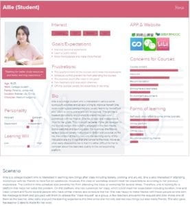
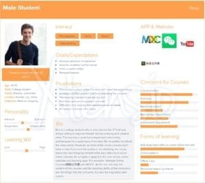
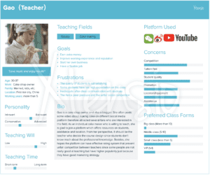
This week we add the “scenario” part to the two personas we made last week. Besides, we made two more personas to further distinguish and position our target users. Last week we made one persona for the teachers and students(female) respectively. This week we made the persona of the male students and another type of teachers with a different personality and teaching fields.
Here are the personas we have so far:
Students:
Teachers :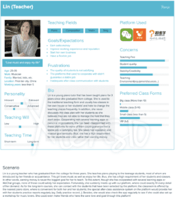
User Flow+Wireframe
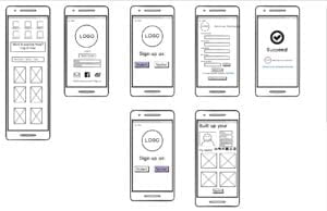
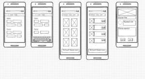
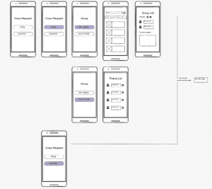
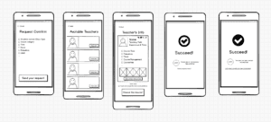
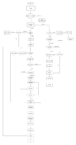
Using the draw.io, we drafted the basic user flow of our APP and developed the wireframe based on some key functions. And we mainly emphasized the division of teachers and students group at the beginning of logging in. After that, we grew up two user stream, which contains different working process and focuses. For example, as for students, the basic step is to narrow down the users’ demands by sorting the courses by their interested areas. Then, it’s the form of the class: personal or group class. Finally, it comes to the requesting page. This procedure follows the common logic and values of the student users when they are looking for a class, which we’ve got from our users’ survey. As for teachers, the logic is sort of different. As the biggest concern of our potential users is the quality of the teachers on this platform. Thus, we put the portfolio and certificate verification at the first step of signing up a teacher’s account. This step might take several days as a working period to ensure if the material offered by the teachers are veritable. After this step, besides the class offering part, the rest of the teachers’ flow just intersect with the students’ flow: the class requesting & accepting the part. In addition to the service in the beginning part of the teaching, we also take assistance during the learning process into our consideration. This problem has initially mentioned by one of our teacher interviewees. We trying to engage our platform into the learning process of the classes, which take the role of after-class assistance to support these teachers. In other words, this model is referring some existing educational apps in the market, which helps the teachers send the homework, reminder; and upload a series of samples, exercises or even play as personal learning assistance. This inspiration comes from the interviewee who is teaching baking. She suggests somehow an assistant help in the class. Thus, we are planning a (voluntary) learning assistant system who keep working with the class to help online or offline depending on the class’s type. This role could answer the problems related to the class content after-class in case that the instructor is too busy to do so.
Here’s the user flow:
For this stage and the further development of the UX design of our app, we want to focus more on the student side. Therefore when designing the wireframe we mainly draw out the pages of students port. We try to make this page as clear and brief as possible. Thus, only necessary words and icons would be included in the pages, and there would a responding page to ensure your activity after making each action of requesting a course. But still, this wireframe definitely still need to be improved and we would continue working on it in the following weeks.
Here are the wireframes:
Registration
