UX Final Presentation & Portfolio – Milly Cai

Project: Courcal刻课 – Customize your courses!

Partner: Qianyi Chen (Daisy)

Professor: Azure Qian 

Presentation slides:

https://drive.google.com/file/d/1d_YgTSdkLn0_jliPPbdLuk2nZwJ0CLz1/view?usp=sharing

Poster
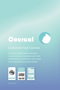
Inspiration & Introduction

As a college student, my partner Daisy and I do have a great interest to learn something new as well as have fun with our friends in our spare time. Besides, according to my previous experience of online and offline courses or activities, most of them are far from satisfying due to all kinds of problems, for example, long distance and poor transportation,  hard to contact with a proper tutor… Thus, with the inspiration of the popular business model like Eleme and Didi, which focus on the useful resources in the neighborhood and also apply the individual customized service, we think up and idea to also provide educational activities based on the local neighborhood resources.

This is how Courcal comes: course + local, which means the course in our neighborhood. The core idea is to provide a platform for teachers and students to customize offline classes in the nearby neighborhood easily. It doesn’t need to too professional, instead, it would be more like an educational community. Besides, on this platform, a special connection between teachers, students and source providers (including classroom providers) has been constructed. The educational resource is efficiently utilized in this way.

Development

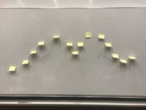
Original Mind Storm Map:

In this original mind map, we initially settled down two basic service routes for our app: the teacher portal and the students portal, which means this app would be divided into two versions to offer corresponding services to each group of users. In addition, we also generally set the two main functions that we would like to emphasize in this app: which the course search and course request. As for course request function, we design it for the students who cannot find a course that fits his own demands; or would like to form a new class with his friends. These students could customize their course requirement and join or create a group to send the request to the available teachers; after teachers accept, they could select the one they want and start their own class. Apart from this, we also would like to provide course tracking and quick message notice functions in this app to add more convenience to it.

Story Arc & Story Board:

As for our app, we assume our user would mainly be two groups: students(class-takers), teachers(class-offers). Therefore, our story arc is a story happens from two sides at the same time but end up at the same place “happy ending”.
Students:

Students A, B, C want to learn drawing. They are troubling thinking about how to get a pleasing course. After searching online with their demands, no results fit them. Suddenly, they find the app Courcal! It helps them to customize their class! After typing in their needs, it soon shows that he has similar demands with B and C. Soon they form up a new group and the platform also recommends the teachers who fit their requirements. Finally, they send the request and select a teacher to set up a class happily.

Teacher:

Young painter Mr. Hat just graduated from the college wants to teach painting. However, he gets annoyed by the boss’s requirements of the cultivation institution. He wants to find his students but has no idea where to start as he is new to the market. Suddenly, he finds Courcal saying to start your class here! He types in his personal information as well as his portfolio. Then starts to offer his class on the app. The platform soon shows him the requests from the students that fit his demands. He then starts up his class happily.

User Research  

Due to the time limitation and the features of our potential users, we mainly focus on the student side while designing the general survey. Survey questions mainly follow two categories: personal information, which focuses on investigating our users’ social conditions and figuring out our target users group; learning experience, which is to find out the users’ pain point and also avoiding the shortcomings in the existing applications in the market.
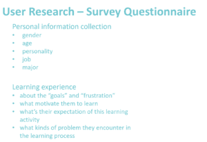
By the time we summarized the results and forms, we have got 97 effective answers in total,in which 43.2% are younger than 20, 25.3% are 20-25, 17.9% are older than 35, 11.6% are 30-35. What’s more, students take up 66.3% in the group. According to this distribution, we could initially assume that the biggest user group still lies in the students, who earn the most interest in exploring new stuff. Besides, another result we could indicate is that there’s a big population of people who have a strong will to learn new knowledge.
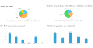
 

By the survey results, we could figure out many problems that the users encounter with the current learning apps or courses they have. A lot of people still prefer offline courses, especially workshops for interest learning. Besides, distance and quality are the main concerns that users have for the courses. The quality evaluation should also be taken into consideration in our app.

User Interview

We take either individual interview or group interview in this session. Surprisingly, all interviewees take a lot of thoughts in our app. As a result, we eventually come out half to one-hour deep talk with 3 potential teacher-users, one resource provider and several students. Students‘ answers are mostly positive and their concerns are similar to the results we have got from the survey. Thus, we would like to specifically analyze the interviews we have with other user groups.

Teacher users:

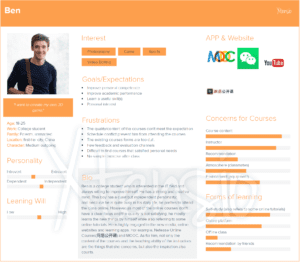
Basically, the interviewee takes two different attitudes into this app: one is positive, while the other group is negative. For example, the piano teacher Ms. Li is worried about the credibility of the platform. Besides, the biggest concern for her is the place to teach. Because big instruments like the piano are not possible to carry with, and she doesn’t want to change the location for teaching too frequently. Teachers like her usually earn 3-5 years of teaching experience and have a stable source for students to teach, and they also have some other pursue in their own career (like music) in addition to teaching. Thus, earning money is not the most important point they care about, but also stable cooperation and extra reputation they could get from the platform.

Another special example we have for teacher users is the typical group coming from social media: the online celebrity own a large number of subscription. Ms. Li is a popular baker on social media such as Weibo, youtube, and Bilibili, she has a big fan club, which is also her student source. She introduced the community she has and also the way they run their teaching business. Though she is really interested and supportive of the platform such as our app Courcal, she also worried about both the teacher and student evaluation system of it. As for her, teaching is an important way to improve build up her reputation and bad learning results from the students will damage her online popularity. In addition, she also requires the assistant for the big classes (over 5 students). This inspires us to add the assistance system for our app, which could be a voluntary or paid system that encourages people who have some experience with the topic to support the course.

Resource providers:

The interviewee we have for this group is the owner of a coffee shop. Surprisingly, he is welcoming to such cooperation relationship with our platform. On the one hand, he would like to advertise his own business, on the other hand, he would also like to improve the business model of the traditional coffee shop. Besides, we also learned that many companies would also book a room in his shop to set up a learning corner or other activities. The only concern he has is the credibility and long term fee distribution.

Persona & Scenario

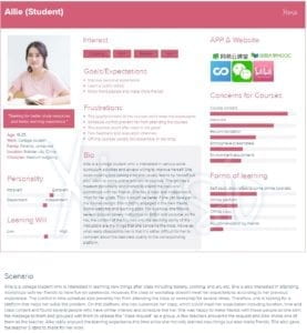
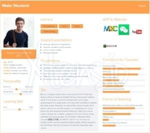
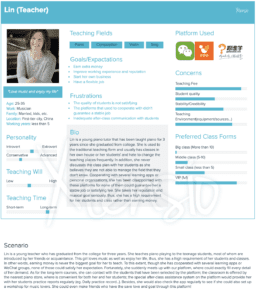
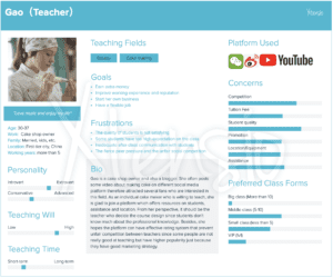
Based on the user research and interviews we have made, we design the following personas, two for students——female and male; two for teachers——negative and positive.

Female student:

Male student: 
Negative teacher:  

Positive teacher:   

Competitor Analysis

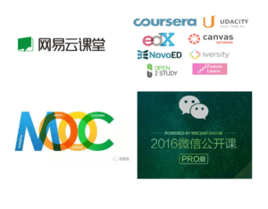
As learning apps have been a heated topic in recent years, we did a research about the competitor apps. Here are the results we have.
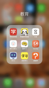
Learning apps:

  • Mostly focus on online courses
  • Professional knowledge
  • High pre-learn standard

Teacher requesting/off-line courses apps:

  • 1v1 courses
  • Simple teaching field/connection
  • Mostly based on a physical educational institution

From the research, we find that though all focusing on the education field, our app has a special perspective that connects three parts-students, teachers and students together, besides, we are not limited to one specific teaching area or class forms. Flexibility and neighborhood learning community makes our app unique from others.

User Flow

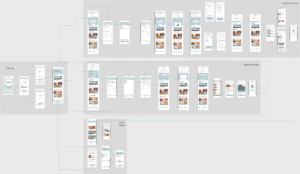
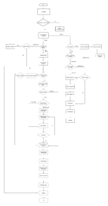
Using the draw.io, we drafted the basic user flow of our APP and developed the wireframe based on some key functions. We mainly emphasized the division of teachers and students group at the beginning of logging in. After that, we grew up two user stream, which contains different working process and focuses. For example, as for students, the basic step is to narrow down the users’ demands by sorting the courses by their interested areas. Then, it’s the form of the class: personal or group class. Finally, it comes to the requesting page. This procedure follows the common logic and values of the student users when they are looking for a class, which we’ve got from our users’ survey.  

As for teachers, the logic is different. As the biggest concern of our potential users is the quality of the teachers on this platform. Thus, we put the portfolio and certificate verification at the first step of signing up a teacher’s account. This step might take several days as a working period to ensure if the material offered by the teachers are veritable. After this step, besides the class offering part, the rest of the teachers’ flow just intersect with the students’ flow: the class requesting & accepting the part. In addition to the service in the beginning part of the teaching, we also take assistance during the learning process into our consideration. This problem has initially mentioned by one of our teacher interviewees. We trying to engage our platform into the learning process of the classes, which take the role of after-class assistance to support these teachers. In other words, this model is referring some existing educational apps in the market, which helps the teachers send the homework, reminder;  and upload a series of samples, exercises or even play as personal learning assistance. 

Wireframe


Wireframe v1.0

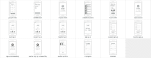
Screenshots for Wireframe 2.0

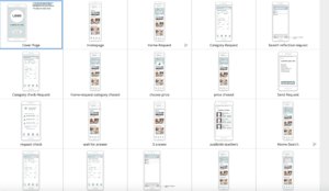
Screenshot for v.3.0
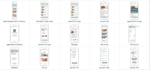
Final version sum-up

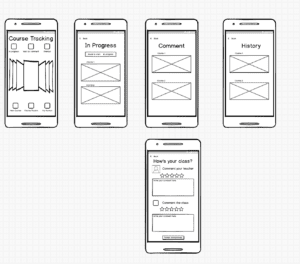
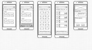
For the wireframe, we developed three versions based on the feedback of usability testing. The first version developed based on several keep functions including sign up/log in, class request, class searching, and my account page.

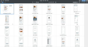
For the second version, we added the navigation bar on the bottom of the screen as well as putting more pictures and details on the pages to make it more understandable. Also, we changed the course tracking page to the “my account” page.

For the third version, we add a new navigation bar which deletes “category”, “plus” and add “my course”. We put research page on the top(homepage), refine the searching function into two main categories. The request process is also refined by adding a new confirmation page with previous request information and new request successfully page with info of people with similar request.

Branding & Moodboard

Researches show that people tend to be more calm and patient when looking at the cold tone color. So we choose this color as our primary color.

For the logo, we used a cat sign which is considered as a smart and independent creature and the shape is also similar to a text bubble.

The APP name is “Courcal” which is a combination of course+local, illustrating our core idea which is to make it easier for people to form a customized class in the nearest neighborhood. The Chinese name, 刻课, has a similar pronunciation with the English name and it means “whenever you want to attend a class, you can find one”.

Logo
logo sketch1
logo sketch2

UI/Mockup


Link to the mockup screen recording

Link to the prototype on marvel

IMPROVEMENTS

In terms of App function, the teacher’s version can be developed and improved in the future. The group request and study group functions are also part of the main functions of this App.

In terms of the business model, the partnership established with the resource provider will be one part of our margin and the advertisement fees will also add to the profit. As a third-party platform, we’re not going to charge too much from teachers and students but there is still a high potential to make profits from that.

Previous documentation:

Week 2- UX project idea &story board -Milly Cai

Week 3 – User Research – Milly & Daisy

Week 4: UX-Updated Persona & User Flow & Wireframe-Milly Cai

Week 5 -Wireframe+Mockup+User testing – Milly & Daisy

Week 5 -Wireframe+Mockup+User testing – Milly & Daisy

For this week, we keep working on improving the wireframe, mock-up and carrying out the user testing.

We test the first version of the wireframe at class. Feedback including:

  1. A little bit confusing about the course tracking page. What does the picture placeholders stand for? It might be better to put the “history” and “in progress” in different places since they have different meanings and priority to the users.
  2. Confused about the search page – what does the information stand for?
  3. Back button issue (often run into situations when don’t know how to cancel or go back)
  4. Too many choices may distract the new comers.

Wireframe V.1.0

For the second version, we added the navigation bar on the bottom of the screen as well as putting more pictures and details on the pages to make it more understandable. Referring to several APPs, we also changed the course tracking page to the “my account” page.

Feedback for v.2:

  1. The navigation bar has too many features and it may confuse or mislead the user. Besides, it shows on some pages while doesn’t show on other pages, which makes it troublesome to go back or cancel.
  2. The user is not sure about the function of different icons on the navigation bar. Some users are also distracted by different pages like the available teacher and the request page.
  3. The request function as the core part of our app is not emphasized in this wireframe and the connection between the “plus” sign and the request function is not very clear
  4. The instruction for new users should be more user friendly. Instead of using words, it’s better to use image illustration.


Screenshots of v2.0

Improvement on v.2:

  1. New navigation bar – delete “category”, “plus” and add “my course”
  2. Put research page on the top(homepage), refine the searching function into two main categories
  3. Refine the request process – a new confirmation page with previous request information, new request successfully page with info of people with similar request
  4. Rearrange course tracking – highlight the course in progress and show the course history in a folded way

Screenshots for v3.0 (editted after user testing)

Feedback for v.3:

  1. Keep working on highlighting the core features of the app – quick request, location advantage. For example, putting the “nearby workshop” before the “popular topic”.
  2. The users want to get more straightforward feedback when making the decision.
  3. Layout of the homepage – using more images to attract the users and put the search part in a mask layer (folded when enter the page, pop up when clicked)

According to the feedback above, we mainly redesigned the homepage and the course request function to emphasize our app’s special feature. This flow has been designed more logical and clear to follow. We added the search and request functions to the initial part of the homepage with a folded button. Following is the recommended workshops nearby and popular topics of courses. In this way, we would both satisfy the users with the strong will and clear mind as well as those not having a clear idea about what to do. As for the search and request part, we select the necessary info requirement to ask our users to choose, after that, they would be led to a general result page where they could sort the results according to the filter they value the most. Besides, the brief intro of each result would contain the name, price, distance and time. What’s needed to be noticed is that after the  request confirmed successfully, users could not only check the progress under “MY COURSES”, but also could see it on the homepage, where would appear a instant message to remind the users.

Theme Color,Name & Logo Design

Since the wireframe part, we’ve decided the general range of color theme. Purple or Cyan. The reason why we choose these two color as potential choice is according to the main target of our app: the young people. Thus, we would like to leave the users with a energetic and young impression. Besides, these two colors also relax and clear people’s mind, through which they could settle to learn something new.

App Name: Courcal

This name comes from two words: course + local, which means the easy-approaching local courses

Slogan: Customize your class easily!

LOGO: Giant letter C overlapped with a cat shape.

Week 5 -Wireframe+Mockup+User testing -Daisy & Milly

For this week, we keep working on improving the wireframe, mock up and carrying out the user testing.

We test the first version of the wireframe at class. Feedback including:

  1. A little bit confusing about the course tracking page. What does the picture placeholders stand for? It might be better to put the “history” and “in progress” in different places since they have different meanings and priority to the users.
  2. Confused about the search page – what does the information stand for?
  3. Back button issue (often run into situations when don’t know how to cancel or go back)
  4. Too many choices may distract the new comers.

Wireframe V.1.0

For the second version, we added the navigation bar on the bottom of the screen as well as putting more pictures and details on the pages to make it more understandable. Referring to several APPs, we also changed the course tracking page to the “my account” page.

Feedback for v.2:

  1. The navigation bar has too many features and it may confuse or mislead the user. Besides, it shows on some pages while doesn’t show on other pages, which makes it troublesome to go back or cancel.
  2. The user is not sure about the function of different icons on the navigation bar. Some users are also distracted by different pages like the available teacher and the request page.
  3. The request function as the core part of our app is not emphasized in this wireframe and the connection between the “plus” sign and the request function is not very clear
  4. The instruction for new users should be more user friendly. Instead of using words, it’s better to use image illustration.


Screenshots of v2.0

Improvement on v.2:

  1. New navigation bar – delete “category”, “plus” and add “my course”
  2. Put research page on the top(homepage), refine the searching function into two main categories
  3. Refine the request process – a new confirmation page with previous request information, new request successfully page with info of people with similar request
  4. Rearrange course tracking – highlight the course in progress and show the course history in a folded way

Screenshots for v3.0 (editted after user testing)

Feedback for v.3:

  1. Keep working on highlighting the core features of the app – quick request, location advantage. For example, putting the “nearby workshop” before the “popular topic”.
  2. The users want to get more straightforward feedback when making the decision.
  3. Layout of the homepage – using more images to attract the users and put the search part in a mask layer (folded when enter the page, pop up when clicked)

According to the feedback above, we mainly redesigned the homepage and the course request function to emphasize our app’s special feature. This flow has been designed more logical and clear to follow. We added the search and request functions to the initial part of the homepage with a folded button. Following is the recommended workshops nearby and popular topics of courses. In this way, we would both satisfy the users with the strong will and clear mind as well as those not having a clear idea about what to do. As for the search and request part, we select the necessary info requirement to ask our users to choose, after that, they would be led to a general result page where they could sort the results according to the filter they value the most. Besides, the brief intro of each result would contain the name, price, distance and time. What’s needed to be noticed is that after the  request confirmed successfully, users could not only check the progress under “MY COURSES”, but also could see it on the homepage, where would appear a instant message to remind the users.

Theme Color,Name & Logo Design

Since the wireframe part, we’ve decided the general range of color theme. Purple or Cyan. The reason why we choose these two color as potential choice is according to the main target of our app: the young people. Thus, we would like to leave the users with a energetic and young impression. Besides, these two colors also relax and clear people’s mind, through which they could settle to learn something new.

App Name: Courcal

This name comes from two words: course + local, which means the easy-approaching local courses

Slogan: Customize your class easily!

LOGO: Giant letter C overlapped with a cat shape.

Week 4: UX-Updated Persona & User Flow & Wireframe-Qianyi Chen

Partner: Milly Cai

This week, Daisy and I updated our persona, improved the user-flow chart and drew the wireframe of our APP.

PERSONA

This week we add the “scenario” part to the two personas we made last week. Besides, we made two more personas to further distinguish and position our target users. Last week we made one persona for the teachers and students(female) respectively. This week we made the persona of the male students and another type of teachers with a different personality and teaching fields.

Here are the personas we have so far:

Students:


Teachers : 

USER FLOW+WIREFRAME

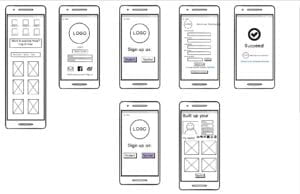
Using the draw.io, we drafted the basic user flow of our APP and developed the wireframe based on some key functions. And we mainly emphasized the division of teachers and students group at the beginning of logging in. After that, we grew up two user stream, which contains different working process and focuses. For example, as for students, the basic step is to narrow down the users’ demands by sorting the courses by their interested areas. Then, it’s the form of the class: personal or group class. Finally, it comes to the requesting page. This procedure follows the common logic and values of the student users when they are looking for a class, which we’ve got from our users’ survey.  As for teachers, the logic is sort of different. As the biggest concern of our potential users is the quality of the teachers on this platform. Thus, we put the portfolio and certificate verification at the first step of signing up a teacher’s account. This step might take several days as a working period to ensure if the material offered by the teachers are veritable. After this step, besides the class offering part, the rest of the teachers’ flow just intersect with the students’ flow: the class requesting & accepting the part. In addition to the service in the beginning part of the teaching, we also take assistance during the learning process into our consideration. This problem has initially mentioned by one of our teacher interviewees. We trying to engage our platform into the learning process of the classes, which take the role of after-class assistance to support these teachers. In other words, this model is referring some existing educational apps in the market, which helps the teachers send the homework, reminder;  and upload a series of samples, exercises or even play as personal learning assistance. This inspiration comes from the interviewee who is teaching baking. She suggests somehow an assistant help in the class. Thus, we are planning a (voluntary) learning assistant system who keep working with the class to help online or offline depending on the class’s type. This role could answer the problems related to the class content after-class in case that the instructor is too busy to do so.

Here’s the user flow:

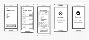
For this stage and the further development of the UX design of our app, we want to focus more on the student side. Therefore when designing the wireframe we mainly draw out the pages of students port. We try to make this page as clear and brief as possible. Thus, only necessary words and icons would be included in the pages, and there would a responding page to ensure your activity after making each action of requesting a course. But still, this wireframe definitely still need to be improved and we would continue working on it in the following weeks.

Here are the wireframes:

Registration

Course Tracking (in progress, comment, history) 

New Course (Find the existing class) 

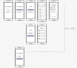
Class Request (Personal & Group): 

Request Comfirm: 

Week 4 – UX-Updated Persona & User Flow & Wireframe-Milly Cai
Partner: Daisy Chen

This week, Daisy and I updated our persona, improved the user-flow chart and drew the wireframe of our APP.

Persona

This week we add the “scenario” part to the two personas we made last week. Besides, we made two more personas to further distinguish and position our target users. Last week we made one persona for the teachers and students(female) respectively. This week we made the persona of the male students and another type of teachers with a different personality and teaching fields.

Here are the personas we have so far:

Students:


Teachers : 

User Flow+Wireframe

Using the draw.io, we drafted the basic user flow of our APP and developed the wireframe based on some key functions. And we mainly emphasized the division of teachers and students group at the beginning of logging in. After that, we grew up two user stream, which contains different working process and focuses. For example, as for students, the basic step is to narrow down the users’ demands by sorting the courses by their interested areas. Then, it’s the form of the class: personal or group class. Finally, it comes to the requesting page. This procedure follows the common logic and values of the student users when they are looking for a class, which we’ve got from our users’ survey.  As for teachers, the logic is sort of different. As the biggest concern of our potential users is the quality of the teachers on this platform. Thus, we put the portfolio and certificate verification at the first step of signing up a teacher’s account. This step might take several days as a working period to ensure if the material offered by the teachers are veritable. After this step, besides the class offering part, the rest of the teachers’ flow just intersect with the students’ flow: the class requesting & accepting the part. In addition to the service in the beginning part of the teaching, we also take assistance during the learning process into our consideration. This problem has initially mentioned by one of our teacher interviewees. We trying to engage our platform into the learning process of the classes, which take the role of after-class assistance to support these teachers. In other words, this model is referring some existing educational apps in the market, which helps the teachers send the homework, reminder;  and upload a series of samples, exercises or even play as personal learning assistance. This inspiration comes from the interviewee who is teaching baking. She suggests somehow an assistant help in the class. Thus, we are planning a (voluntary) learning assistant system who keep working with the class to help online or offline depending on the class’s type. This role could answer the problems related to the class content after-class in case that the instructor is too busy to do so.

Here’s the user flow:

For this stage and the further development of the UX design of our app, we want to focus more on the student side. Therefore when designing the wireframe we mainly draw out the pages of students port. We try to make this page as clear and brief as possible. Thus, only necessary words and icons would be included in the pages, and there would a responding page to ensure your activity after making each action of requesting a course. But still, this wireframe definitely still need to be improved and we would continue working on it in the following weeks.

Here are the wireframes:

Registration

Course Tracking (in progress, comment, history) 

New Course (Find the existing class) 

Class Request (Personal & Group): 

Request Comfirm: