Week 3 – User Research – Milly & Daisy

SURVEY/QUESTIONNAIRE/INTERVIEW OUTLINE DESIGN/RESULT

The purpose of this survey is to help us get a big image of our potential users. We want to figure out who might be interested in this kind of learning platform and what’s the touchpoint of these users. Milly and I worked together on discussing the questions of the survey, reaching out to

Interviewers and inviting people to take the survey.

QUESTIONNAIRE/INTERVIEW DESIGN

Personal information collection

To study how the personal experience might infect the learning experience, we collect information about gender, age, personality, job and major.

Learning experience

In this part, we aim to know more about the “goals” and “frustration” (two parts of the persona template) of our users. Therefore, we design questions to know more about what motivates them to learn, what’s their expectation of this learning activity and what kinds of the problem they encounter in the learning process so that we can take all of these concerns into account when designing the product.

The interview aims to collect qualitative data, so we choose people who are students, teachers and site providers in order to know more about their concerns and what might attract them to use this app.

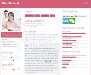
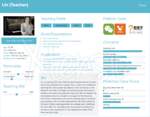
Questionnaire/interview result(details see persona)

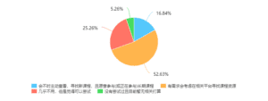
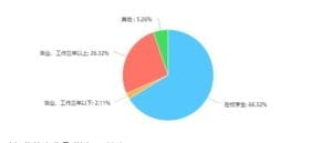
For the quantitative data, our questionnaire has received 95 answers this week. And for the qualitative data, we interview 2 teachers, 2 students, and 1 resource (like the site, equipment) provider.

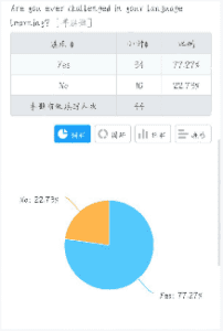
Here are some charts that visualize the data we got from the survey:


Interview

The teachers’ attitude towards online platforms is mainly divided into two groups, willing to cooperate or not, especially for offline courses. Different types of teaching prefer different time-span: for example, music learning should be a long term learning while bakery could be just a one-time course. The main questions they concern are as follows:

  • The teaching fees (compared with they finding the student by themselves)
  • Platform’s credibility
  • Students quality
  • Environment: as most of the teachers don’t want to change their teaching places frequently

Most of the students are familiar with these online learning platforms and also willing to use them. The question they concern the most is the quality of the courses and the responding system of the courses. The group booking choice could be popular for most of them choose to study with their friends or classmates in school.

The resources provider is willing to collaborate with this kind of platform and prefer long-term collaboration. They are also willing to offer other resources like the equipment, teachers and drinks as long the price is fair, which is one of their main concerns.

Improvement

(Special thanks to the feedback of Prof.Azure)

  • Use simpler expressions and make the logic of question clearer for people to understand
  • The question setting can be more related to the functions of the app (need to have a more concrete idea of the app before)
  • Set the questions in sequence, from easy to hard
PERSONA


Week 3 – User Research – Daisy & Milly

Survey/questionnaire/interview outline design/result

The purpose of this survey is to help us get a big image of our potential users. We want to figure out who might be interested in this kind of learning platform and what’s the touchpoint of these users. Milly and I worked together on discussing the questions of the survey, reaching out to

Interviewers and inviting people to take the survey.

Questionnaire/interview design

Personal information collection

To study how the personal experience might infect the learning experience, we collect information about gender, age, personality, job and major.

Learning experience

In this part, we aim to know more about the “goals” and “frustration” (two parts of the persona template) of our users. Therefore, we design questions to know more about what motivates them to learn, what’s their expectation of this learning activity and what kinds of the problem they encounter in the learning process so that we can take all of these concerns into account when designing the product.

The interview aims to collect qualitative data, so we choose people who are students, teachers and site providers in order to know more about their concerns and what might attract them to use this app.

Questionnaire/interview result(details see persona)

For the quantitative data, our questionnaire has received 95 answers this week. And for the qualitative data, we interview 2 teachers, 2 students, and 1 resource (like the site, equipment) provider.

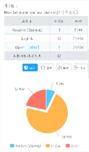
Here are some charts that visualize the data we got from the survey:


Interview

The teachers’ attitude towards online platforms is mainly divided into two groups, willing to cooperate or not, especially for offline courses. Different types of teaching prefer different time-span: for example, music learning should be a long term learning while bakery could be just a one-time course. The main questions they concern are as follows:

  • The teaching fees (compared with they finding the student by themselves)
  • Platform’s credibility
  • Students quality
  • Environment: as most of the teachers don’t want to change their teaching places frequently

Most of the students are familiar with these online learning platforms and also willing to use them. The question they concern the most is the quality of the courses and the responding system of the courses. The group booking choice could be popular for most of them choose to study with their friends or classmates in school.

The resources provider is willing to collaborate with this kind of platform and prefer long-term collaboration. They are also willing to offer other resources like the equipment, teachers and drinks as long the price is fair, which is one of their main concerns.

Improvement

(Special thanks to the feedback of Prof.Azure)

  • Use simpler expressions and make the logic of question clearer for people to understand
  • The question setting can be more related to the functions of the app (need to have a more concrete idea of the app before)
  • Set the questions in sequence, from easy to hard
Persona


Melt Dictionary–UX Azure(Zane Fadul Candy Bi)

Documented by: Candy Bi & Zane Fadul

Team members:Candy Bi & Zane Fadul

Project name: Melt Dictionary

Professor: Azure Tianran Qian

Problem

As a language learner, building your vocabulary is usually the most difficult part, because while a dictionary is always static, the words that native speakers are always evolving and changing. Not everyone has the luxury to travel abroad and immerse themselves in the language, and so this prevents people from truly mastering a language, and more so deters people from even trying.

Solution

Using Melt Dictionary, you have access to words that are being updated and verified by other users in real time. This ensures that you have the most accurate word choice when making translations or inputting simpler definitions.

Pre-Design

Story

When creating this project, we both equated the target problem with problems we faced head on. As a native English speaker, I understand that many languages function differently than I expect, so I’m constantly being told I “can use a better word” when I’m having daily conversations in Chinese. This cycle of always being able to use a better word is the exact motif we we used when creating our user story,

Storyboard

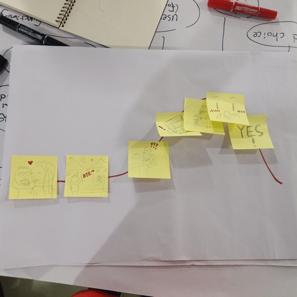
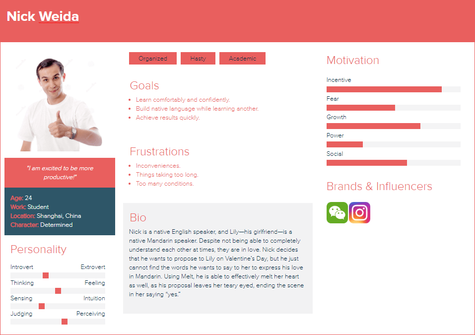
We start our scene with an interracial couple: Nick—a native English speaker—and Lily—a native Mandarin speaker. Despite not being able to completely understand each other at times, they are in love. Nick decides that he wants to propose to Lily on Valentine’s Day, but he just cannot find the words he wants to say to her to express his love in Mandarin. Using Melt, he is able to effectively melt her heart as well, as his proposal leaves her teary eyed, ending the scene in her saying “yes.” Another way we can show that it is the app that helps him to communicate better with her could be to include some smaller tidbits of them having some communication barriers earlier in the scene.

User Research

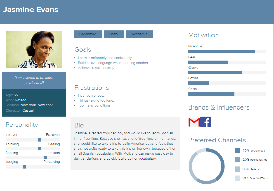
Before we began working on specific features of the application, we surveyed about 60 students in our school using questionnaire platforms like Google Forms and Wenjuan Xing. Since we know that every student at NYU Shanghai is learning a language, this was the perfect population for us to get samples from. With these, we were able to establish a few personas.

Persona

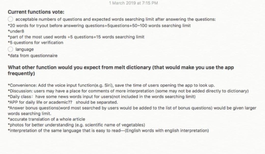
We were also able to survey students and see what kind of features they expected from Melt Dictionary.

Discovery

By just explaining the main premise of the application, our surveyees were able to give us some more insight on the features we could implement into our original idea. Keeping this in mind, we obviously didn’t want to clutter our app with unnecessary features. I think that understanding the realms in which your app does not belong is just as important as understanding where it’s primary focus should be.

Design

Based on the data we received from our soon-to-be users, we were able to begin the design process.

User Flow

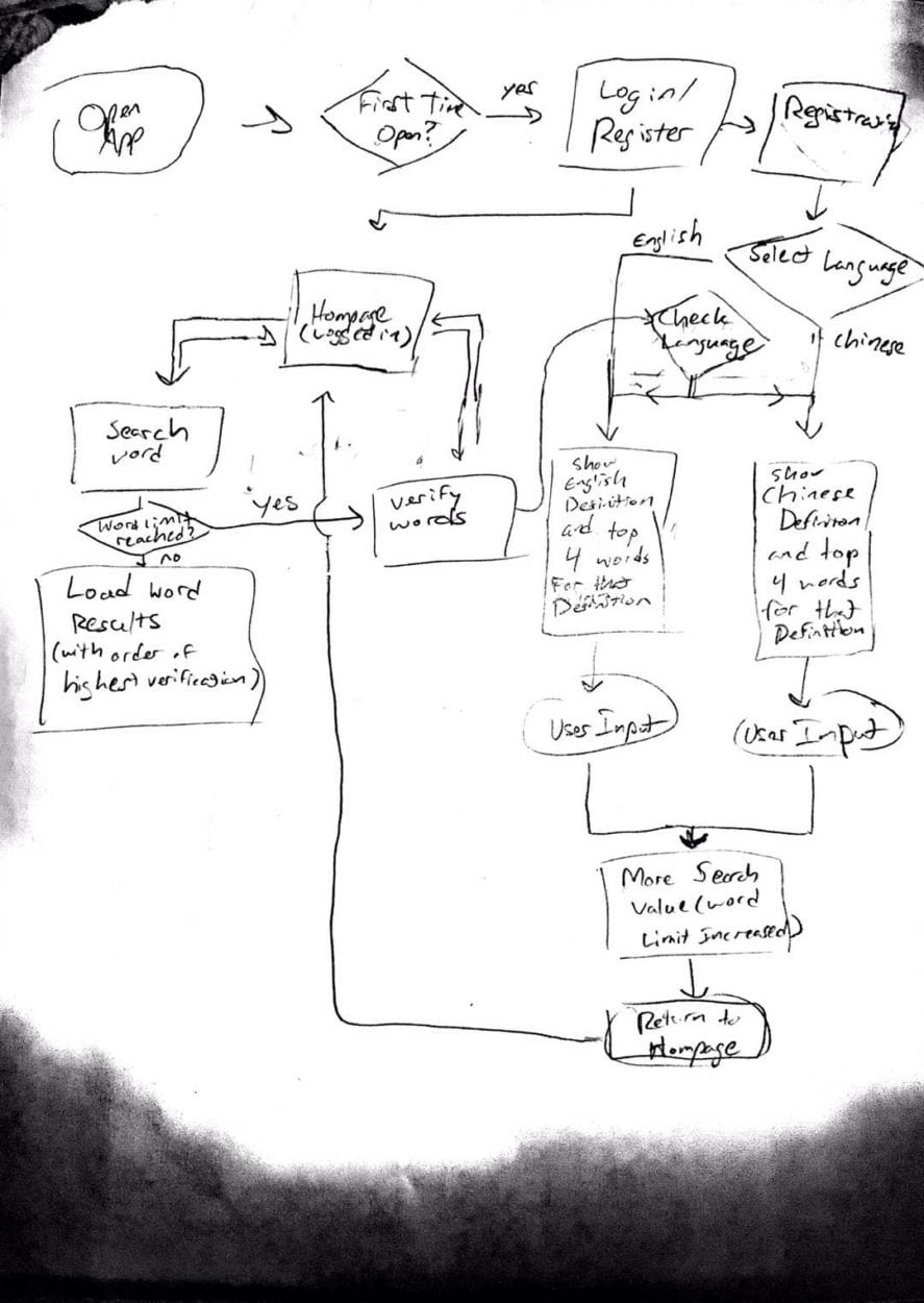
Sitemap

We used this rudimentary sitemap to emulate the typical cycle that a user would take on a dictionary app, while including the verification service needed to update the dictionary’s word database.

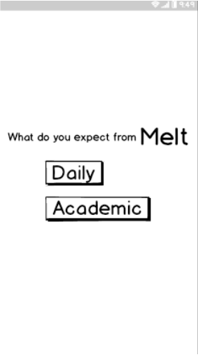
Lo-Fidelity Wireframe

After creating our sitemap, we implemented a basic layout in the form of a lo-fidelity wireframe. This allowed us to make any tweaks to the sitemap if we needed to, and to also account for any tweaks to our layout design.

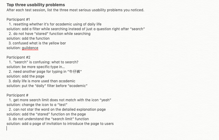
Usability Testing

Branding & Final Details

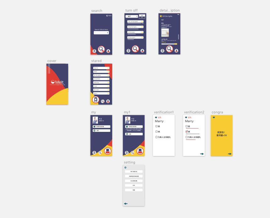
Mockup & Hi-Fidelity Wireframe

When creating our mockup, we wanted to keep in mind what our general audience was. For example, we are pitching to a demographic of younger, relatively tech savvy, language learners. Because of this, we wanted to maintain a brighter color scheme; we felt this embodied the essence of our demographic.

Using tools like Adobe Illustrator and online color resources, we were able to develop a color scheme that was both bright and relatively appealing.

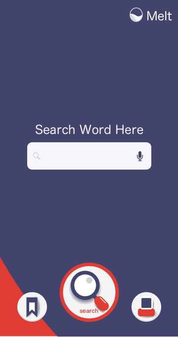
After this, we added color and other visual details to our applications wireframe. While the wireframe still obviously can’t allow the user to search up their own words, the hi-fidelity wireframe gives quite a few examples that the user can interact with to understand how the app works.

Reflection

Through the design process, we were able to truly understand the process that a UX designer goes through. From start to finish, it is honestly a lot more work than I had initially thought, but it’s fascinating to see how important it is to keep in mind that you—the creator—are nothing without your users. It seems like an obvious thing, just like how a play isn’t a play without an audience, but it really does make a difference how aware you are of your product and how well you can implement what your users truly need.

Challenges & Solutions

Through our process, we assumed that the only useful information we needed was from students at our university, when in fact the entire city of Shanghai is growing with people from all over the world. It’s safe to assume that many of them, students or not, would benefit from this app, and definitely would add to our user research.

The user flow can always be made smoother, and I think that if we were to look at this project again, we could create a smoother interface that was easy for users to understand just upon opening.

Referring to the story arc that we would expect our users to follow, we assume that the only thing maintaining user attention is the demand of learning a new word, which we can expect would happen at a regular rate. I think despite this, there are other possible ways that we could attract users. However, this is not something that you can just make happen. Adding extra features would definitely take a lot more user research and and prototyping, which we unfortunately do not have the luxury of time to do. But this is also something to keep in mind.

Week 2- UX project idea &story board -Milly Cai

Group member

Milly Cai & Daisy Chen

Project idea & storyboard

The general view:

Left part:

Right part:

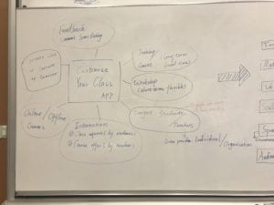
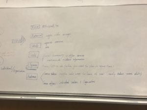
After discussion of several prototypes, we eventually settle down our project idea, which aims to design an APP that helps people customize their class according to their own needs. It’s like a courses version of “DZDP(大众点评)+Didi”. We mainly want to design this app as a two-direction platform: from one side, it enables people who want to learn something new to contact the teacher(s)/coaches directly; from the other side, it also enables people who want to teach to get their potential students.

This platform will contain come out as both mobile phone app as well as the web on PC, where information about online/offline courses and workshop would be provided to the users. Ideally, everyone who has the will to learn or teach could be our audience. However, based on the situation in real estate, the potential users may mainly lie in the age of 20-40, as this group has the ability to independently manage their spare time and income. Besides, they are also the group who are most likely to welcome new products.

Nowadays, as a result of social competition, there is an increasing demand for people to learn more things in order to either enrich their skill sets or just for fun; besides, with the rapid development of internet and social application, more and more individual teachers or coaches start up their own career instead of working for an organization.  However, as for students, local organizations or institutions have a lot of shortcomings: not offering the exact course they need, costing too much time to go or not fitting to their own schedule… As for teachers, people who want to teach or earn an extra fee and do not want to fix their time to the organizations as well as the people who do earn a special skill (painting/drawing) but probably do not have a certificate, our platform also provide them with a easy way to reach out to the potential students.  Apart from the users, compared with the existing platform who contain related content (eg. the online courses, wechat…) they still do not have a smart and clear way focus on this service. Instead of the indirect way of teachers and students to match each other in the previous time, we design this project to eliminate this inefficiency. Without intermediary institutions or organizations, students could gather together according to their personal demands and request teachers to set up a class. In addition, it is also a chance for teachers/coaches, especially the individual practitioner, to accept the request or offer their own class according to their own schedule with high flexibility. In other words, this APP aims to address this problem by connecting these two parts – students can find the teacher through class request and teachers can find students through these request or by offering classes.

Story Board

Our storyboard starts from two sides (students, teachers) and approaches the same “happy ending”.

From Students’ side

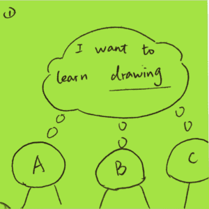
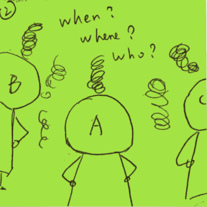
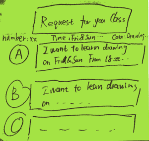
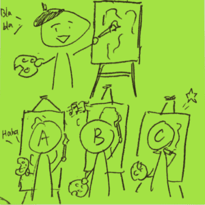
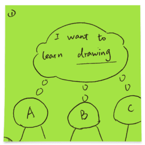
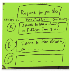
Students ABC want to learn drawing.

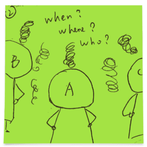
They are troubleing thinking about how to get a pleasing course.

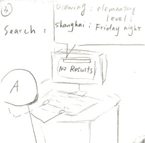
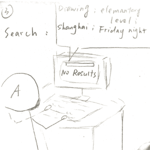
After searching online with their demands, no results fit them.

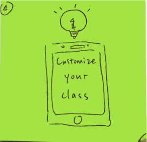
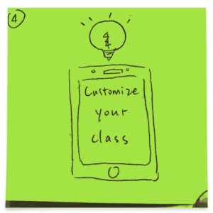
Here comes our app: to customize your class!

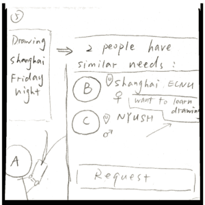
A type in his needs, it soon shows that he has the similar demands with B and C.
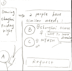
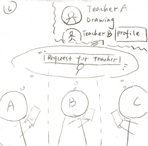
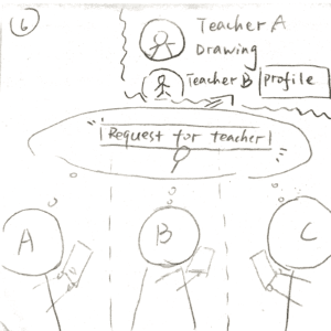
And the platform also recommends the teachers who fit their requirements.

Finally, they select a teacher and set up a class and learn happily.

From the teacher’s side


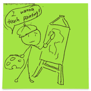
Painter Mr. Hat wans to teach painting.


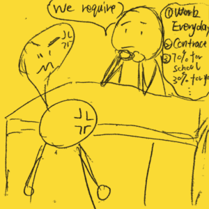
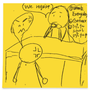
However, he gets annoyed by the boss’s requirements of a painting organization.


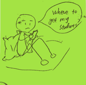
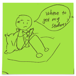
He wants to find his students but wondering where to go.


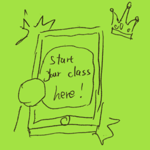
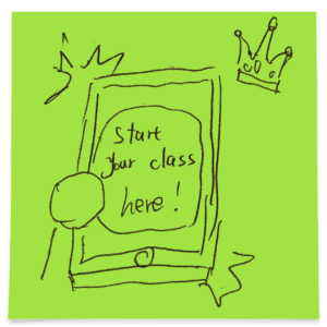
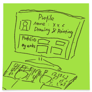
Suddenly, he finds our app says to start your class here!


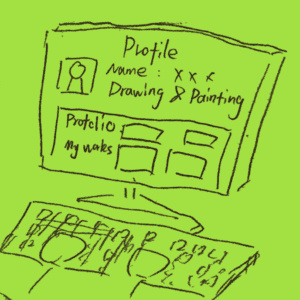
He types in his personal information as well as his profolio.


Then starts to offer his class on the app.


The platform soon shows him the requests from the students that fit his demands.

He then starts up his class and teaches happily.

Reflection & Conclusion

 Our inspiration comes from both public rating apps such as 大众点评DZDP and also the app with the costumer-request model like Uber and Didi. However, we also add the group-match and group-purchase element in this project. Further improvements on functions and UX design will be made in the following week when the user research goes further. But unlike  Didi/Uber in which the first-comer takes the order, here it’s up to the person who sends the request to decide the teacher. The students can also find people who have similar class interest to them to be their classmates. Or they can also invite their friends to join and send a class request as a group.

Of course, this idea is far from complete. Further improvements on functions and UX design will be made in the following weeks when the user research goes further.

Week 2 – ux Project idea & storyboard – Daisy Chen

Group member

Daisy & Milly

Project Idea/Concept

For this project, we aim to design an APP that helps people customize their class according to their own needs. It’s like a courses version of “DZDP(大众点评)+Didi”. On one hand, it enables people who want to learn something new to contact the teacher(s) directly. On the other hand, it enables people who want to teach to reach out to their potential students.

In our product, the users will be able to find online courses as well as offline courses and workshop info. Our platform will be a mobile phone (APP) as well as PC (web). Generally speaking, everyone who has the will to learn or teach could be our audience. According to the situation in real life, the potential users may lie in the age of 20-40.

We design this project to address the demand for people to learn and teach. Nowadays there is an increasing demand for people to learn more things in order to either enrich their skill sets or just for fun. But they have limited time and can’t go to traditional extra curriculum school to learn. There is also a group of people who have a good command of something (language, music instrument, drawing, etc) and are willing to teach. But they don’t have the channel to reach out to the potential students. 

This APP aims to address this problem by connecting these two parts – students can find the teacher through class request and teachers can find students through these request or by offering classes.

Story Board

Our storyboard approaches the same “happy ending” from two sides – the students and the teacher(s). 

Storyboard from the students’ side

Storyboard from the teachers’ side

This APP serves as the bridge between teachers and students. Instead of simply listing out all the choices, we adopt a similar form of Didi – students can “request” a course with their expectations (like sending an order for a taxi) and teachers who satisfy these requirements and willing to teach will respond to this request. Unlike Didi in which the first-comer takes the order, here it’s up to the person who sends the request to decide the teacher. The students can also find people who have similar class interest to them and they could be classmates if they want. Or they can also invite their friends to join and send a class request as a group.

Further improvements on functions and UX design will be made in the following week when the user research goes further.