Week 3: Basic HTML/CSS Website- Ying

Link to the about page: http://imanas.shanghai.nyu.edu/~yc3359/week03/index.html

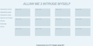
Or you can take a sneak peek to my new welcome page proposal.

http://imanas.shanghai.nyu.edu/~yc3359/week03/welcome.html

 This is where I got the effect from (https://css-tricks.com/snippets/css/typewriter-effect/) and I thought it was really cool. 

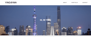
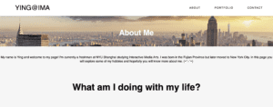
I started out my assignment with the construction of a horizontal navigation bar on the top. I decided to make that first since it will be used multiple times throughout my other pages. This way I can just copy and paste the code to finish that step before stylizing my other pages. For the navigation bar, I created a white background on the top. I added my title for the assignment “Ying@IMA” as my logo. Then I added tabs that are already existed like the portfolio page. I will be updating more tabs in the future. The HTML code for that is shown below. 

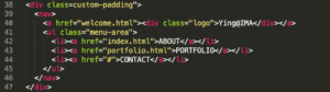
As you can see I’ve assigned it in a class called custom-padding so I can easily adjust the over padding and I wrote the rest of the code within nav. Below is the CSS code.

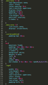
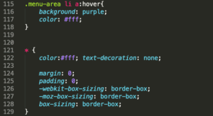
So what I did is that I’ve set the tabs on the right and the logo on the left. I also did the hover function where tabs will be enclosed in a purple box. This code is shown from 115-117. Moreover, I added a shadow to the bottom corner to add more contrast and the code is in 182 by using box-shadow. There are several difficulties while making this navigation bar but most of it is about the position of the text and the bar. I eventually got the result that I wanted by testing numerous values for almost 2 hours but it was worth it. On the about page, I’ve added a background for header one. This was quite easy just by adding a background from the local file. I then adjust the background by using background-position and background-size. The rest of the content was pretty straightforward where I put the text in either center or to start on the left. For the involvement section, I’ve added two logos and decided not to add any texts for it so I can keep the website simple and minimalistic. The user can click in to check more information. When you move the mouse cursor onto the image it will have a little message box appearing that says the title of the website. This was done by using the title code. Lastly, I insert link to the tabs that I already created.

For the portfolio page, I’ve fixed the footer problem where it does not stay on the bottom of the page by changing the position to fixed. One useful thing that I learned is how to put special symbols onto HTML by using converter online. I tried to make a footer section but failed and I gave up because it messed up my previous section all the time.         

Week 3: CSS Portfolio Website – Adam Chou

Website:  http://imanas.shanghai.nyu.edu/~ac6596/Portfolio_Project/

Reflection:

I enjoyed working on this project but felt as though much of my hard labor came from a lot of guesswork. The majority of the project included a brutal cycle of me forgetting the functions of lines of code, and then having to look up functions and playing around with values grew tiresome. This, combined with combing through my source code, made the process of creating my project more cumbersome than I liked.  However, I feel as though I was better prepared for this assignment after the CSS exercise, as the practice definitely helped me to understand the classification and division system better. With practice, I hope i will get faster at coding, as well as more efficient. 

I will not lie though, I feel like my project is quite basic in comparison to the others that have already posted. However, for now, I will be complacent and settle for what I have.

Somethings that I would like to later add on would be the incorporation of multiple pages, as well as a better idea for content. I have a lot of writing that hasn’t been published yet, so I was thinking that I would make this portfolio much like an online book for my unfinished work. This is for the future though, when I learn a bit of javascript as well as more commands for CSS and HTML.

Week 3: Updated Portfolio CSS- Evan Xie

http://imanas.shanghai.nyu.edu/~emx200/wk2/portfolio.html

Throughout the process of adding new CSS elements to my flexbox portfolio, I enjoyed the majority of the process itself. I found that adding different colors and font styles were fairly simple after looking back at the powerpoints as well as doing outside research. I originally experimented with different fonts like Arial sans serif and times new roman but found that Helvetica suited the overall style of my portfolio more. I tried to go for a light blue/gray feel that represents something mysterious or unknown so that users would be curious as to what the portfolio includes. As well, I titled my portfolio “Allow Me 2 Intrude Myself” because I often find myself overthinking my own thought process/creativity. Rather than introducing myself, I thought to use the word intrude to make users question the purpose of the portfolio IF they catch the word choice in the first place. The challenging parts of adding CSS to my portfolio came from making sure my code was placed in the right areas such as “.header” or “.content.” Besides this, I found the styling and creative aspects of adding CSS elements very fun and personalized. 

Week 3: CSS [Ta-Ruedee Pholpipattanaphong (Ploy)]

Link to HTML/CSS Portfolio About Page   http://imanas.shanghai.nyu.edu/~trp297/week1/ploywebsite

This project was really fun. I ended up liking to design my about page a lot. Initially, it was really hard because it was something that I have never done before. It is like learning a whole new language. It is all about trial and errors. At first, when I didn’t get what I expected, I was frustrated. However, as time passed, I feel like I became more patient and I embrace the process. Once I got what I expected, I’m so happy, as if I have accomplished something really great. 

I faced many difficulties along the way. First of all, it is really hard to align the different parts. For instance, I want the profile picture (circled) to be right next to the contacts me session but it instead went above. Therefore I need to play around to change the margin, the display, and the position.  Another challenge falls into my profile picture image. This is because I want to make it a circled frame so that it would look like the profile picture of my Instagram account. When I do so, the image of me does not show up in the circle, because the image automatically was cropped so that the only part visible is the top left. 

One of the silly mistakes that got me stuck for a long time was the  IMA main page. I forgot that my IMA main page was in the week 2 folder and not the week1. Therefore, the hyperlink does not work. 

Ultimately, this project is challenging but I like how we can be creative with it. I like the trials and errors even though it took quite a while to be successful. 

NOC – Week 2: Object-Oriented Programming – Yang Gao

Assignment: 

The link to my assignment(With Music): https://editor.p5js.org/yg1273@nyu.edu/sketches/m9VuBHkeY

For this week assignment, I played around with class and expanded what we did in class. When you click, it will generate stars✨ and play the sound. The background music is also playing all the time. And once you click, it will print/show a poem sentence by sentence by access them in the array. 

To get the background filled with gradient color, I changed the color function to HUB mode.