Audio Project- Kyra Bachman

http://imanas.shanghai.nyu.edu/~ktb300/audio_project%202/

Description

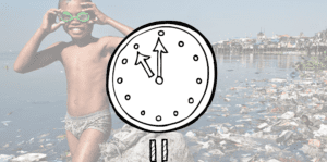
Our intention for this project was to simulate a PSA style that brings awareness to an urgent issue in a creative way. The layout of the website has a clock in the center with various pollution-related photos in the background.  One the play button is pressed, a playful and light underbeat begins and each time the user presses the clock, it signals another the sound of a pollutant, will  new pollutant. The juxtaposition of the visuals with the mood of the sounds to portray the harmful effect of our seemingly inconsequential habits, i.e. motor  vehicles contributing to carbon emission and plastic bags. The clock symbolize people fixation on their daily routine, sometimes oblivious to the existential and pressing issues of the outside world.  Once the clock-hand reaches  12 am, sirens sound off signaling the final audio recording of a call to action. Users can then click on the clock and be routed to the UN Climate Action website. 

Process

We had originally planned for minimal interaction, but we learned from the test-run in class last Thursday that it was important add more interaction and visual elements for a better user experience and general understanding of the topic. I initially thought it would be cool to have minimal visuals, so the user would have to infer the meaning and then come to the surprising understanding in the end. However, that awakening ended up benefitting us immensely because our project is much more powerful and comprehensive than before. 

We gathered the majority of our audio using the TASCAM. All the sounds heard when the clock is clicked were recordings of things both Selina and I associate with being harmful to the environment. The other tunes heard underneath our gathered audios are from royalty-free websites. And lastly, gathered recordings from Donald Trump and Sir David Attenborough’s famous speech at a United Nations conference of December 2018. Our initial plan was to make one holistic audio, but we instead opted for interactivity by allowing the user to signal the audio by attaching separate audio ID’s to the sounds and their respective number of clicks. For the audio at the end, though, we did use audacity which was helpful in manipulating certain sounds.

I think the most difficult part of this project was the interactive audio portion. Because we have so many audios IDs and different layers of audio,  I really needed to pay close attention to the detail for the code to work. Although connecting the audio IDs to Javascript seems fairly concrete, it was easy to make a small mistake that would later be difficult to detect. 

Conclusion

I am overall very pleased with the outcome of this project. Both my partner and I were bit concerned about our project’s lack of interaction from the peer feedback we received last Thursday; however, this pushed us to reevaluate how we could improve the user experience, which helped strengthen the communication of this topic. 

Recitation 6: Processing Basics by Yixuan Liu

Motif:

FORMULA 15 by Sol LeWitt

The image I chose is called Formula 15 by Sol LeWitt. The reason why I chose this image was that the combination of those regular and standard shapes and lines created a sense of aesthetics, and it may also be easy to draw with the functions we’ve learned in Processing.

Based on the motif, I want my image to be more variable for both color and shape compared with what it used to be. Therefore, I changed the color and the weight of different rectangles, and add not only straight lines but also arcs inside of the rectangles.

My final creation links to the motif in the way that the basic structure is that same, which contains many rectangles of the same size, and many curves and lines inside. However, there are some differences between mine and the motif. The first is that the motif is black-and-white, while mine is more colorful, since different rectangles are filled with different colors, and the color of the strokes are different as well. The second difference is that the rectangles in the motif are of the same weight, while I changed the weight of the strokes in my image. The third difference is that the lines and curves in the motif all start from a corner of a rectangle then end at another corner of a rectangle. In my image, I added some arcs apart from lines to make the whole image more abstract and in a more pop-arted way.

I don’t think drawing in Processing is a good way of realizing my design. The reason is that the shaped drawn by Processing are in a fixed way, and it is really hard to add varieties and irregular patterns. It is also troublesome since you have to think about the position of each point in the axis, which can make the process of drawing inefficient.

Code:

size (800,800);

background (#A8C1BC);

stroke (#ADF074);

strokeWeight(10);

rect (0,0,100,100);

rect (200,0,100,100);

stroke (#090F03);

fill (#70C6B6);

rect (400,0,100,100);

rect (600,0,100,100);

stroke(#F2D73B);

rect (100,100,100,100);

rect (300,100,100,100);

rect (500,100,100,100);

fill (#A6EA40);

rect (700,100,100,100);

stroke(#090F03);

strokeWeight(50);

fill (#5E92B9);

rect (0,200,100,100);

rect (200,200,100,100);

rect (400,200,100,100);

rect (600,200,100,100);

fill (#DEEBF5);

rect (100,300,100,100);

fill (#13171A);

rect (300,300,100,100);

stroke(#709CC6);

strokeWeight(20);

rect (500,300,100,100);

rect (700,300,100,100);

rect (0, 400,100,100);

stroke(#090F03);

rect(200,400,100,100);

fill (#BA7EE3);

rect(400,400,100,100);

stroke (#F26C3B);

rect (600,400,100,100);

stroke (#9B49D3);

line (0,0,100,100);

stroke (#081415);

line (500,100,600,200);

stroke (#E5E862);

strokeWeight (10);

line (100,300,200,400);

stroke(#2856C6);

strokeWeight(5);

noFill();

arc(250,50,100,110,1.1*QUARTER_PI,5*QUARTER_PI);

arc(250,450,150,200,0,1.7*PI);

stroke (#28C659);

fill(#9DDCE8);

arc(350,350,100,100 ,0, 3*QUARTER_PI);

arc(750,150,50,80,2,5*QUARTER_PI);

stroke (#E5AE56);

strokeWeight(1);

fill(#EA8140);

arc(200,300,20,20,0,1.2*PI);

arc(250,350,60,80,1.2*PI, 2*PI);

arc(300,300,50,50,2*PI, 2.5*PI);

arc(450,240,150,150,0,PI);

arc (500,500,30,30,0,1.5*PI);

Sketch:

Sketch

Week 08: Audio Project Vincent – Moon

For the audio project, I worked with Chloe and Susie.

The first day of the project, we spent a lot of time brainstorming, thinking of ideas. We went through like 3 different plans, but in the end we came up with the idea of a long distance relationship between two people and them calling each other. An idea Dave gave us was to make their voices farther apart by formatting the audio clips to play from the left and right audio.

We split the work into website making and audio clip working. Susie would work on the website, while Chloe and I worked on recording and the audio clips.

Before we worked on the recording, we created a script and made many changes. Chloe and I did the voices of the story’s main characters, and it was really fun to do the recording. We used a blue yeti to record. One of the problems we also had was people making noise in the background, but we fixed it by changing the sensitivity of the microphone.

After recording, we stated working on the audio clips, which was the more annoying part because it was a lot more work than we thought. We had to do 16 different audio clips, and also search for audio clips online for background noises etc. Once we were finished with the audio clips, we just had to implement them into the website and we would be finished with the project.

Overall, I was very happy with this project because everyone did their part and I felt that our idea of the project got implemented well.

Audio Project – Julia Riguerra

URL: https://imanas.shanghai.nyu.edu/~jhr360/audioproject/index.html

For our audio project, Kat and I delegated the work between us such that I worked on the web design while Kat designed the audio. We decided on recording a reading of a poem, “Biography of Southern Rain” by Kenneth Patchen, which Kat then distorted and added other atmospheric sound bytes.

Because our main focus was the audio, I decided to design the website to complement the content of the audio and made the background a gif from the film Garden of Words, which heavily uses rain as a symbol. Since the background and the player are gifs, I decided not to include an author’s bio, as that would have been more distraction from the audio, and I felt that there wasn’t anything more that could add to the website, other than subtitles.

I initially had trouble with the subtitles not appearing, but I was eventually able to resolve my issues. I used the in-class exercises for coding reference.

I wanted to have the background be multiple images that would transition into one another, but I couldn’t find a solution that I understood with my current coding knowledge and decided not to pursue this.

Through this project, I was able to design a website, which I hadn’t done since before the comic project, as I’d been working on content then. I also designed the player in Photoshop and drew the gifs, and it was satisfying to see something I created functioning properly.

Week 7: Response to The Danger of a Single Story- Cara Chang

In Chimamanda’s TED talk discussing the dangers of a single sided story was interesting to me because it points true to the society in which we live in. She discusses how due to her British education that she learned about the world from a perspective different from her ethnic descent, which I could personally relate to. I feel like growing up in America in an age with such universality can make me forget to learn my own culture. People do not think about the rest of the world’s perspectives because they are so used to only being exposed to one certain atmosphere. I found it interesting that Chimamanda read books of white characters with blue eyes, and found it normal to her, just as I can personally see the culture of Americans as my own, even though I am fully of Taiwanese descent. Being immersed in a world of such diversity yet with such universal cultures can blur people’s mind from being able to understand other culture’s perspectives. Being in Shanghai offers a firsthand experience to immerse myself in a culture similar to my own. The students who attend NYUSH have the opportunity to expand upon their knowledge of only the culture from which they grew up. Understanding a much more different culture such as China’s can personally allow us as students to be more aware of the many perspectives of the world. Chimamanda warns people to not be caught up in only being able to see from one perspective, because that then causes a lack of consideration and knowledge as well as understanding for many other cultures. A single story then creates stereotypes which can then lead to a direct misunderstanding, as Chimamanda explains. Many people have a misconception about Africa, which Chimamanda got to learn herself, as she learned about her culture and its stereotypes through a single sided story. Take, for example, her taste in music, and when someone was disappointed she had her taste in Mariah Carey, not the “tribal music” she is stereotypically supposed to listen to. This offers a firsthand example of how quick people are to assume certain things based off of stories they hear from only one perspective. People must learn to immerse themselves in all these different cultures so they do not fall for the stories that they hear from a perspective that is not true to reality.