IMB Capstone: Mentor Reflection (Week 1)

For this week’s meeting with my mentor, I worked with Professor Brandenburger with some help from Professor Alex Ruthmann as well for the brainstorm. For my project, I want to focus on the intersectionality between education, technology, and social media, as well as how that supports student’s social-emotional well-being. Since my question was quite broad, I got some help from my mentor to narrow it down, as well as consider other questions with a startup mindset.

Link to mentor presentation

Motivation

My main motivation for this project stems from my frustration as a college student going through online learning. Since the pandemic, I have adjusted to online learning using zoom and other technology. However, the quality of lectures hasn’t been the best, and I also felt emotionally unsupported from the remote environment. After speaking with some of my peers, I realized that it is a common pain point of online school, ad how that left many students emotionally down and overwhelmed. This has also been a difficult situation to navigate, especially for students of marginalized groups.  Although the covid-19 situation has gotten better in some capacity, e-learning is here to stay. The online learning and education technology market isn’t perfect, and has a lot of potential to grow as a booming sector. Therefore, these reasons motivated me to concentrate my capstone around education technology and how to build a system/platform that helps students during this time, and to improve online learning.

Question #1:  How can online applications connect students with one another in a supportive and efficient manner?

For this question, I thought about how the social aspect/connection part of college has been extremely difficult and changed due to the pandemic. Many people I talked to and researched about have shown signs of depression and felt low during this time. I thought about maybe creating an application that allows students to connect with other students in their classes, university, and/or major in a one-stop-shop manner. Since many universities have large Facebook groups that are often uncategorized, I thought about creating a better-managed system that can categorize different aspects of being a college student, and support them. My inspiration stems from the NYUAD Room of Requirement Facebook group where students ask everything in. In addition, this may include course selection help, more inquiries about professors (that are not on rate my professors), dorm, extracurriculars, internships, and other areas as needed. This can serve as a support network ad social platform that allows students to meet other students in their classes through a short bio and photos + interests w/o utilizing other social media platforms.

Question #2: How can Educational Technology tools improve Student’s Social-emotional Learning and Cultural Competence? 

For this idea, I think social-emotional learning is a really interesting and important sector to examine. I thought about developing an e-learning platform or courses that provide support and social-well being courses for students through video-based technology. However, I still need to further develop this idea and conduct research, since the idea is very broad and hard to pinpoint.

Question #3: How can digital learning tools be used to support students’ learning outcomes and success?

For this idea, I want to focus on supporting student’s mental health specifically. I want to examine how to best support students using digital learning tools, so students can feel best supported, during this time and after the pandemic. I thought about building chat functions into pre-existing online learning platforms to engage with students and connect them to one another, making the process of meeting other students online easier.

Final thoughts

My mentors provided great feedback on scaling the problem, as well as inspirations for looking at pre-existing education technology tools, thinking about how to narrow down the problem, and define pain points for students using digital learning platforms. They also helped me think about who the buyers and ideal users are, with a business-driven mindset, and additional resources for prototyping. For my next steps, I will conduct more research on different student’s experiences with online learning, and how they can be best supported, to narrow down my problem. 

Final Blog

嗯…听说可以写中文所以…..

一学期下来感觉自己可能是全班玩游戏数量最少的人(之一)?喜欢游戏设计开发的原因更像是,游戏是一种自己比较喜欢的表达方式。所以一直以来自己的关注点也集中在叙事和表达上。加上自己经常有一些稀奇古怪的想法,游戏也是实现他们的非常好的方式。

比如说第一个project的“和过去死亡的自己合作”

3Dproject想说的关于“存在与感知”

final project的拼字与在游戏中反思现实中存在的教育问题

(趁机在这里记录一下这学期都做了些啥)

但自己一直以来也局限在这些方面。因而在这门课上也学到了自己曾经忽略或是感觉“好像跟我想做的没什么关系就懒得去管”的东西,并且意识到他们的重要性。

比如说风格,拼字游戏随便设计了一个攻击“怪”的机制,却没有考虑到游戏的整体风格和感受。

比如说难度设计,新手引导,机制的复杂性。

比如说如何将想要表达的东西更好的融合在游戏里,或者说表达和机制并不是很match的时候要怎么办

比如说美术风格与机制和叙事如何统一

还有音乐

比如说工作量,每次想的挺美结果都做不完lol

同时这门课也给了我机会去实现自己想做的:设计稀奇古怪的机制,当编剧….

因为之前用过一点unity所以上课讲的技术上并没有感觉很难,但我这个主修CS的人虽然代码能力还可以其实并不太喜欢写代码于是非常感谢sven和pato写掉了大部分lol

但也加深了我对unity的理解,技术上我主要处理各种插件的使用和解决稀奇古怪的bug。常常搞出些“不入流”但是能解决问题的办法。这对我来说或许比“重复写内容相似的功能代码”对自己的提升要大很多

一直想把游戏当副业来做,既可以实现自己的想法/搞钱,还不用受别人制约(想的挺美)

总之在这门课上学到了很多,非常感谢Ian老师,也非常开心可以认识大家。

希望我们的遗书可以上steam卖钱lol

Kinnected! Midterm Project Update

Why design for kids?

This topic was chosen during the NYU Abu Dhabi Hackathon where we were asked to design an invention for Covid-19. Many innovations were produced during the pandemic for people of different ages, but very few were designed for toddlers (age between 1-4). 

Stage 1: Second-hand research

We conducted a series of second-hand background research on toddlers’ conditions during the quarantine. In one of the researches, researchers surveyed nearly 2000 children in second through sixth grade both in Wuhan, China and in a city about 50 miles away. After an average of 34 days under the lockdown, 23% of the kids reported symptoms of depression. 19% reported symptoms of anxiety.

We decided to look into the lifestyle of young kids, and explore the reasons behind their depression. 

Stage 2: First-hand research: questionnaire round 1

We started to design our first version questionnaire. From our second-hand research, we found out that since kids are staying inside over the quarantine period, they don’t get the chance to play with their friends. We made an assumption that their depression and anxiety could be coming from this loneliness and their desire to stay connected. 

Our questions focus on kids’ interactions with their peers. We collected data of the interaction frequency between their kids and their playdates, of the type toys the parents prefer and their preferred material. We received about 40 responses, but the feedback from these parents were not as satisfying as we imagined. It seemed like they weren’t that worried about their kids not being able to stay connected with their friends. The results showed the same thing: in the question where we asked what are their main concerns for their kids, their concerns were more spread than focused on the “lacking interaction between peers” option. Nevertheless, we summed up the results we acquired and summarized our first version pain point.

Pain Point version 1

Kids cannot connect/play with their playmates during quarantine periods and other times when they are physically departed. 

Similar Toy Design Research and analyze: 

Tinkamo: https://www.tinkamo.com/

Lego Mindstorms (targeting older kids): https://www.lego.com/en-gb/themes/mindstorms

Although focusing on the hardware part,  those all contain digital screen children need to connect with.

Features we designed for Kinnected!:

Narrow down the age rage to 2-5/3-5, for which kids can communicate better.

There should be no screen/non-necessary screen for the toy. Best without a digital screen or app.

Kids need to co-create/compete and win. (design game system)

Consider different kinds of blocks such as sound blocks…

Mother Block (the special one): more complex, embedded Android system, maybe uses Bluetooth/Wifi, reads RFID tags on children blocks. 

Design a game system for the toy. 

Engagement should be virtualizing play-date.

Use wood/natural materials (parents prefer).

Realize audio synchronization.

Considered Problems:

How to keep kids’ attention? (For long-term playing)

What do kids do with blocks when they’re together?

Stage 3: Interview Round 1

Our first interviewee is our professor who has 2 year-old twin daughters. When talking to her daughters, both of them mentioned that they’re really interested in the emoji characters in their mom’s phone. They also love the Peppa Pig cartoon and corresponding toys that allow them to go through the storylines and roleplay with each other. During the conversation with our professor, we asked some open-ended questions so that we can get more comprehensive answers. Since her children are not attending the kindergarten right now, she was worried about their social skills and may not be able to make friends with others. In terms of her children’s interests, she mentioned that she would guide them toward certain fields on purpose by giving them different kinds of educational toys. She also mentioned that her children really enjoy watching cartoons on TV and playing with her phone, as they’re not playing specific games, but only interested in this new kind of interactive experience. 

The second interviewee is a 4 year old girl and her mom. The child likes to listen to stories with Tmall Genie for about two hours a day, and her favorite story is Black Cat. She has a lot of dolls, she likes to talk to the toys and role play with them. “During the pandemic, I couldn’t play with my buddies. I miss them, but it’s nice to play with stuffed animals at home.” Her favorite game is role-playing, no matter what time with whom to play. It works like this: for example, you are a kitten and I am a puppy, and we start making up their own stories. She does not play a lot of video games. Doesn’t have her own social account and doesn’t use her mom and dad’s social account often, but watches videos on Tiktok often. Though having a lot of friends, she likes to stick with her mom all day long. “I don’t like the fact that I can’t go out because of the pandemic, but the rest is fine.”

The mom allows the kid about two hours of play time per day. For the mom having playmates to connect with is important, but not that important. “I’m willing to play with my kids and because I myself am a kindergarten teacher, so I’m with my kid almost all the time. Children love to listen to stories.  I think it’s very educational.” Buy toys ranging from a few to a few hundred yuan, if more than 500 yuan, it needs to be considered twice. Extracurricular activities are: learning ancient Chinese literature and English, and many other children are also learning to draw and dance. It’s very important to keep the child happy.

Stage 4: Second-hand research: questionnaire round 2

However, since the pandemic situation is getting better, the vaccine for the covid has been invented and the government is lifting the stay-at-home order, which allows more outdoor activities for kids. They get to hang out with their playmates more. Then, how to keep them connected when they’re physically departed doesn’t seem like a core problem now. In order to redefine the real pain point, we created a new questionnaire and distributed it to parents of kids under 5 years old. 

Among all of the data we collected, we focused on two key questions that are the most vital to our project. The first one is “what are you most worried about during your child’s absence from kindergarten?” 73.33% of the parents, which is also a majority of them, choose “feeling lonely and unable to play with friends”. “Cannot learn at home” ranks the second, with 46.67% of the parents choosing this option. There is also 42.22% of them choose they’re worried about their kids “Playing electronic products for too long”. Another question is “what are some of the features you expect the toy to achieve?” The top two answers are 1) development of intelligence and early education, with 88.89% of the parents choosing, and 2) let children make more friends / have more communication with friends, with 66.67%. 

Stage 5: Interview Round 2

Our second interview revolved around collecting feedback moreso from the parent as we wanted to adjust our niche and introduce more open ended questions. We decided to interview an NYUSH Business professor named David Hunsaker, who has 6 children ranging from the ages 1-10 years old. Because of the amount of children he had, we thought it would be very insightful for him to tell us what he thought worked in differing age groups, having seen many cycles of kids growing up and fulfilling our target audience. 

During the interview, we asked questions such as:

  • What do you think is your children’s interest for toys
  • Has there been any effect on your kids during quarantine in relation to screen time
  • If you could create a toy for your kids, what do you want feature-wise?
  • What types of toys do you think are the best?
  • As a parent, do you think toys should be educational

From these questions, the conversation opened up to include other insights that the questionnaire was not necessarily considering. Firstly, the professor solidified that socializing for his children (being so many), was not a high priority as compared to the quality of toys and their modularity. When the conversation shifted towards how he would look at toys, he explained that while education was an important factor, more importantly was the ability to captivate his children’s attention span for longer periods of time. He then went on to explain this concept between certain toys having a “one time use” vs “many time use” potential for kids. The main separation had to do with how much the toys could change and provide multi functionality rather than just doing one thing that would over time become very boring. He gave a vivid example of toys he bought that were very modular (such as doll houses that could have many parts to them, or items like cars that could come in a set) vs toys that were overpriced because they would be so 1 dimensional (such as a doll that only says 1 thing, or a plush toy that doesn’t have any types of feedback). He went as far as to say that when him and his wife to the store, it bugged him that there were many toys that would seem hard to distinguish to a first time parent, and that most toys were actually all one time use. In essence, he implied these toys were money eaters with no value add to children, given once the child is bored with the toy, it quickly becomes trash.

Coming out of this interview, we realized the importance of having a “many time use” type of toy and the importance of showing feedback to the children. Without any modularity, our product would flop because it won’t create long standing brand value if it becomes trash quickly. 

Pain Point version 2

Based on our second round research, we have reached some helpful conclusions. First, for parents, what they demand in toys are: 1) educational, 2) healthy, eye-friendly especially, and 3) multi-usability. Then, for kids, they are looking for 1) fun and new experiences, 2) interactive devices, such as smartphones, iPad, or TV, and 3) relate to the popular cartoon characters. However, in the current toy market, parents are struggling to find a screen-less phone/iPad substitution that is fun and educational enough for their kids. Therefore, on the basis of our summary, we develop our new pain point: there is an untapped marketplace where a screen-less toy that has smart capabilities and is educational is highly desired.

Persona → Story

Parents: After re-empathize with our users and re-define the problem, we found out that actually what parents care about most is a kid’s health and education, rather than social connections with peers. For Health, according to our interview, parents of little kids worry more about their kid’s physical health than mental health, which includes eyesights, height, nutrition and etc. among all these, one very pig problem most parents worry about is eye sight. Children are getting exposed to all kinds of digital screens younger and younger, even a two year old child learns how to open and scroll through TikTok. For Nowadays’ young kids’ parents, they struggle to limit children’s time using electronic devices. 

So the second version of the user story is : Grace’s kid often got angry with her because she limited her child’s iPad usage time for one hour a day. She doesn’t want her child to get addicted to ipad games and cartoons because it’s so harmful for the eyes as well as not making her child unhappy. And then, she is introduced with a screen-less and educational device which is fun for children to play. 

Kids: we also redefine and re-empathize their needs: they seek for fun experiences. The desire of playing with playmates is not an essential one. they can have fun themselves if they find the right way to entertain. My cousin, a four year old girl, has fun role playing with friends, her mom, or even just with her dolls. However, They may not need people to play with every time, but they need someone to share the experience with every time. So two key words for kids’ needs are: Fun experience and sharing. For the age ranges, we change it from 2-5 to 2-8 because according to our interview, most parents indicate that they will not purchase a smartphone for their kid before their  kids until the kids get 9 or 10. So we believe, among the range of 2-8, screen-less, educational and fun experience is very important for kids. 

For the user story, candy is now not addicted to electronic devices. One hour of ipad time is enough for her. She has fun with this screen-less device and can learn and share experiences while having fun. 

Prototype

We decided to construct a digital prototype view of how the hardware components would work and how game mechanics could potentially be implemented. Taking inspiration from classical board games (primarily chess and checkers), we wanted to create a board that could easily create dominance in the middle, and would be easy to track movement. It was with these criteria that we decided a 5×5 board would work best for our use case, given it wouldn’t be as complicated as other classic board games, but also not too simple that games would be boring to make for the grid.

With this board, we took the feedback that Wood would be a desirable material t use for construction, and thought about the prototype’s board being made of wood with slotted chamfers to the inside where a lining of LEDs would allow a crevice to fit blocks in. With this, we achieve centering the materials all in 1 orderly fashion, and 1 power source. Also programming would serve to be easier as all the logic would be handled in this board.

Next, we constructed the design for the cubes. We decided that based on our current knowledge of NFC and RFID, it would be best to construct these cube shapes with the idea that each face would be a unique id that could create different game mechanics once in touch with the board. These cubes could serve as the physical element to the board, where movement of these cubes on the board would create different outcomes depending on what the game developer was thinking.

From the construction of this rough prototype, we drafted some ideas on simple games that would provide educational opportunities to children without being too difficult. Games such as matching or using memorization were just some ideas that we would be instructed to construct, as these could be suitable for all age groups. We also constructed some more sophisticated games to showcase how the product has the ability to grow with the children, given that games are super modular and extensive with the interface we have constructed. 

Future Steps

The two main focus “educational” and “fun” for us are still two relatively broad ideas. With the idea of  “no-screen”, we intend to find out small entry points to start our design. Right now, starting from what we’ve got from the interview like designing a more interactive experience with “role play” is one direction we can proceed with. We also consider to start with transforming a digital Ipad game into a physical one. Audio is another element we want to include in the experience. 
UXD Documentation:留学通

Inspiration

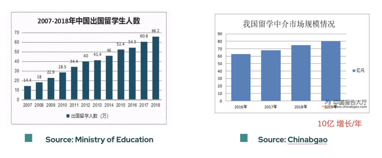
In recent years, there appears to be a steady rise in the number of students that want to go abroad for master or phd programs to further their studies. In order to design a product, a user experience that caters to the needs of these users, in the past few weeks, our group has conducted market research, interviews, questionnaires to narrow down the pain points of our potential users, so that we could decide on our core task and work out a prototype.

Market Research 

In order to learn about the market size, we looked into the data of the number of Chinese international students, the market value of the graduate students agencies and the increase in the number of international Chinese students each year from different data sources such as Ministry of Education, 白皮书,and Chinabaogao. We also searched for the anxiety and pains of the graduate applicants on social media like Zhihu and Douban. We find that graduate students often find themselves overwhelmed and anxious during the application process. 

Questionnaire

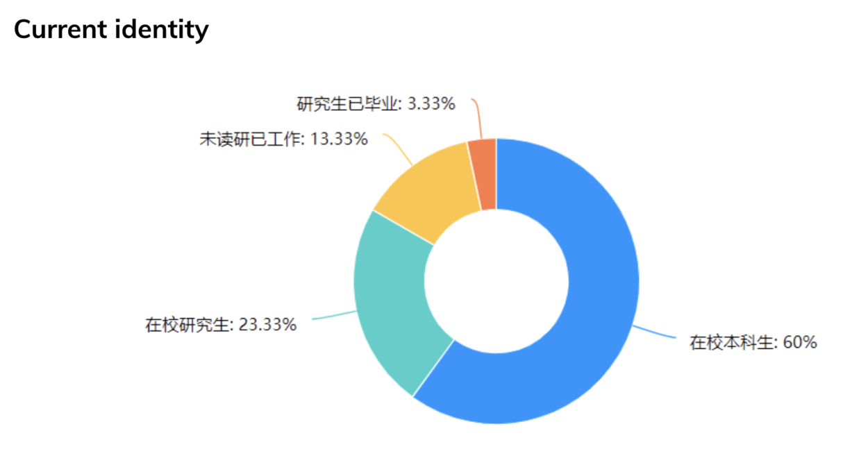
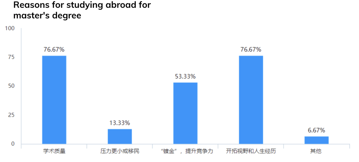
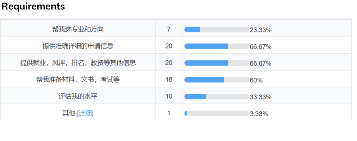
Based on the results of previous market research, our questionnaire puts forward the main ways to obtain information as a participant, the reasons for choosing to study abroad, and whether relevant software and intermediary services have been used. Through the feedback of 76 participants, we found that most of them were college students or graduate students. They pay more attention to the quality of studying abroad and enrich their own life experience.
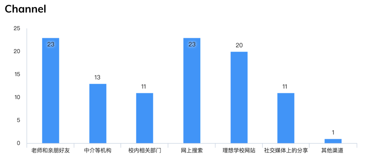
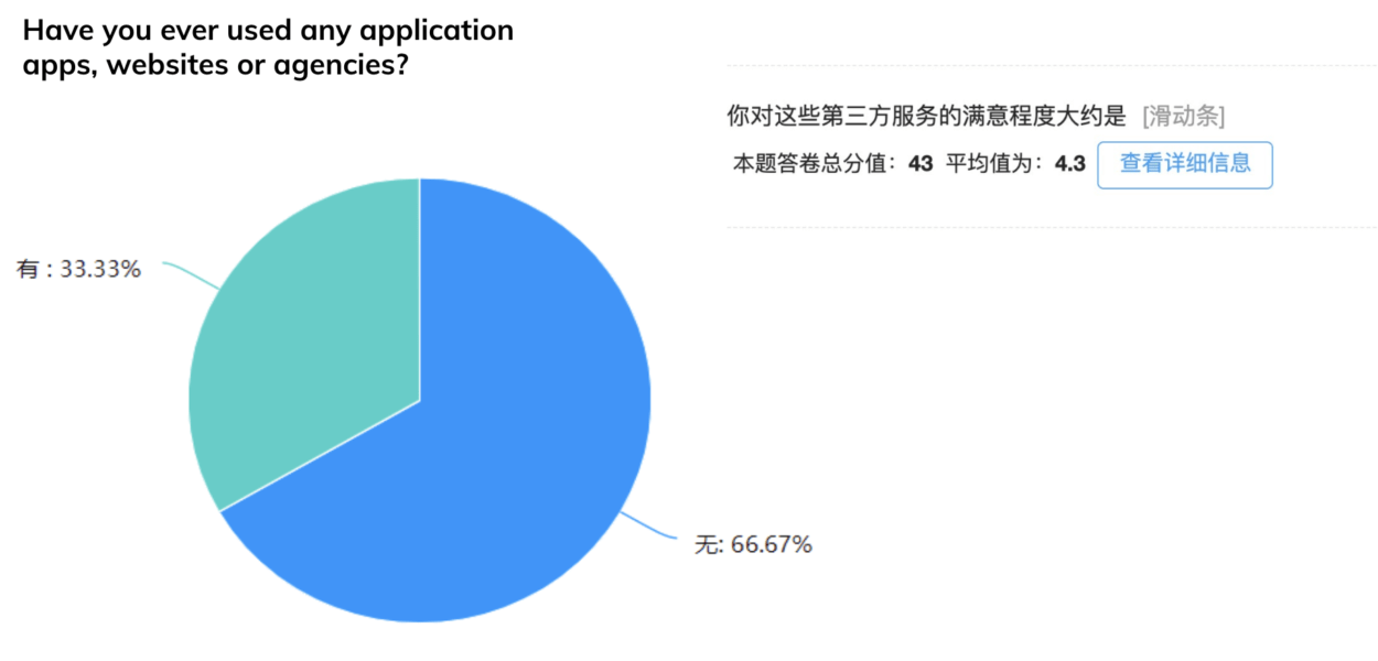
However, in China, the channels for obtaining information are not professional. Generally, information is collected through friends around and searching on the Internet without the help of relevant practitioners. Only one third of the people have sought advice from professionals. They prefer to have a professional institution to provide more detailed information, materials and self-assessment required by the school.

Interview

For the interview, we wanted to get the widest possible range of perspectives from our potential audience.  Therefore, we conducted six interviews from an undergraduate student, a university professor, and a graduate student.  Each interview was roughly 30 minutes and contained 21 questions.  After the six interviews, we used dovetail to find trends in what users wanted and also potential pain points.  We compiled all of these keywords into a word cloud and were able to get a visual representation of the most repeated points that our interviewees brought up.  These were a lack of resources, too much time spent on searching, and a feeling of being overwhelmed and lost.

Pain points

Searching for graduate program information is too time-consuming,  inefficient, and overwhelming for applicants.

Persona

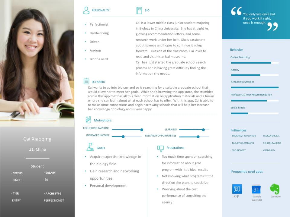
Cai Xiaoqing

  • Cai is our hardworking undergraduate student persona.  She is a lower middle class student who dreams of going to graduate school and fulfilling her dreams of doing biology research.  However, she is concerned about the expensive price of using an agency to help her look for schools and put together an application.  Her own efforts to find suitable schools for her needs have yielded few results, especially as she is not yet sure where she wants to specialize in the Biology field.

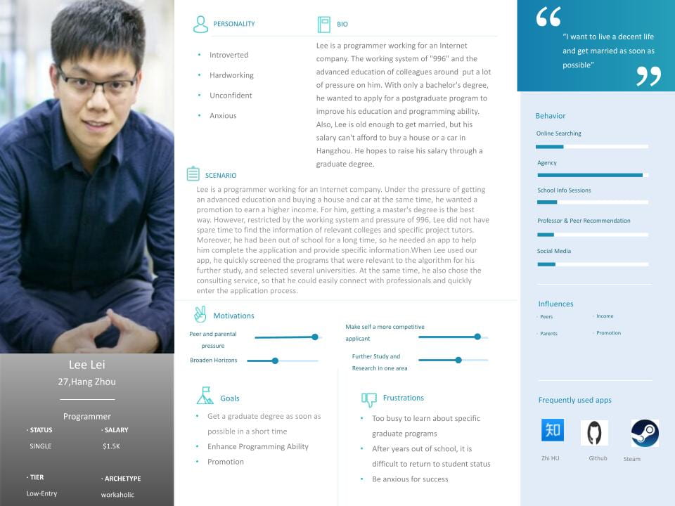
Lee Lei

  • Lee is a programmer working for an Internet company. Under the pressure of getting an advanced education and buying a house and car at the same time, he wanted a promotion to earn a higher income. For him, getting a master’s degree is the best way. However, restricted by the working system and pressure of 996, Lee did not have spare time to find the information of relevant colleges andecific project tutors. Moreover, he had been out of school for a long time, so he needed an app to help him complete the application and provide specific information When Lee used our app, he quickly screened the programs that were relevant to the algorithm for his further study, and selected several universities. At the same time, he also chose the consulting service, so that he could easily connect with professionals and quickly enter the application process.

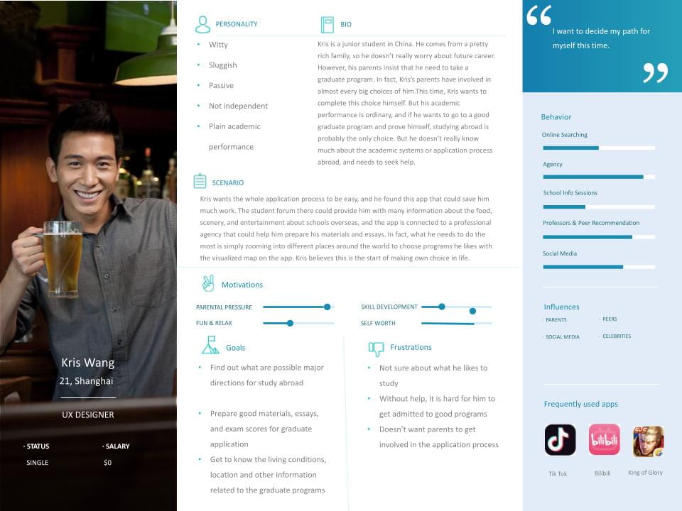
Kris Wang

  • Kris is a junior student in China. He comes from a pretty rich family, so he doesn’t really worry about future career. However, his parents insist that he need to take a graduate program. In fact, Kris’s parents have involved in almost every big choices of him.This time, Kris wants to complete this choice himself. But his academic performance is ordinary, and if he wants to go to a good graduate program and prove himself, studying abroad is probably the only choice. But he doesn’t really know much about the academic systems or application process abroad, and needs to seek help.
  • Kris wants the whole application process to be easy, and he found this app that could save him much work. In fact, what he needs to do is simply spending 15 minutes a day choosing he likes among the programs which the app recommends for him. Kris believes this is the start of making own choice in life.

Core Task

Provide graduate program applicants with accurate, comprehensive, and accessible information to help them find the program best suited to themselves.

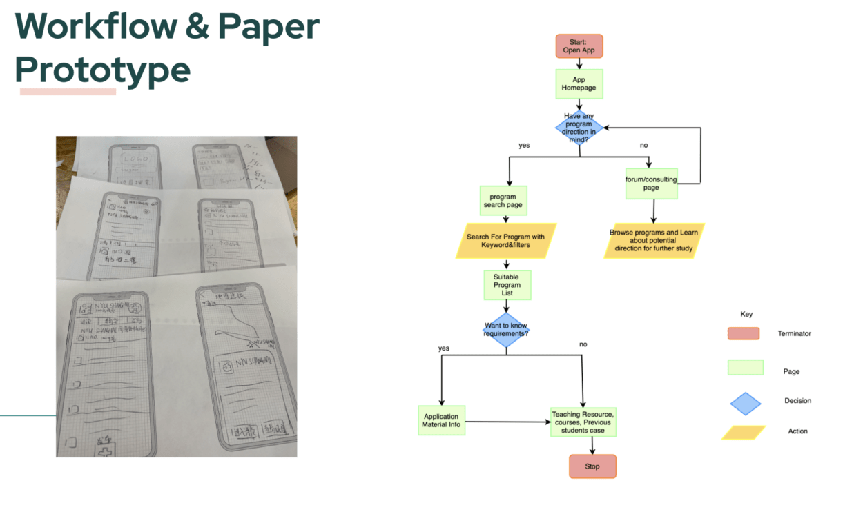
Paper Prototype

First Draft Prototype


User test

We got a lot of feedback including:

“Needs more information sections, such as sample courses, application deadlines, and alumni status.”

“The interface is a bit confusing. Why does the map and the program keywords search need to be separate?”

“The logo looks too big on the homepage”

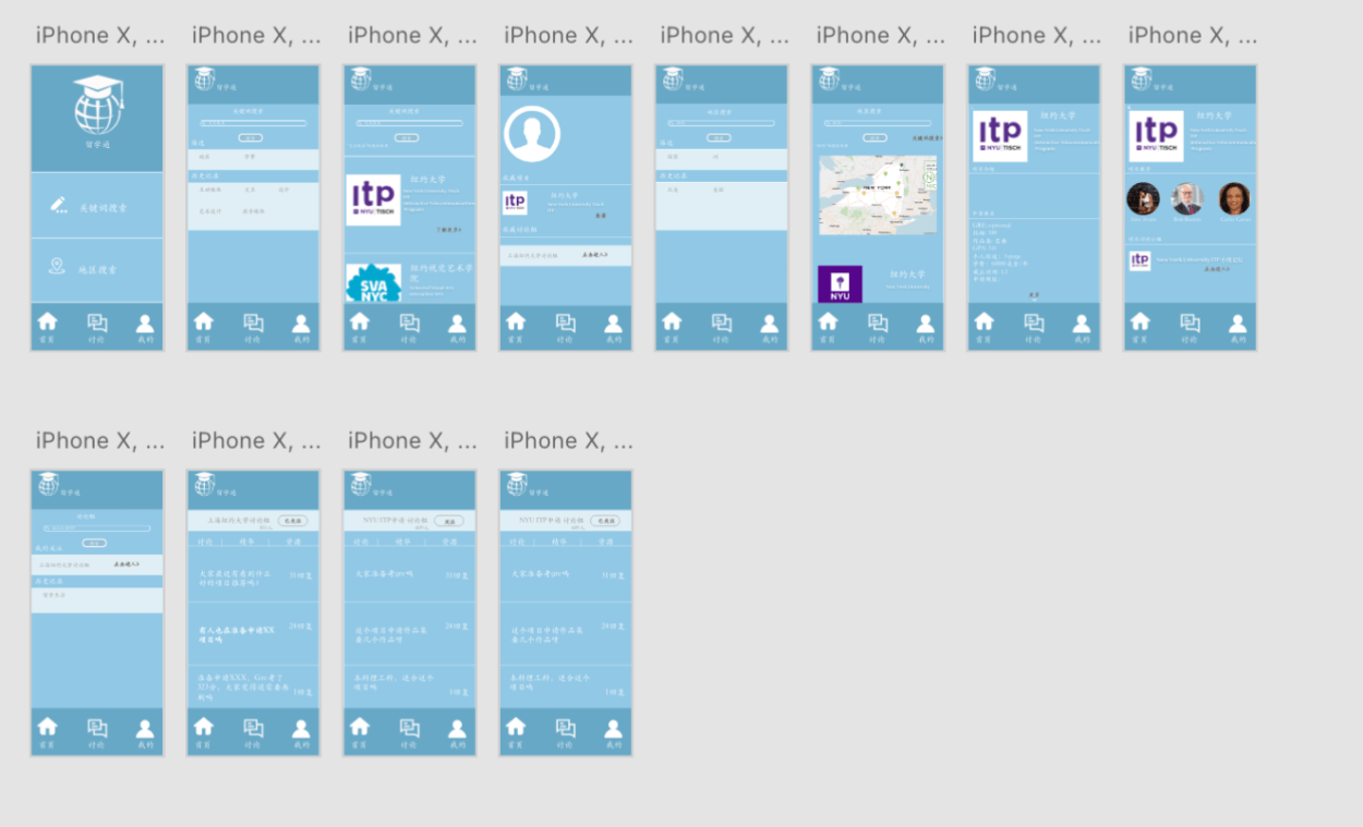
Second Draft Prototype

Focused Solution

  • From the user test and class feedback, we realize it could be distracting for users if we just simply add multiple functions to the app. So we decided to really focus on solving one pain point, and after analysis and discussion, we concentrated on the hard searching process and tried to provide help.

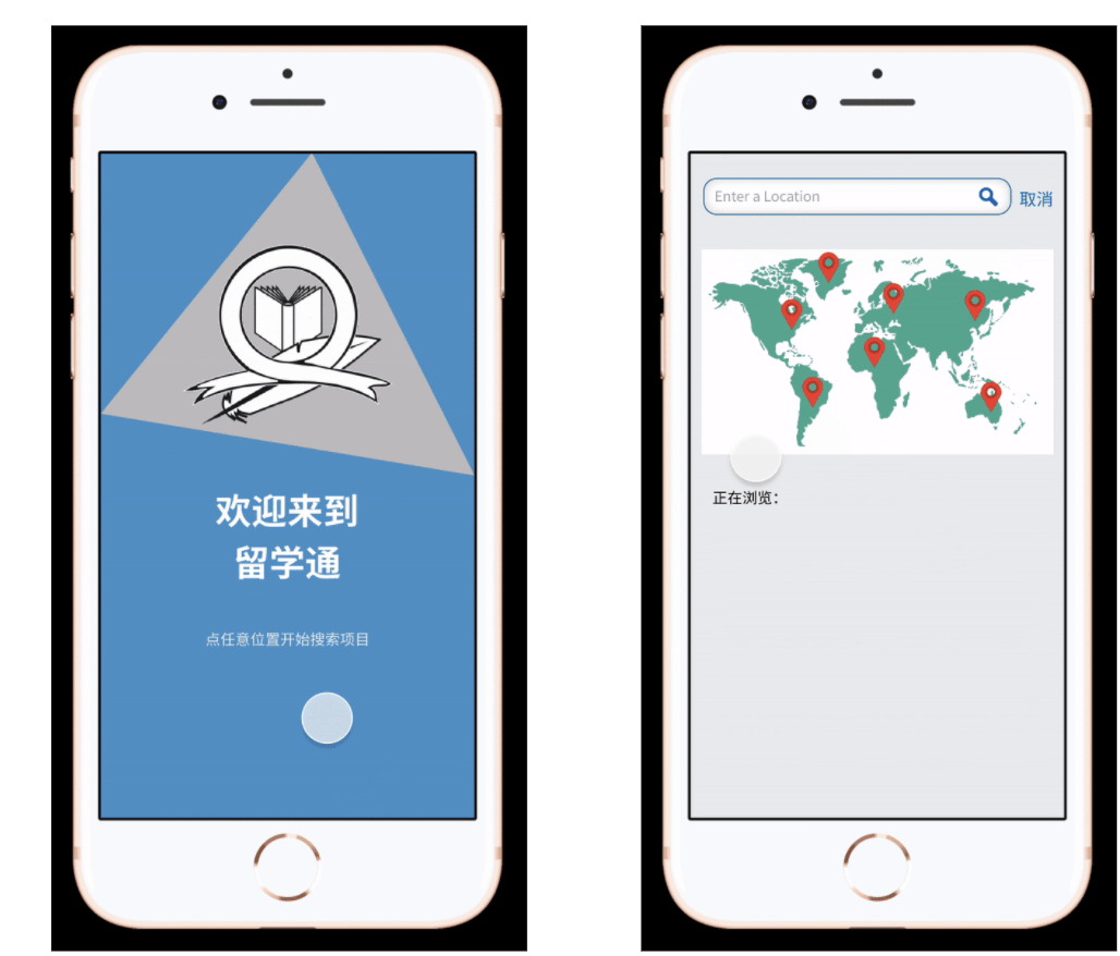
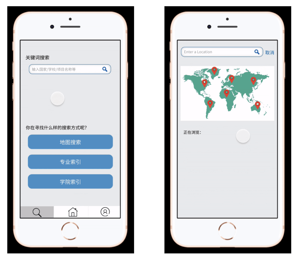
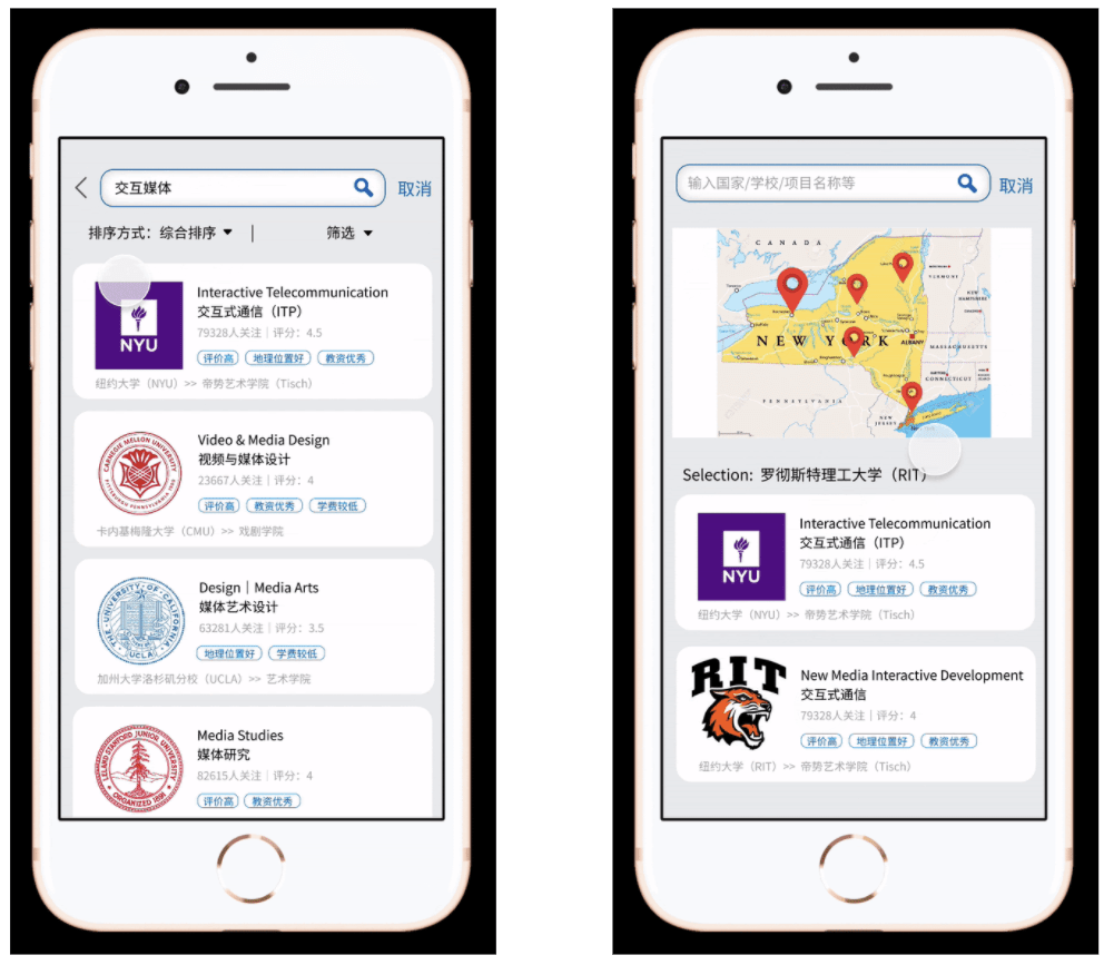
Map Search

  • The map search function allows users to find a school by interacting with a map.  They can tap on an area on the map and it will zoom in and display a list of schools in said area as well as a map marker for each corresponding school.  Users can tap on the map markers to find out which markers correspond to what schools.

Keyword Search

  • Keyword search would be the most powerful search method, as we would give all programs multiply tags to match users’ keywords. With these tags, the search would be more accurate and the users and better compare different programs. Also we would provide various filters to satisfy different search needs.

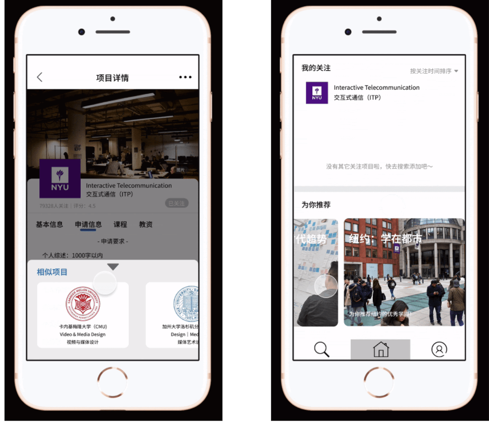
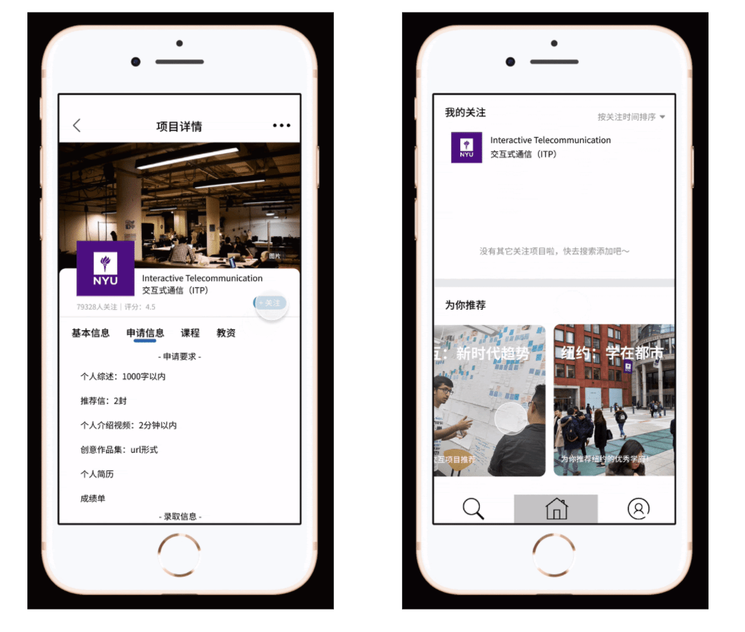
Detailed Information

  • In order to solve the pain point, we would offer very detailed information about programs. We have prepared information including requirements, courses, professors and etc. that are urgently needed by applicants according to our previous research.

Easy Access

  • One feature of our app design is that you can easily get access to the information. So besides simple search, you can also simply review the information once you add the program to your list.

Smart push

  • In order to save user’s research time, we would provide smart recommendations for them. So you found one good program, you found them all. The recommendation would be based on the programs in users’ list and users’ information, so the more you use, the recommendation would be more accurate.

UXD Documentation–Muse

Overview

Our project MUSE is an app gathering information about museums and exhibitions. It aims at providing accurate and comprehensive information. We provide users with a personalized tag-based classification system to help them find exhibitions instantly. For example, we have a tag called kid-friendly so parents who want to take their children to visit museums could select this tag and find educational exhibitions easily.  We place the focus on the visual information of exhibitions such as pictures from the official website to increase the credibility of the source.  In order to avoid being cheated by the over beautified pictures, all the photos on the introduction page are from official resources, and there will be the area of the museum in square feet and probably the amount of the collections to make up the limit of the picture.

Inspiration

The project idea actually originated from a personal experience. One day my friends and I were talking about going to exhibitions during the weekends, and they came up with several interesting exhibitions, but I had no idea what these exhibitions were and how they got the information. So I just nodded and agreed on the exhibition they finally chose. After several discussions with my group members, we found that it could be a universal problem for people finding an exhibition.
Market Research

According to the 2020 China Art Museum Industry Analysis Report, the number of visitors in 2019 was 41.36 million. The report also predicts that the number of visitors will continue to increase in the coming years as China recovers from COVID-19. On the one hand, this tells us we have a large potential user group as well as the exhibition-related app has a promising future. Then we conduct further market research, through our investigation, although the potential user group is huge, there are few apps providing users with a good channel to the exhibition. Compared to the total 41.36 million visitors, in 2019, the museum-related app with the largest user base: iMuseum has only been downloaded 586,123 times, counting for only 1.417% segmentation of the potential users’ group. This means the competitors’ rivalry is weak and is relatively easy for us to enter this market. Thus, we decide to create an app targeting museum visitors. 

Competitor Analysis

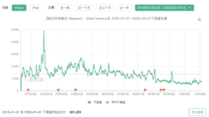
To know more about our competitor iMuseum, we analyze its download time in 2019. At first, we thought the decrease in download times was because of the virus. Surprisingly, we found that in 2019.2, iMuseum suffered a sharp decrease in download times. This is before the COVID-19 so the loss of users is caused by other factors.

To study why it fails to engage a large user group, we go through the user review in-app store during that period. We notice two issues. First is users sometimes lost in the wide range of information. iMuseum provides users with information, but they lack a good filter for the user to select. To improve their shortage, we design the tag function providing a user-friendly experience. If you are a mom, we provide a kid-friendly tag. If you are an office worker, we provide weekend-open and open-at-night options. Our slogan is “whenever you use our app, you can find the exhibition we like”. The second weakness is its pictures and text are separated. Users mentioned although there are a lot of photos, there is no text introducing the exhibits in these photos. To improve this, we integrate text with pictures helping users know more about the artifact. Our tag function and visual design are where we stand out.
Survey

Next comes the survey. We did a two-round survey. In the first-round result, the pinpoint was revealed again. First, visitors want to see the exhibition but cannot find the exhibition they want to see, because the exhibition information is too scattered. And again, we confirm the user’s need that 83% of them wish there can be a channel where they could find a summary of exhibition information. Second, they also hope the app can provide a credible but also easy-understanding guidance of the artifacts.

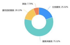
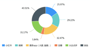
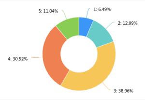
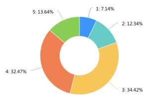
In the second-round survey, we collected 138 results. After information Integration, we found three problems. The first problem is the fragmentation of exhibition information. Official public IDs, self-published tweets, and friends’ recommendations all account for a large proportion of available information channels for users. This leads to the fact that users can only see part of the exhibition information in each platform, but cannot see the comprehensive information. Only 10.22% of users are quite satisfied with the existing platform. 60% of users feel that the content of the platform is not sufficient and some exhibitions cannot be searched on the platform.

To solve this problem, we decide to build a single platform to provide users with all the exhibition information. The second problem is users feel that the existing exhibition information is not that comprehensive enough. Because the existing profiles are mostly provided by a single channel, users respond that they need professional, objective, reference-oriented exhibition evaluation and introduction. Only 9.49% of users felt that the actual exhibition they saw was comparable to what they knew beforehand. Based on this, we intend to introduce the post function written by other users who have been to the exhibition before. This can provide more objective and comprehensive information about the exhibition for those who have not yet visited. The third issue is the classification and timely pushing of information. Only 14.49% felt that the existing search method could find the right exhibition quickly. We received feedback that information categorization is needed. We also received feedback indicating that information about exhibitions of individual interest needs to be pushed more actively. Based on this we decided to add a tag function and also alert users of upcoming exhibition information. 

How do you find the information about the exhibition?
What platform do you use to learn about the exhibition information?
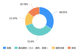
What kind of the information is inaccurate?
To what extent do you think the platform can provide comprehensive information?
To what extent do you think the platform can help find the information efficiently?

Interview

After the survey, we also conducted 17 interviews. 13 of them have a demand for/already using an integrated informative museum app, 9 of them have a demand for a more personalized/filterable museum app. Below are some representative comments from our interviewees. 

Person one: “就其实我主要信息来源也就只有小红书啊点评上关注的博主或其他去过的人的贴文,但关于展本身的信息比较少(或者没有)”

Person two and three: “查找信息费时费力,没有时间。会希望有更多资讯,可以推出人流量数据,避免人太多” “希望更私人定制一些,不要虚假宣传,照片能更有全面性”

Person four: “平常应该一个月去一次吧,公众号我不会常看,但有时间去搜寻信息的时候,常常找不到合适的。至于app的话,希望推送能及时,也能推荐附近的展。”

Again this echoes the three problems: fragmentation, incompleteness, and lack of classification of exhibition information. Based on these findings, we start our further development. 

Iterations:

I–an application that integrates and categorize exhibition information

Based on our first round survey result and interviews, we came up with the conclusion that the pain point of our user lies in the fact that all the information about the exhibition is too scattered and sometimes not authentic enough. Building on our defined pain point, we came up with our first round solution– an application that integrates exhibitions from all sources (both the official channel and visitors reviews). In addition, since our target users don’t want to spend so much time on searching for exhibitions, we want to categorize the exhibitions properly so that they can find an exhibition that caters to their needs within several clicks.

II–in addition to integrating information, having precise tags to be more personalized.

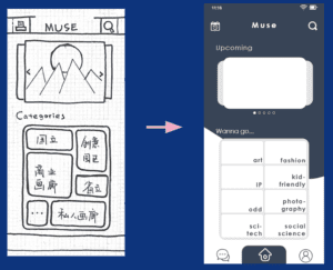
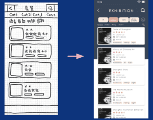
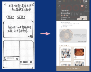
After doing several rounds of user testing, we realized that the categories we originally defined were not user-friendly enough. Originally we were using conventional categorizing methods (solo/collective/retrospective exhibitions). Unfortunately, the users had no idea how to continue with them. After conducting and reviewing our second-round survey result, we found that what users think of when searching for an exhibition to go is actually the theme of it rather than the type. To categorize the exhibition that fit their needs, we searched for all the exhibitions on display and categorized them by themes( such as art/sci-tech/kid-friendly). In addition, to also shorten the time searching, we added a filter function that can filter by tags we defined that fits the need of our target users (open at night/on weekend). We also worked on the description page so as to make it simple enough for the users to make decisions quickly.

Nonetheless, since we skipped the low-fidelity digital version and turned to relatively high-fidelity one right away, it seems that we have been focusing too much on the detail of interaction rather than the general user flow itself. For the next iteration, we will conduct a new round of user testing so as to identify frictions within our current design.

Further Development

  • Modifying home page (simple and clear)
  • Posts and Review section (to create a sense of community)
  • Confirm and enrich the tags of exhibition
  • Highlight terms that will help strengthen the understanding of the exhibition, and make the highlighted text clickable. 


Citation:

2020年中国美术馆行业分析报告-行业运营现状与发展趋势预测. baogao.chinabaogao.com/qikantushu/398090398090.html.