In my first group project, the Knowledge Transmitter 2.0, we came up with a product that would save time for students when they are preparing for a test in the year 2100. However, the device only has a low interactive level. It is mostly inputting knowledge (that will be forgotten very fast), or in terms of fiction, it projects a hallucinating storyline into the user’s brain without safety ensured. After the first group project, I wanted to use what we have learned in class and assemble it to be more interaction. To find an approach to making something more interactive, I looked back to the quote by Tom Igoe: “Your task in designing an interactive artwork is to give your audience the basic context, then get out of their way. Arrange the space, put in the items through they can take action, suggest a sequence of events through juxtaposition. If you want them to handle something, give it a handle…”(Igoe). After looking at the interactive guitar course by Fender “I Spent a Month Learning Guitar on the Internet and It Actually Worked”from my previous project, and looking in to the various uses of a high interactive device:the Nintendo Switch, I realized that games and gaming devices are probably the most interactive among all products. With this idea in mind, in our project “Don’t touch me”, Kat and I aimed to make a simple but fun and addictive gaming device, and the users would immediately know how to react and interact with it.
We got the idea from a simple buzz wire game by Joe Coburn on Make Use Of. The game has already been made by many people, but they were all similar.
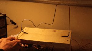
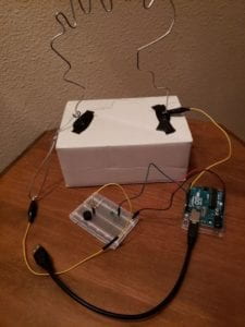
We wanted to make our own version of the game. At first we thought about adding another track to the game so two people would be competing, but eventually, we chose to make the game into a collaborative game so two players would be holding two ends of the stick, and they would have to balance out each other’s force to be successful in the game. Our project is made for everyone to have some fun in their lives, to relax after a tiring day by focusing on a simple task, or for those who would like to train their patience and ability to focus. During the user testing session, someone pointed out the the game is also good for couples to have some quality bonding time. As I wrote previously, our device is designed to be intuitive. We wished that people would know what to do with it immediately when they see it. We don’t need a fancy setup to achieve that. We took a pair of chopstick, something we would hold with our hands, to indicate that they are two handles. We had proposed to use 3D printing for the handles, but we weren’t so confident about the result would have people immediately realize that it is for their hands to hold. For the best results, we kept the original idea. A little ugly, but useful chopstick handles. We made a simple cardboard base for the game’s course, and used a metal wire for the course and the stick with the loop. However, if we got the idea earlier, we should have changed the cardboard base to a laser cut base to make the presentation better. Apart from that, I think the rest of the materials we chose suits the goal of this project.
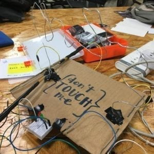
The making of the project actually took some effort. We did not want to completely copy what was made in the existing buzz wire games. After building the game with a simple buzzer that would make a noise as the player let the loop and the course contact, there was also an LED that functions as a timer that indicates the player only has one minute to complete the course. When the time finishes, the LED turns off.
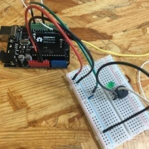
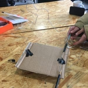
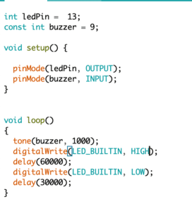
After the framework of the game was set-up, we tested it with a sample code we found online.
As we put our project to the User Testing Session, the wires connecting the handle and the buzzer got loose, so for parts of the user testing, we didn’t receive feedback from the buzzer. This happened so we soldiered the all the connecting points that might get loose after user testing.
We received many feedbacks during the user testing session. Here is a list of all the feedback we received. 1. We could have a victory music played as the player finishes the course successfully. 2. We could have different ringtones as the player touches the course. 3. At each place on the course, there could be a different musical note. 4. There is a possibility that if the player touches the course, they would get shock. 5. People thought it was obvious what to do with the game without us explaining the function, but they wouldn’t realize that the LED is a timer. The LED could blink faster. 6. Maybe there can be feedback in multiple ways. 7. There can be music playing along the course. But later I asked someone else whether they would like to have music while they are playing, they responded that for this game, they would rather focus without distractions. 8. The shape of the course should be more complicated.(x2) 9. Something that tells you that the loop shouldn’t touch the course.
After considering all the feedback, we added another LED that would blink each time the loop touches the course, and we set up an indicator in the serial monitor that writes: “Hit! You lose!” when the player touches the course. We also got the LED timer to blink faster as the player has less time. After the user testing session, we also changed our code to make the LED blink faster and faster as the time is up with a new code.
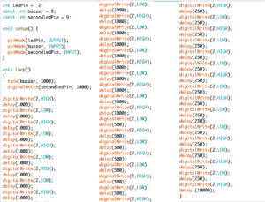
Then after consulting fellows, we found a better way of making the LED blink faster with the “millis” function. So here is our final code

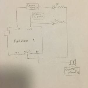
During the User Testing Session, we realized the position of the LED was not so obvious. We tried many times of positioning the LEDs so they would be more obvious for the players to see. We tried different ways of directly putting the LEDs on the cardboard without showing the breadboard and the wires, and we tried to have the LEDs pierce through the cardboard. But none of those worked. So later we changed the LEDs to a smaller breadboard and attached them to the cardboard base. Sadly we did not get the
music related ideas into the project, and we didn’t add the shock onto the handles. But I think the other suggestions for our project worked well as we implemented them into our project.
In the end, we added a laser cut plate stating the name of our project on top of the game for a little decoration.
From the ways other people saw and used our “Don’t Touch Me” game, I know that the set up of the game can clearly tell them how this game works. However, there are different approaches to the game. Some groups would start all over when they touch the course, and other groups would continue with the course despite touching it. I think our project is successful in indicating how it is used, but it is a little weak on actual responses once the players started playing. All users immediately held the handless they first see the game, and the unbearable buzzer noise can let them no that they should avoid making that noise. But some users would hold the two handles by themselves and turning this into an individual game, while others would find a friend to play with them. If we had more time, I would definitely put the victory music in, and maybe a vibration to the handles when users touch the course. This project made me realize that anything that seems simple is actually not that simple. In defining interactivity, I wrote that games are the most interactive forms of art. Our project took a basic concept in the use of Arduino and made it into a more interactive game. Our goal was to create a bonding experience in which two people would collaborate for their common goal, try get to the end of the course without touching it. There are still a lot of room for improvement. We could hide all the wires so the presentation looks better. We should have put in the victory music so the players have a goal to finish the game. The reward and punishment mechanism Making it into a racing game with two players is also a good idea since it makes people competitive and thus care about focusing on the game more. It was still satisfying to see people interacting with the game without us telling them how the game works.
References:
Coburn, Joe. “Make a Buzz Wire Game With an Arduino.” MakeUseOf, 21 Sept. 2016, https://www.makeuseof.com/tag/make-buzz-wire-game-arduino/.
Igoe, Tom. Making Interactive Art: Set the Stage, Then Shut Up and Listen. 21 Aug. 2012, http://www.tigoe.com/blog/category/physicalcomputing/405/.
jlskala319. “Buzz Wire Game With LED Timer for Arduino UNO.” Instructables, https://www.instructables.com/id/Buzz-Wire-Game-With-LED-Timer-for-Arduino-UNO/. Accessed 27 Oct. 2019.
Rosenthal, Emerson. “I Spent a Month Learning Guitar on the Internet and It Actually Worked.” Vice, 10 Aug. 2017, https://www.vice.com/en_us/article/433y3n/learning-guitar-on-the-internet-fender-play.