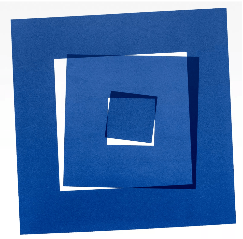
In recitation 6, I chose to imitate carré coupé en 3 by Vera Molnar, and I was impressed by its depth in meaning but simplicity in presentation. This piece for me is what I believe a modern art piece should offer – leaving room for imagination and individual interpretation with the minimal elements.
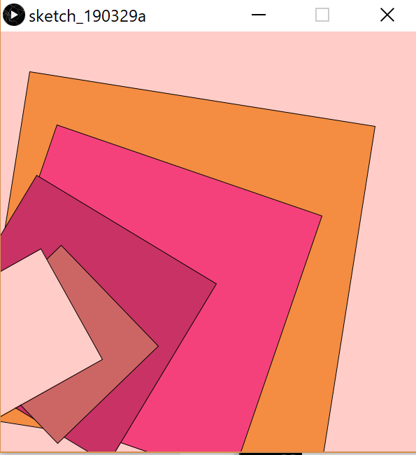
While doing the process of imitating, I decided to do a little adjustment rather than sticking with the original look. I wanted to have a strong presentation of fading and fissuration and switch the color. Coding was a bit more difficult than I expected, especially locating the rectangles while rotating it, and I spent quite some time in addressing this problem.
I knew mine seem a bit simple comparing some of my peers’ work, but I am quite satisfied with I came up with acknowledging my way below average coding skills. It is not really a imitation of the original work, the art by Vera Molnar inspired mine. Mine is a bit rough compared to hers and does not really give the sense of internal fissuration but more a sense of moving.
Personally, I think processing could be really useful in creating modern art, especially in laying out color clashing and the aura of machinery. But to a certain extent limits human innovation, since the creation has to be in line with the coding logic.
size(600,600);
background(255, 204, 200);
fill(244, 140, 66);
rotate(PI/20.0);
rect(50, 50, 500, 500);
fill(244, 65, 124);
rotate(PI/18.0);
rect(120, 100, 400, 400);
fill(200, 50, 100);
rotate(PI/15.0);
rect(150, 150, 300, 300);
fill(204, 102, 100);
rotate(PI/12.0);
rect(280, 150, 200, 200);
fill(255, 204, 200);
rotate(PI/12.0);
rect(300, 100, 180, 180);

