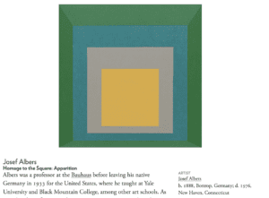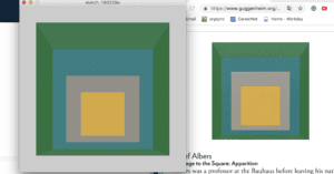
As a beginning learner for processing, I am not capable to draw some complex images in a short time. Hence, from the very beginning, I want to choose a work that is not overwhelming for me, at the same time, is also challenging. The image called Homage to the Square: Apparition from Josef Albers becomes my final decision. In the work, Albers uses the square as the basic element. With oil color applied from the white panel, audiences can see the harmony of color and shape in this painting. Besides the artistic taste, another reason why I choose this image is that I am able to practice all the new knowledge that I have learned from the class, including drawing a certain shape, filling color, marking position, and removing the stroke. I can apply all the functions and code that the professor has taught during the class and digest them in recitation.


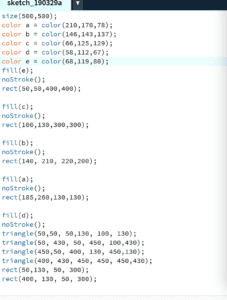
First of all, in this painting, the outside square has two different colors because there are some places with darker color which look like shadows in the painting. These darker areas make this image more stereoscopic. However, I can only draw different shapes and color to achieve this sense of stereoscopy instead of actually drawing shadows. Hence, I decide to separate the rectangle into two tangles and a smaller rectangle, then remove the stroke and fill them with the same color. By doing this, I can keep the original design as much as possible.

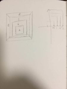
Then the second step is calculating the size and position coordinates for every circle. In order to ensure that every square is located in the middle of the other one, I have to calculate the specific number of their coordinates. I do not know which code or function should I refer to, hence, I just all calculate by myself then enter the number to the processing. The last step is to decide the correct color for every shape. It is impossible for me to identify the three codes of color by simply watching them. I should find a more reliable method to pick the color. I end up using the application called “Digital Color Meter” which can read the exact number of the color mode.
However, after finishing drawing the image, I realize that color is the biggest problem that I may not be able to solve. The original work is an oil painting, and I can see the trace of the pigment on the canvas. In other words, for the original painting, color is not perfectly stable and uniform like what I draw on the computer. Moreover, the color of the original painting is also randomly distributed, which means there is no way for me to draw different shapes and then fill them with different colors. Comparing the Homage to the Square: Apparition with my drawing, people can easily distinguish which one is the oil painting and which one is the digital work. Even though I can make all the shapes and sizes perfectly match with the original work, as long as I cannot solve the problem of color, there is a huge difference between my drawing and the original work. I then ask the instructor for help wondering whether this problem can be solved by applied another function. The instructor tells that I have to learn another advanced code called Perlin Noise which is always used to deal with the problem of color. This function is without any doubt the most complex code I have ever seen so far. I try to understand it by analyzing the example code from the website, however, in the end, I still fail to apply it in my work. I think if I am going to use processing to draw in the future, how to make color more natural is definitely one of the most important learning I have to learn. Additionally, this is also very important to make digital images more acceptable and have more sense of reality.
Works Cited
“Homage to the Square: Apparition.” Guggenheim, 20 Mar. 2019, www.guggenheim.org/artwork/173.