Project Name: Button, No?
Project Members: Sam Li & Amily Yang
CONTEXT AND SIGNIFICANCE
Our group research project helps me understand interaction as a process in which one or more human actors engage in reciprocal exchange of information with other human beings, objects, systems, or the outer environment. We researched interactive projects like the Expressive Tactile Controls and the Eye Writer project.
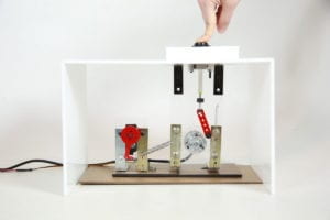
Both projects made me realize that interaction design creates human experiences that are not simply visual, never spectatorship in one direction. It’s mutual and reciprocal, in which multiple senses of the human bodies are stimulated and engaged. For instance, users interact with the “Expressive Tactile Controls” project by touching various kinds of buttons and receiving diverse kinds of responses. The enjoyment of this project is not about watching a video of how the buttons respond in different ways, but rather being able to experience and feel movements of the buttons, to observe the changes and react emotionally to the project.
Inspired by our group research project and my interest in fine arts, I came up with the idea to use arduino and electronic components to create a new type of interaction with exhibits in an art space. Suppose one walks into the Guggenheim in New York or the Rockbund Art Museum in Shanghai. The experience interacting with art objects and spaces can be intimidating or even uninviting. By the unspoken norm, you sort of knowing that you’re not supposed to touch anything, speak too loud, or act crazily in a gallery or museum space.
You should look, but not too closely. The appreciation always comes with a sense of awe and a mystifying aura surrounding the objects. With what we learned in Interaction Lab, I cannot help but wonder: what if I can re-imagine the experience interacting with an art object, one that makes the audience touch, feel, and even laugh and rejoice. Therefore, the user archetype of the project is the general public interacting with an art gallery or museum space. At this point, my teammate and I had some preliminary ideas about 3D printing some kinds of art objects, maybe an Ancient Greek sculpture or a piece of Chinese jade, in order to reshape the interaction between the audience and fine arts objects.
CONCEPTION AND DESIGN
The initial design concept is to create the context in which an art object is exhibited in a gallery or museum setting. Through researching how art objects are exhibited in museums, we were also wondering if we could mimic and make fun of those museum signs which say things like, “DO NOT TOUCH”.
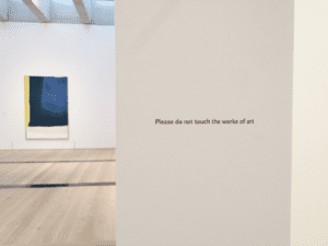
We hoped to use sensors through which the visitors can interact with the art object beyond simply observation. Our intention was to design an interaction between the users and an object, which is visually compelling, easily understood, and tacitly humorous. Our desired outcome is that when a user interact with the the object, the person is able to laugh at it; users will “wow” when their interaction with the piece creates unexpected but funny outcomes; the piece sparks dialogues between the users. René Magritte’s painting, “The Treachery of Images,” immediately came to mind as I was looking for an art piece that has a tacit sense of humor. This surrealist painting is composed of an illustration of a smoking pipe with a line of French at the bottom, saying, “This is not a pipe”. If executes well, the users will get the tacit joke/reference and they are able to rethink the Rene piece in different way.
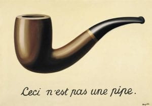
After discussing with my teammate Amily, we decided to mimic Magritte’s painting but add in more interactive elements that we’ve learned in the class. The basic idea is to mimic Magritte’s painting by 3D printing the pipe and shown as an art exhibit (Source of the pipe 3D printing model).
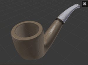
We thought about putting a pressure sensor around it, so that when users touch the sensor, the pipe might light up with built-in LEDs. Because the pressure sensor was extremely not sensitive, we tried to place a heavy magnifying glass on top of the pressure sensor, and the removal of the magnifying glass will trigger the sensor. However, it did not work out as well as we imagined. We were also thinking about distance sensors or temperature sensors, but none of those worked out nicely, as it was hard to anticipate where exactly will the users touch the object, or which exact spot should we place the sensors.
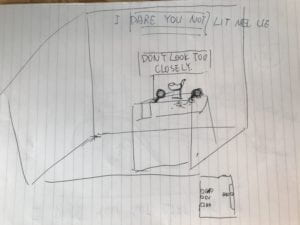
FABRICATION AND PRODUCTION
Initially, we built the circuit with a pressure sensor connected to the arduino board and two LED lights. The initial design was when user press the pressure sensor, the LED lights will be on (light up the pipe!), else they will be off. Because the pressure sensor was extremely not sensitive, we decided to try some other kinds of sensors. With help from Professor Parren, we realized that a big button might be a visually compelling sign suggesting ways for users to interact with the piece. I got a big red button from the Shanghai Electronics Market.
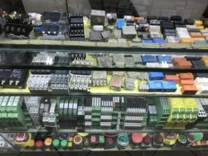
We built the circuit connecting the button switch and two LEDs. Our code was simply when someone presses the button, the LEDs will be on. When one presses the button again, the lights will turn off. We placed our circuits inside a neat cardboard box, showing only the pipe and the big red bottom for the users. To make jokes about those intimidating signs in museums, we put a sign saying, “I DARE YOU NOT TO LIT IT UP”.
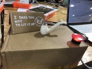
Video Link: First generation of Button, No?
We did some preliminary user testing with people at the IMA lab the night before our user testing session. The feedbacks we heard were both frustrating and revealing. People told us that the signs seem to suggest that they could not touch anything. Some others also told us that they were expecting more unexpected things to happen after pressing the button. The most revealing findings was that our first prototype failed to create the sense of an art object as we originally imagined. Based on the feedbacks, we specifically changed the way our object is presented to the audience. I used cardboards to create a painting frame and decided to write something on it, similar as Magritte’s piece. We also wrapped the box with some white papers, making the display more elegant. The object was then contextualized in front of an art frame, with captions saying, “This is not a button-triggered pipe.” We also changed out code for the LEDs. The lights will be on continuously after pressing the button.
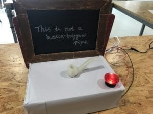
Video Link: Second generation of Button, No?
On the day of our user testing, the piece turned out nicely because most of the users got the idea that our piece was presented as an art piece. We observed how the users interacted with our piece and heard from their feedbacks. It was interesting to observe how some users immediately tried to touch the pipe or the box, without getting the meaning from our caption or trying to press the button. These are usually the people who did not know about the Magritte painting in advance. For them, our piece was confusing because they did not know what to do or expect from the piece. For those who had seen the Magritte painting, our piece provoked laughters, and they interacted engagingly with the button. Our users suggested that we could perhaps changed the caption and make it more comprehensible; others also suggested that we make more changes in the LED lights, create sounds or even smokes, if possible.
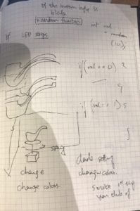
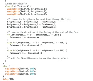
Over the weekend and Monday, we used laser cutting to create a nice wooden box, painted in white for display. We also rewrote the code for the LEDs. We added one more LED, used the …. code, so that the brightness of the lights will change constantly, creating the effect of a blaming pipe.
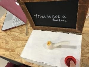
Video Link: Third generation of Button, No?
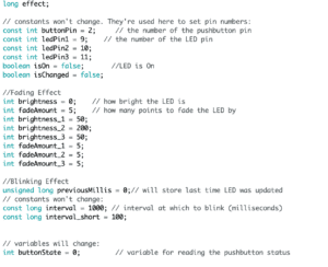
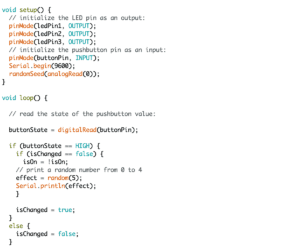
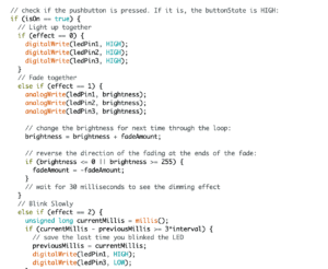
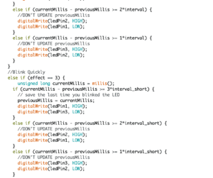
Here are the sources we resorted to for our code. (millis function, blink finction, fade function, fade in sequence) Screenshots of our final code are attached at the bottom of the blog post.
CONCLUSIONS
On the day of our midterm presentation, it was happy to hear that people in the class understood the context we created for this interaction, and it was funny to observe how the users enjoyed pressing the button constantly. The tactile experience and the reciprocal response from the pipe were indeed powerful compared with visual interrogation in front of a static painting. Our design intention was to create an interaction with art objects that is more inviting, engaging, and amusing. Our project was able to make our audiences “wow” when they observe the reciprocal responses from the LEDs, and the experience interacting with an art object was an engaging and amusing one. However, it could have been more desirable if we could borrow a speaker and created some sound effects, or that we could better engage audiences who have not seen the Magritte painting.
My biggest lesson learned from the project was definitely the value of rapid prototyping and iteration in the design process. It was through constantly receiving user feedbacks, iterating and improving our project that we landed on a much better project than what we originally started. I learned that if I ever have a great idea, share it with others and hear other’s thoughts or feedbacks. Ideas built upon each other. Most importantly, if there’s a great idea, do something about it. Make something, even just a scrappy prototype. The prototyping process helps to communicate my ideas and challenge taken-for-granted assumptions.
The project also made me rethink my own relationship with art objects as a viewer, and as a creator. Our project was intended to better spark dialogues between the audiences and the object, between people, and between people and the situated space. The audience was no longer spectators passively receiving information from static art pieces, but instead active users constantly shaping, changing, and interpreting the messages they reciprocally exchange with the piece. Hopefully, our project has sparked such dialogues between our users and our art piece.
Appendix: Screenshots of our final code (LEDs blink in sequence)
