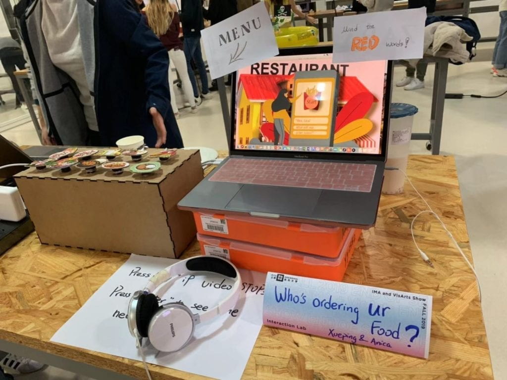
Codes: Arduino + Processing
We wish our users do not interact with our project simply by clicking some buttons only but get more involved and think during the process when they are interacting with it. Therefore, we add more sensory experiences during the interaction to get users more focused and interested. Images, videos and sound responses are presented with this aim. We also tried to choose or create images which are bright-colored and kind of animated so that they look more inviting. Movement of images during the third scenario about news both help attract attention and resembles how people encounter news that massive information show up and change all the time. We could have use more words or one simple scenario but we think that might become more responsive instead of interactive and users will lose interest. The mode that letting users go through three scenarios and make choices before teaching them anything makes results more convincing and provokes thoughts in this process too.
Video of the whole interaction process (shoot in the final show)
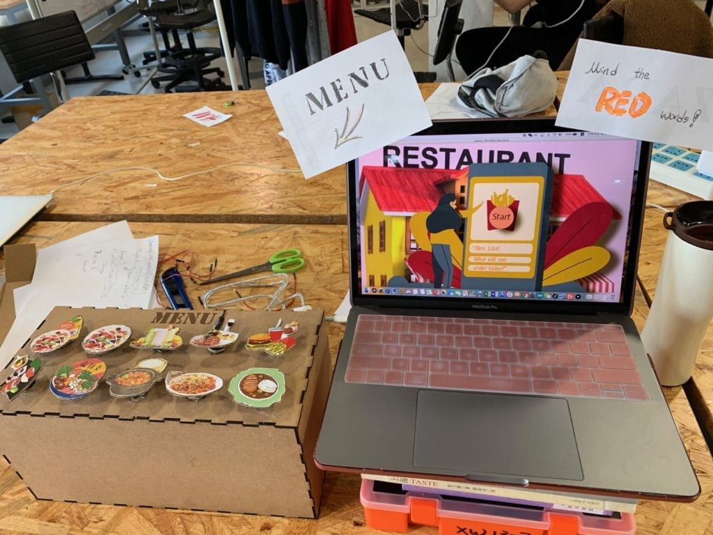
The most important part in our production is creating the three scenarios in processing and creating indications to tell users what they are supposed to do without being too direct. Since we want our users to make their food choice in a social context similar to reality to see how social media might have influenced their food choice so that they learn to be more aware in their later lives, we first let them choose dishes for a meal and then after being primed with video and news/advertisements, they are going to do the choices again. The menu is not made in processing but as fabrication also because we intended to make it look more like a real menu with images of the food combination which we assume can be more interesting and inviting. Nevertheless, since it is now a box-like thing, I personally feel it does not fit our plan and I do agree with some comments that maybe making it look more like a real menu or having other buttons all on this menu helps improving this project.
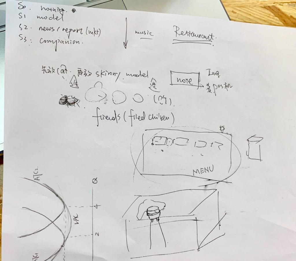
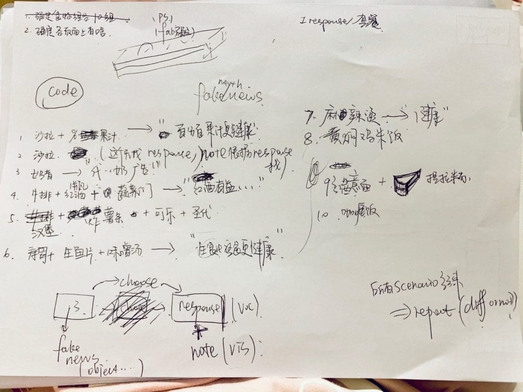
Our whole research & production process documented in doc
Because we spent too much time coding the third scenario and dealing with all images, videos and audios; we only have our third scenario for user test. We are very glad that most our users get the message we want to convey by this project before we explain anything to them. Their suggestion mainly fall into two categories: one is adding more instructions so they will not feel lost and the other is having a explicit feedback at the end. Although we already planned to do similar things, some detailed comments are really helpful. One advice we followed is to develop on the character Lisa we used originally for the front page only and to create a more conversational guidance so that all three scenarios are connected fluently as a full diet story of Lisa. The videos and “fake” news reports are also embedded into this story so users will not get a wired feeling why they need to do this before choice (since during the user test some users especially male users are impatient and skip everything they thought unnecessary before making their choice which ruins the experience and cannot get the whole idea of the project).
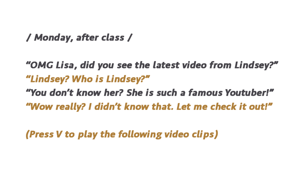
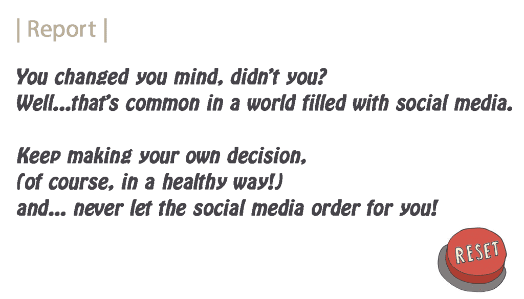
This adaption seems to receive welcomed feedback as now most users report they feel the whole experience makes sense and they are willing to go through this project scenario by scenario. It also resembles how people interact with social media in reality and makes them more aware next time when confronted with these information relating to food choice. We also complete our “report” session and inserts a reset button as response to certain suggestions we get from user test.
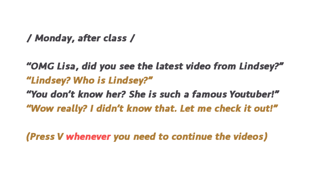
After we fixed all bugs in codes and are almost complete, we invited some of our friends and classmates to test our project again and there are still some confusions about which key they should press to continue and sometimes they get lost where the menu is so we change some of the guidance again with red words hoping users can see the emphasized part at least and put on notes to inform them again. However, as we have seen in the presentation, the effect is limited.
The goals of this project is to call for awareness that our current food choice is so easily influenced by all kinds of social media and information we receive no matter it is in form of live-streaming, Youtube videos, news, scientific reports; or it is in essence for educational purpose, for advertising purpose or purely recommendations. I have friends who are easily influenced by the fashion trends to be fit or by advertising articles about new restaurants or popular snacks so some of them develop eating disorders or have obesity problems. So I wish this project would help arouse awareness and awareness certainly affects decisions.
Our project overall align with my definition of interaction that it creates a personal experience since it is aimed to be used by a single person and his/her choices combined with the specific response considering those choices creates a unique experience for that user. And they need to take in various information and process different sensory experience into thoughts to make decisions. Something not so align with our definition of interaction is that we only involved buttons as a way to interact with the scenarios which is kind of a very simple physical interaction. We do wish more interesting ways of receiving information could be used such as having something similar to a POS to print out the result which is both interesting and creates the context of a restaurant too but that is hard to put into practice.
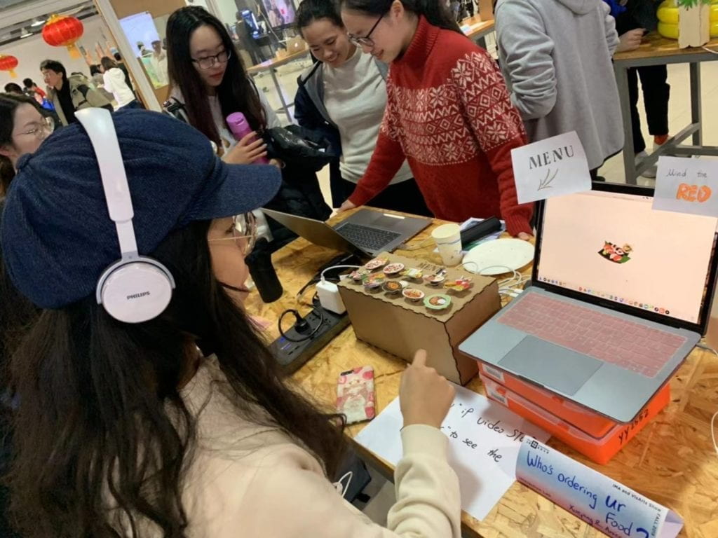
Nevertheless, we are still glad that during most user tests and in the presentation users can go through with the scenarios with interest and after their experience, they all give some feedbacks about their current feelings on the impact of social media. Most of people who change their choices after being primed by videos or news/advertisements report that they never realize social media has such influence on them. And we are also happy to see some people are not influenced by social media. For these users, they are also satisfied to see there are responsive feedback for them. Since our project does not aim at telling users what information are correct and what are not valid but to let them be more aware of all information that might change their choice or behavior in some ways, it is great to see different results but all get the expected reflection on their previous choices. I am also surprised to learn some stories from users who had been impacted by the exact news or advertisement we choose to include here (three users report to have used the SlimFast shake because of its believed effect). And I even get several feedbacks in the final show that suggest me to use this project to have a social research in this area.
If we have more time, first thing we would do is to fix the problem in instruction to be clearer and apparent. We might create some more buttons on the menu so there is no need to ask people to press certain key which is somehow confusing and we will try to make something really look like a menu. Another thing we have wanted to do is to change the third scenario to have two versions. Some people report in the user test that there are too many information and they lose interest in the long “lectures” of news. So we were considering to have two different ways to read the news, one is the detailed version which is the current one and the other is a brief “skim” version which has all the news and big titles moving while the voiceover will be a combined soundtrack with varied voices telling different news or slogans. The “skim” version will try to create the effect of a “explosion of information” to the user so that even if they are not patient to see the news one by one, they get the idea and some big titles. Also, if I have more time, I wish I could get the IRB approve and use this project as a device to observe and record people’s food choices after being primed with social media and research on this topic.
The most important thing we learn from the previous mentioned failures apart from coding is to think from the user side. Because of the fact that we are the people who have researched a lot in this topic and have a general knowledge what our project is and what is the aim, sometimes the “common knowledge” or “things easy to figure out” in our minds are not common sense at all for users which confuses them and make them feel lost what to do. Also an important thing is to target a specific audience group and keep that in mind while deciding certain interactive ways, the context where the project will be shown or presented is also something needs to be think of in order to create a coercive experience. But having a specific audience group does not mean they will perform or react in similar ways. We have observed how users interact with our project during the user test and be amazed at the different ways they interact. So if we do want everyone to behave in similar ways (e.g. in our project we want everyone at least to go through the three scenarios), there should be a explicit guidance or there should be ways to restrict users’ control over the project (e.g. set timer to restrict users from skipping everything). And differences should be allowed and valued so that there need to be “responses” toward the users’ different choice and decision.
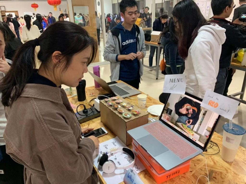
Another really essential thing to keep in mind as learned from all work done in 826 is that never assume any job/work to be easy and simple. Whenever I assume some part of coding is easy and believe I can finish in minutes there turns out to be bugs… Like I think the second scenario will be the easiest to code because it is purely movie playing and the other interaction is the same as in the first scenario which I can copy. But there turns to be errors which later we find out is due to the fact that mov. does not work properly in Processing. And then more problems pop up such as being shown as an image instead of movie and that images supposed to stay for a while just flashes. So every part of the work needs to be carefully dealt with and when you arrange the plan there should be left enough time to accomplish each step.
Our project aims at raising awareness of impact of social media on food choice. Studies have shown that choice of food is essential for both physical health and psychology wellbeing. The blind choice of using some food to lose weight in a short time might lead to Bulimia or other eating disorders as well as depression or anxiety while the inordinate consumption of certain foods causes health issues like obesity or heart-diseases. In recent years, with the development of social media such as live streaming, photos, online short videos or other ways which might be used as ways to popularize some product or fashion; the ideology of regarding “thin” as pretty prevails and the massive information about certain food products and their pros and cons. These things ultimately alter people’s choices either in the way of leading to the expected way or causing opposite results. With our project, users experience themselves how some social media works to influence their choice unconsciously. And this awareness they get after this experience will help them follow their own heart for decisions instead of easily get affected by information around them.