CONTEXT AND SIGNIFICANCE
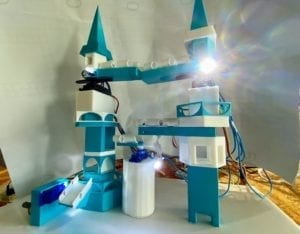
One of the conclusions that I made from the previous project was that it’s really important for an interactive project to make the interactions between it and users clear and understandable. When users are interacting with the project, they should be able to know how their actions would trigger the response of the project. Based on this understanding, we decided to use some basic components in Arduino in order to let the users know how the interactions work instantly. The feature of “Click Canvas” that the lightness and the color of light boxes would change only when people physically touch them along with the feature of the “Neo-Natur” that encourages users to just walk around and explore the whole project triggered my thought. In my opinion, interactive projects must contain reciprocal communication with users. Therefore, my definition of interaction would be: a cyclic process in which at least two characters take reciprocal actions that contain physical input and output to each other. The feature of our project is that it’s not a traditional maze, but a three-dimensional one. We got the inspiration from “Monument Valley”. We made the mechanism and checkpoints in the game come into reality while maintaining its romantic castle-like style, added a touch sensor and a controllable platform to make the interaction more interesting and diverse. The targeted audience would probably be kids because the general color was light blue and white which looked like Elsa’s castle in “Frozen” and the genre of the project was a game that would catch the kid’s attention. In addition, the form of interaction is not only diverse and intriguing but also it’s easy to understand.
CONCEPTION AND DESIGN
My basic understanding of how the interaction between users and my project is that users could create multiple different physical input to the project, then the project would react to the input accordingly and users should know why they need to put physical input to the project. In the initial stages, we decided on creating the project for entertaining so that the form of our project would be a maze. Since the rule for a traditional maze is set and universally known, we made the maze a three dimensional one, inspired by the game called “Monument Valley”. The general outline of the project is a castle, inside which there is a path from the top of the castle to the bottom. There are four checkpoints where the path is not connected and the users’ purpose is to find the controlling devices to change the direction of some parts within the castle and make the whole path connected correctly.
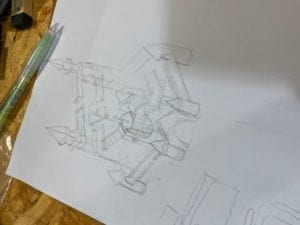
Yet, after due consideration, I found that if the purpose is merely to connect the whole path but for no actual reason, it does not accord with my understanding of the interaction between users and the project. Even though users successfully connect the path together, they would not know why they should have done that. For this reason, we added a little ball and switched the original rule to connecting the whole path so that the little ball could roll from the top of the castle to bottom in order to make the whole game more purposeful. When thinking about the understanding of mine, I found that if the interaction parts with the project for users are only to use buttons or potentiometers to control, the form of interaction would be too monotonous. Therefore, we made the whole castle attached to a foam board and installed a hemisphere underneath the foam board.
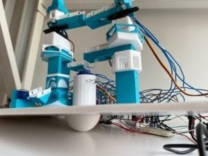
With this design, users are able to control the whole project by wind the foam board like a handle to change the slope of the whole project and thus the direction of the little ball.
As for the materials, the criteria for choosing a motor is that it could rotate at least 180 degrees, easy to control and to attach things onto it. Stepper motor was eliminated from our consideration for the project due to the difficulty to attach the bridges of the castle and the requirement for a huge amount of power. Compared with stepper motor, servo motor is easier to control and attach things to it and needs less power. In addition, we chose the servo motors that could rotate at maximum of 180 degrees over those that could rotate 360 degrees at most for the reason that the codes for the 180-degree-rotating servo motor are not applicable for the 360-degree-rotating servo motor. Therefore, one 180-degree-rotating servo motor is used to each checkpoint. In order to give instant feedback of users’ interaction, we need some elements that could inform users when they manage to complete one checkpoint. LEDs are the perfect option for us by reason of its easy installation and its perfect performance on giving visual hints. For the materials for the castle, LEGOs are the first thing that came up to our mind, for its convenience to assemble and the possibility to create different shapes.
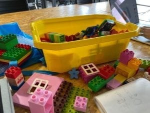
However, LEGOs are not hollow inside, and the size of each part is not flexible but fixed, which would increase the difficulty for us to install the LEDs, buttons and the motors inside. With 3D printing, we could have any shape that we want and customize the size of each parts have a much more precise measurement in order to fit all the electrical components needed better. Moreover, when determining how the servo motors should rotate, we were thinking about applying mechanism to make the movements more diverse and interesting. Yet, creating a perfectly functioning mechanism takes too much time and requires very precise measurements.

FABRICATION AND PRODUCTION
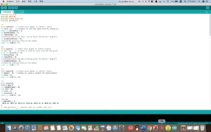
The final design for the four checkpoints was that the first two is to click the buttons and let the servo motors to rotate 90 degrees, the third one is to use the touch sensor to make the servo motor turn 90 degrees and the last one is using the potentiometer to control the rotation of the servo motor. The first significant step was to code the checkpoints. For the first two checkpoints, I thought I only needed to use one simple “if” structure in Arduino. But I found out that the servo motor would stop rotating after it reaches 180 degrees. Enlightened by the fellows, I realized that the easiest way is to add another two variables. The first integral variable called “countstep”, ranging from 0 to 4 is to count how many times has the user clicked on the button and when it reaches 4, make it become 0 so that the rotation would be in a loop. The second integral variable called “prebuttonState” serves as an indicator of whether the button is clicked instead of being pressed for a long time cooperating with “buttonState”. As for the third checkpoints, the servo would only react to the sensor once after reaching 90 degrees. This time I used the same strategy, adding another variable like “prevtouch” to determine whether the sensor is touched once or is pressed for a long time. “Else if” structure is used in this code as well.
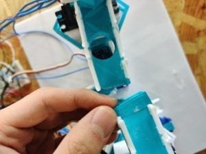
The second important step was to 3D print the whole castle. Before asking Andy, we thought that things printed by 3D printer would look exactly the same as those in the files. It turned out to be impossible, so we separated things in the files in order to print them one part by one part and then assemble them together later.
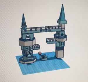
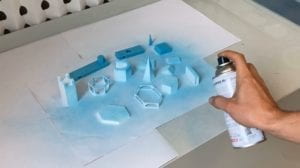
In addition, the colors that we chose for the castle was white and light blue. Yet during the process of 3D printing, we ran out of the light blue material, so we had to print them all in white and spray light blue on to them.
In the beginning, we built 4 separate circuit on 4 Arduinos and 4 separate code for the checkpoints, yet it was unnecessary and would increase the difficulty to connect them to the computer. After receiving suggestions from my instructor, we merged those separate things together in order to run the 4 programs in one single code.
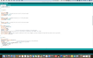
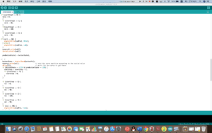
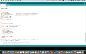
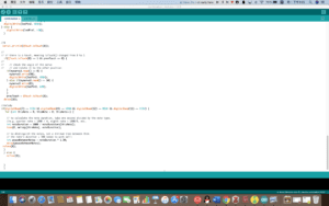


Our original plan for the touch sensor was that when the little ball touched its key0, the servo motor would turn 90 degrees and connect to path together. However, in reality, the little ball could not trigger the touch sensor, even though we had already changed a bigger and heavier one. Therefore, we had to ask users to trigger the sensor by their own hands.
During the user testing process, we got some compliments about the fascinating outlook of the project, the basic concept and the variety of interactions. More importantly, we received several suggestions for improvement: 1. Adding a reset system in order to facilitate the next player 2. Making the wires longer and adjusting the position for the wires so that they would not affect playing the game 3. Adding an instruction to make players understand the game quickly 4. Adding more audio hints when users successfully finished the game 5. Add a visual hint to let the audience know that the foam board is involved in their interaction. We took the first four advice and they all turned out to be effective and very helpful for improving the users’ playing experience.
We also found out that there is a connection problem which existed between the first two checkpoints. So we made adjustments on the abandoned material after due measurement and applied it to the project.
We would say that deciding not to take the fifth advice may be one of the crucial mistakes that we’ve made throughout the process.
This is the display of our project
CONCLUSIONS
The main goal of our project is to let users employ different forms of interaction to play with it as a game. The interaction that users could click on buttons, rotate the potentiometer, trigger the touching sensor and handling the foam board would all cause a series of changes of the project, while if the bridges are placed in the same order and position, users’ would get instant visual feedback that they’ve successfully complete the tasks.Therefore, users’ action and the project itself would have an ongoing effect on each other, aligning with my definition of interaction. The ultimate outcome of the user’s reaction was that he knew how those checkpoints work exactly with one look, yet he found it hard to detect those buttons and sensors attached to the checkpoints. Also, he didn’t get the idea that the foam board could be controlled by users. Though it took him some time to figure the things mentioned above out, the whole process of the game was smooth after that. If we had more time, there are a few we need to improve. The first is to write the instruction more clearly so that users would instantly know the function of the foam board in order to take users’ experience with the project to the next step. The second thing is to give more visual hint like making all the LEDs light up about the location of those buttons, the potentiometer and the touch sensor, so that people would enjoy the process of playing the project instead of making so much effort to try to find those things. After encountering the setbacks I learned that if we ever encounter with difficulties and problems, as long as we take time to be patient and examine the problems carefully, we would always get them done. And with the failure of perfectly applying the touch sensor, we’ve learned that next time we do a project, we need to first get clear knowledge about the materials that we are going to use before it’s too late to replace them with other materials. While from the accomplishments, I’ve learned that we should not be afraid of coming up with creative ideas and feel overwhelmed when we try to make those difficult and innovative concept come true because as long as we pay enough efforts and attention to those ideas, we would always work a way out. The significance of this project is that we perfectly combined the use of electrical components in Arduino and a physically controllable board to create a game involving different forms of interactions with users. The 3D modeling part was extremely complicated compared with other project, and the process of combining the whole circuit and the 3D printed castle was even harder, but we managed to construct such a complicated project with careful measurement and delicate design.
References:
“Click Canvas.” Accessed October 10, 2019. https://www.creativeapplications.net/member-submissions/click-canvas/.
“Neo-Natur – A Space for Thought, about and for Nature / @artcom @FuturiumD.” Accessed October 10, 2019. https://www.creativeapplications.net/environment/neo-natur-a-space-for-thought-about-and-for-nature-artcom/.