Step 1: Choose an image to be your motif
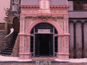
The image I have chosen is a screenshot from one of my favourite films “The Grand Budapest”. The use of color in this film is so beautiful and dreamlike that I thought of it immediately as my motif. I’d be so happy if I could make it come true.

Step 2: Draw your image in Processing
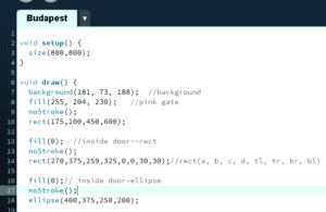
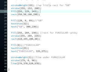
It would take an incredible amount of work to copy an exact same image. However, if I am to give a general idea of it, all it needs is a few features easy to notice, which would be the color, some basic shapes, and the English words. To achieve all these, I just needed to search in the reference list of Processing website. For colors, I found a color selecting website, where I could get all the codes needed. I improved my searching skills during the process!
Of course, I ran into some trouble. It took me a while to learn the order of stroke, fill, and shape. Also, the coordinate of each shape was decided completely by my calculation, and I believe one shouldn’t have to be a math genius to be able to draw on Processing. Therefore, my approach to the coordinate definitely had room for improvement.


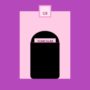
The final product, I would say, was so much different from (and uglier than) the original motif. It’s flat, and its color lacks the sense of depth. I think in drawing this kind of detailed image, Processing wouldn’t be a good choice, for it is better to be used in making animation.