PREPARATORY RESEARCH AND ANALYSIS
Chronus Exhibition Experience
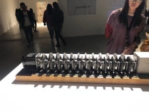
The experience visiting Chronus exhibition was definitely eye-opening and different from other exhibitions I have seen before. There was one exhibit that really intrigued me, using wheel gears and strict calculation to demonstrate the concept of time. As is written in the introduction, despite the high speed of the first gear, the time it would take to make the last gear rotate one full circle would be as long as the history of the universe. I was deeply impressed by how an abstract and huge concept (the existence time of the universe) can be embodied so precisely and concretely by a piece of art design, in which technology is the main contributor. If I am to pick a static, classical art piece elaborating on the same idea, it would be Dali’s surrealist piece named The Persistence of Memory. However, they are so different in terms of aesthetic experience. Dali’s painting is static and more tacit. It communicates the main idea by showing how objects are rotten with time passing. One has to stare at the piece for a while, switching his attention to different spots on the painting to gain a comprehensive understanding of it. In comparison, the artwork employing technology is more linear and straight-forward, almost like a metaphor and is easy to grasp. Also, it is dynamic, creating a different kind of expeirence compared with an oil painting.
In terms of inspiration of final project, this particular exhibit teaches me one important lesson: a design has to be straight-forward. However fantastic the embodied idea is, it has to be clear to the audience/user about its function, delivering the designer’s thinking precisely and noticeably. I’m not saying that art should be understandable to all audience; I’m saying that an understandable artwork has a greater opportunity to have its idea remembered and spread, if an artist’s goal is to let more people know about his thinking. With regard to interactive design, it is a necessity to stand in the shoes of audience/user.
Two other interactive projects I searched
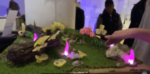
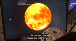
I found two projects by browsing randomly through the NYU ITP students’ end-of-semester show. One is a miniature garden. By pressing buttons or waving at the plants, different kinds of responses are triggered. The other is an interactive space explorer. With one planet model in hand, which functions as a steering wheel, you can rotate it and the planet animation on the screen would rotate correspondingly. Both are really interesting, but if I am to choose a better one, I would probably go with the interactive garden. For, in terms of experience, the miniature garden simulates a real landscape, the details of which are carefully designed and therefore look very tempting to the audience to interact with it. The possible outcomes are also versatile, which raises the users’ expectation as well. The interactive space explorer, on the other hand, does not provide as many possible outcomes (at least according to the video), which makes it, say, more boring. However, I still consider it a good project, for it delivers its idea very clearly. One’s first repsonse when holding the model planet would be to rotate it, and therefore no further explanation is needed.


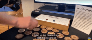
However, there’s one thing that I think should be avoided when thinking about communication efficiency, which is overloaded information. In the same video, I noticed a project with a LONG instruction. It was not until I watched the part twice that I understood how the project was supposed to work. What’s more, after taking all the trouble to figure it out, I didn’t find it interesting at all.

Therefore, other than the basic “input-process-output” logic of interactive design, there are so many more things to be considered. One important aspect is the usability. As discussed in class, it means “a measure of the ease with which people can use something”. To maximize usability, a design should be easily understood by the user without much instruction. An online article expresses the same idea. In “Bad Design vs. Good Design: 5 Examples We can Learn From”, the first characteristic of a bad design is “information overload”, the problem of which is that “what sounds like a simple question takes a lot of mental processing to answer”. Therefore, simplifying the logic of a design is crucial to improve usability, and eventually, the level of the design. Both of the first two projects I mentioned were user-friendly, in that the user can go straight ahead to try the project out without much “training”.
Reference
1.Interactive garden(2:57); Interactive solar system (8:39); Project about dyslexia (5:22) https://www.youtube.com/watch?v=02z_yyHAm-U
2. Definition of “usability”-class slide https://docs.google.com/presentation/d/1-EnH9SQ38CsvkCpDZsZA59jau7_GMBkfrPy_k6UCSKw/edit#slide=id.g42ef75b7c2_0_82
3.Bad Design vs. Good Design: 5 Examples We can Learn From https://www.interaction-design.org/literature/article/bad-design-vs-good-design-5-examples-we-can-learn-frombad-design-vs-good-design-5-examples-we-can-learn-from-130706