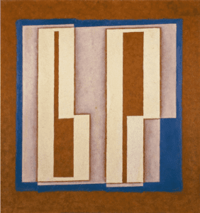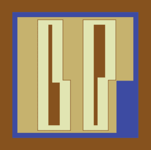
I chose this image because it consists of shapes we learned to make in class. It seemed like a relatively simple design, but unique enough to provide a challenge. I attempted to directly emulate the image’s shapes rather than taking the liberty of creativity because I wanted to see how close I could get with my processing skills.
The first step was to create the background color and the smaller blue square. After that, things got more complicated. I first tried to make the “b” and “p” using four smaller rectangles, but the brown stroke would cut through the letters. I opted rather to write in the coordinates of each shapes’ vertices.

For the brown centers, the lack of strokes allowed me to use simple rectangles. As for the color, I was uncertain of how to create the grainy texture the original painting has, so I stuck with the regular fill and matched it as close as possible.
However, there is one glaring difference between the two. The tan shape within the blue rectangle is not a rectangle; in fact, it appears to be two or three different rectangles that are slightly offset. Processing proved to be a very useful tool to realize this design. I’m sure there are many more uses that I am unaware of, but to the extent of my knowledge, I was able to fairly accurately replicate b and p. The code I used is below:
size(600,600);
background(#86521E);
noStroke();
fill(#3D4BA2);
rectMode(CENTER);
rect(300,300, 500,500);
fill(#C6B26E);
rect(300,300, 460,460);
rectMode(CORNER);
fill(#3D4BA2);
rect(463,323, 80,220);
stroke(#86521E);
strokeWeight(2);
fill(#E1E5B2);
beginShape();
vertex(150, 80); //first shape
vertex(250, 80);
vertex(250, 320);
vertex(280,320);
vertex(280,520);
vertex(150,520);
endShape(CLOSE);
beginShape();
vertex(330,80); //second shape
vertex(460,80);
vertex(460,320);
vertex(430,320);
vertex(430,520);
vertex(330,520);
endShape(CLOSE);
noStroke();
fill(#86521E);
rect(193,100, 15,240); //brown middle rect
rect(193,330, 45, 170);
rect(373,100, 45,210);
rect(373,310,15,190);