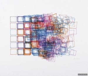
I chose this piece by Vera Molnar because I really like how the squares are neat and gradually get extremely messy towards the right and even change shape. I also like the colors used and how they clash. To me, there’s a certain aesthetic appeal to this piece because I like artworks that are have messy lines.
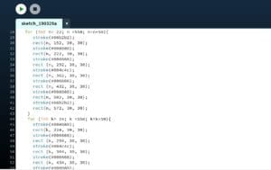
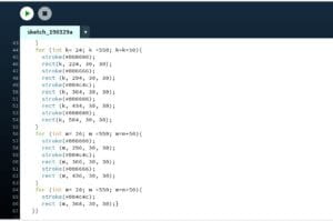
I wanted to draw layers of overlapping squares in rows and columns. I used the color palette from https://www.color-hex.com/color-palette/4666. I used rect() to draw the squares. I drew them in a for loop for the squares so I wouldn’t have to input each and every one of them. I used additional for loops for every row that overlaps.
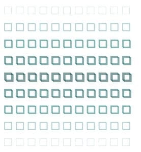
My final creation is similar in that there are squares and they overlap. However, mine isn’t messy towards the center. The squares in each row have the same color, and also the same colored squares overlap unlike the ones in Vera Molnar’s piece. I think that drawing in Processing was a good means of realizing my design because it allowed the squares to be precise and accurate in size and distance from one another.