Watch Your Words
CONCEPTION AND DESIGN:
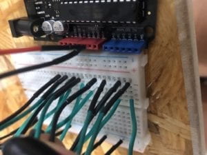
We wanted a model that would actually inform the user of what they had to as they went on through the game instead of giving the user all the information at once in the beginning. In fact, we gave very specific instructions at the beginning that were at the same time not fully complete. Once users got asked what was the last word they saw and are given four-word choices, they now know what they have to do. Another aspect of the project that we really wanted people to focus on, as the name implies, is the words themselves. Our project is meant to improve eyesight and reading skills as well as memory skills. On every level, there was an array of nine words from which the code would randomly pick four. The words were programmed to blink in a pattern were only one word out of the four would show on screen, something we got inspired by my games for dyslexia as a kid. The pattern was meant to make sure the user follows the words. Each level coherently had words that were about a specific topic. For instance, on the beach level, we had shells, sea, and sunscreen. To add to this, we had a soundtrack for each level; on the beach level we had the sound of the sea. The soundtracks were meant to allow the user to have a sensory experience that would enhance their eidetic memory. To facilitate the already complex process of this project, Sarah and I opted in having a fairly simple design for the Arduino part. I made an Arduino case with four buttons, that we got from the Shanghai Electonic Market (really cool LED buttons). To us and to the users who tested our project, the buttons worked because the instructions on the code pointed users to refer to the buttoned case to answer. To make it obvious I engraved the case with A, B, C, D for each button. It was a very personal project for me because we made it wishing I would have had this project helping me deal with dyslexia as I grew up. We wanted to include something else rather than just focusing it on memory and reading in the way we had it already, thus, we wanted to play with incorporating coloring into the equation. Nevertheless, we had a time constraint.
FABRICATION AND PRODUCTION:
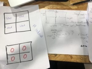
In this section, describe and assess the most significant steps in your production process, both in terms of failures and successes. What happened during the User Testing Session? How did your user testing process influence some of your following production decisions? What kind of adaptations did you make? Were they effective? In short, keeping in mind your project goals, how do you account for and justify the various production choices you made for your project? Include sketches and drawings.
On the User Testing Session, Sarah and I concretized our idea for the project. We were not so sure about how to make the “game” feel challenging for people, but still, make it enjoyable and easy to understand. People would tell Sarah and me separately to make it like a “multiple choice quiz” so people would feel pressured to answer correctly. Back in the testing session, we did not have a background track included in the code. We had planned to have a soundtrack but did not have time to include it. People really stressed to us how much it would help to have sound in the project. People in the testing session wanted us to have “cool” buttons for the visual aesthetic of the project, especially the Fellows. I finally got LED buttons from the electronic market that Eric recommend. Because the design we already had for the Arduino case was way too small, and the time constraint we had, did not allow us to incorporate the LED part of the buttons.


CONCLUSIONS:
As I have previously stated before, interaction as a conversation, a dialogue, a transmission and a tool that requires an input a process and an output. For it to be a more complex interaction, there must be an input a process and an output that can go back and forth. By the nature of it, you would need a relationship. To add to what I had said before I would like to stress in one key element: Understanding. In the communication that interaction facilitates there must be an understanding of how and what to communicate. For this final project, we wanted people to communicate with the computer so that people could get a different experience each time (words are randomized). We wanted this dialogue to feel unique and compelling each time. The buttons on Arduino could have easily been taken off; we could have just used the computer mouse or the keyboard on the computer. I think we could have done a better job with the interface’s design. So I learned from this that we could have planned even more and invested time into building something even specifically meant for people with Alzheimer’s like Eric suggested. I love the idea of using technology as a means to bring art, and social thought together. An insightful element of the project experience was working on something that was constantly subjected to other’s opinions. OnThe User testing we got a lot of valuable opinions. Being open to hearing everything, even when it modified your initial idea of the project and modified your “art”, in the end, you do it for the people. In fact, our idea of a video game to help people with dyslexia is something I would like to maybe propose to a tech company.