For my midterm project with my partner, I created a UFO Memory Game. The aim of the game is to memorize the left and right direction (or sequence) of the spaceship and copy it with the left and right buttons on the control panel. In order to win the game, the user must memorize up to 10 directions without losing all 3 lives. In each round, the user has an option to click a button which will allow them to repeat the sequence once. There are lights to indicate if it is the spaceship’s turn to show you the sequence or your turn to copy the directions, lights to indicate your remaining lives, and lights above the buttons to show if you have clicked the left or right buttons.
My previous research inspires my proposal by challenging me to create a new interactive experience from something familiar. The Nike installation recreated basketball by adding interactive LEDs, and the Tactile headset reimagined the “headset” from the sense of sound to touch. These projects changed my definition of interaction because it showed me different degrees of interaction and challenges my definition, making me wonder if interaction can be reactions that cannot be seen (for example, considering the internal or emotional experience a kind of interaction). The Tactile headset, to me, is less interactive than the Nike installation but it still interacts with you, whether it is through your senses or your internal experiences. Although my project is not necessarily a “new” invention per-say, it is significant because it brings a new spin to an old game. It takes what one usually finds through screens and attempts to build a game that solely relies on the physical elements to communicate to the user what to do. The memory game attempts to transport the user into the physical world of being in a space ship and copying another spaceship’s movements with the control panel. The version of this memory game with a digital screen fails to do that physically, so does it with the human version (Simon Says). My game allows one to interact with it in somewhat between the real world and the technological world. It’s for audiences who want to play a game without having to immerse themselves in a screen and who want to improve and challenge their memorization skills with the physical reality present yet with the help of technology. This game is special for this audience because it conveys a popular game into one that is thematic (UFO Theme), uses technology as necessary as an aid for its purpose, and does its purpose of practicing your memorization through memorizing the directions of the ship as it progressively gets harder.
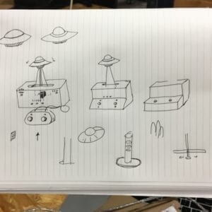
There were many ways that my understanding how users were going to interact with my project informed certain design decisions. First, I wanted to have a control panel for my game, similarly to a spaceship’s control panels, so I decided to place the controls in one concentrated area. I thought it would make sense by placing the spaceship one needs to copy the movements of in front of the controls so the direction where the user must look would be intuitive. I used arcade buttons and LED lights for my controls and used cardboard, tape, hot glue, knife, and scissors to shape and structure it. I chose these materials because if there need to be any adjustments, it would be a flexible enough material to help me adapt to necessary design changes (i.e. hardware not fitting inside the main body of the physical component). I used arcade buttons and LEDs because they were relatively straight-forward components to signify to the user something to be pressed or seen. If I had used plastic, it would have been much more durable, but by using cardboard, I had the ability to adjust the size if necessary as I was bound to make some changes during the user testing process, and these measurements would help me blueprint the necessary size for the more durable components if I had a final product.
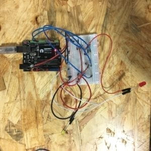
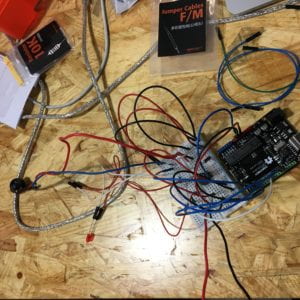
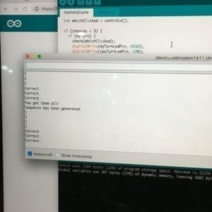
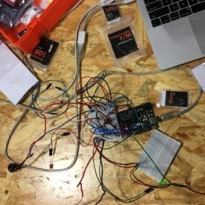
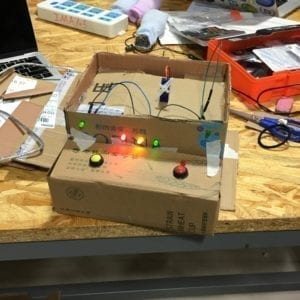
My production process was quite long. The first step was writing the code for the game. In order to surmount this feat, I reduced my coding process into digestible checkpoints. For the game, I knew I needed to have two buttons to answer to the left and right motion of the spaceship, so I began small by making sure I could make two buttons signifying left and right work. From there, I created an array of 1’s and 2’s (left’s and right’s) and made a function to check my answers from what my buttons clicked. Once I got that working, I built on it even more, adding lights to signify the spaceship’s turn to move left and right and the user’s turn to copy, to adding the number of chances the user has before losing, the reset round, adding another direction to the maximum 10 directions in a sequence after each correct sequence, lights to signify the amount of lives the user had, and the music. While the coding component was steady and repetitive in regards to making sure every component worked, I did run into several issues. One of the issues was regarding the possibility of when the left and right buttons are pressed simultaneously. In the code, I needed to write a logical and in the conditional to fix this error. Another issue was not completely pressing the left and right buttons. In response, I added LEDs above the buttons to help the user know that the button had been pressed. Another notable issue I ran into was regarding hardware memory and the concepts of arrays within the Arduino programming language. I had an issue where the last element of my array, which was growing larger by 1 after every successful round, was unstable. I learned this was due to the fact that Arduino code sets a fixed amount of memory for an array when initialized, so instead of initializing an array with the smallest amount of elements I needed for the first round, I initialized an array with the largest amount of elements I needed for the entire game. After coding, the physical component needed to be made. To do this, I used cardboard found from the cardboard room and shaped the size of the game to fit the space the Arduino, breadboard, and its wires took up. A lot of this process involved checking if my components fit into the designated holes and spaces I placed them in and adjusting them if necessarily. User testing session helped me gain some eye-opening insight into how to present a physical object through the object (and design) itself. We had good feedback from users who liked our game, but we also had good critical feedback; some of which were: How am I supposed to tell that I’m supposed to follow the spaceship’s direction?, The labels under the LED lights that say “ALIEN” and “YOU” are confusing, the buttons were somewhat confusing, and the three LED lights are confusing. We also noticed during user testing how some users would not pay attention to the game or the game would start too suddenly for the user to recognize it has started. In order to counteract these issues, I decided to experiment with the tilt sensor as that would more easily connect that one must steer in a direction to mimic the direction of the spaceship; however, due to time and the estimated time it would take me to rewrite the code I had already written, I decided to scrap that idea even though I had a tilt controller mostly working. I also realized we needed to add another button so the user could begin and start the next round, so I added another button to the physical component so the user, for each round, has a single chance to replay the sequence of the spaceship’s movements. This adaptation was chosen to keep the amount of buttons we had on the control panel to a minimum and to keep it less confusing. While this allowed the user to repeat the sequence once in case they did not pay attention, it still retained the purpose of the project which is to help one’s memory by only allowing the user one chance to repeat the sequence. Another adaptation to the project was adding clearer labels and adding more labels. We changed the “ALIEN” and “YOU” labels to signify one’s turn to “MEMORIZE THE DIRECTIONS” and “YOU COPY” with arrows pointing where to look, as well as a “LIVES” label above the 3 LEDs to clarify the meaning of the lights and the meaning of the game. The spaceship also has an alien with a speech bubble that says “Remember where I’m going!” to direct the user’s attention to the spaceship. We also added another label for the replay button, which says “Remind me the directions one more time…” to convey to the user one can replay the sequence again, once. All of these design choices were necessary in both clarifying the function of each component, but also relaying the instructions of the game to the user without a screen or piece of paper, but through the physical components at hand.
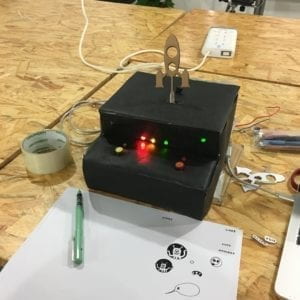
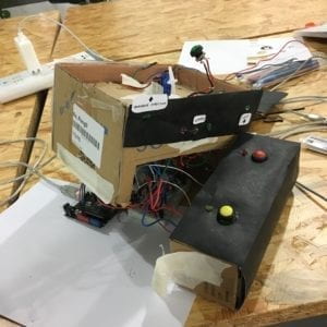
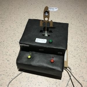
The goal of my project was to create a new interactive experience with something familiar; in this case, it was to create a memory game in a new way — to bring it out from just the digital or real world, but into one that somewhat shares both. My project results align with my definition of interaction by having the game communicate with the actions of the user. When a user gets a memorized sequence correct, the game moves forward and adds another direction to the sequence. However, when the user does not get a memorized sequence correct, the user loses a life and a different sequence with the same amount of directions is played. The game changes it’s response depending the user’s response to the game. It does not necessarily align with my definition of interaction because the interaction is quite limited. The game responds with essentially two answers: either you get the sequence right or you don’t. It’s arguable that the interaction is predictable and because of that, it doesn’t necessarily communicates to the user as a whole but a series of button pushes and “yes” and “no” responses. The audience interacted with my project pretty intuitively, understanding the goal of the game was to memorize sequences and copy them through the controls. To improve my project, I would use a more durable material to make it more sustainable and would convey the intentions of my game more clearly and thoughtfully through the design, which was what I learned largely from this project: how to design and portray functionality and intentionality from a designer into a user’s experience and how to make design that guides, not confuses. A large part of interacting with an object is also understanding how to interact with it, and that is communicated through its design. This project made me reflect over the ways we design anything in life (game consoles, spoons, tote bags, chairs, maps, advertisements, etc.) and how that affects the way we interact with the world and understand it. Such an idea also trickles down to this project as well.