Interactive art, installations and products should make the viewer or user feel engaged. From what I’ve observed, key ways of achieving this include the gamification of a mundane process, an intellectual challenge, a strong statement, an intriguing learning opportunity, and/or personalized response.
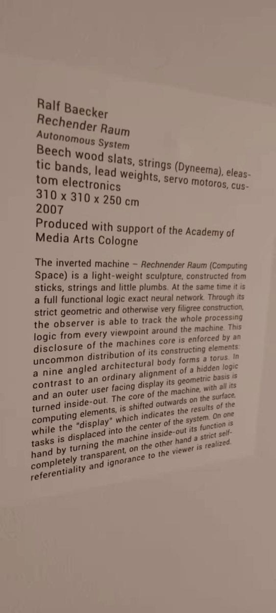
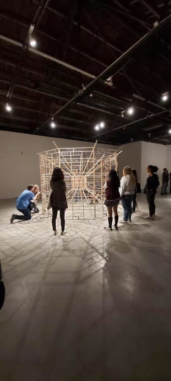
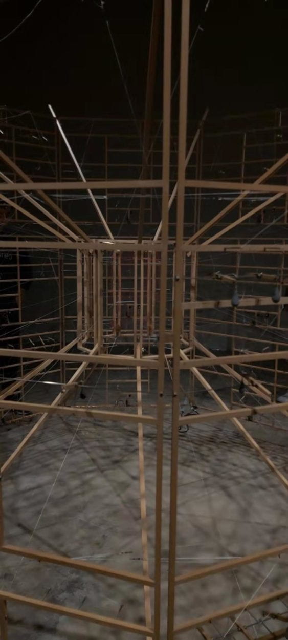
We saw these methods applied during our field trip to the Chronus exhibition. An installation that caught my eye was the “Autonomous System”, because it created an introspective experience for me, where I thought of the human brain and how we process data, and likened it to the computers we used, wondering about how complex we really are. I left not knowing if my thoughts ever got close to those of the artist as he created the piece, but questioning the complexity of systems and processes in my life. What aspect of my life is simpler than I expect based on its outwards appearance? What logic do the unseen processes in my life have?
In this respect, the installations were similar to others I’ve seen that did not include technology and moving parts- they both make me look for meaning and the artist’s intent. However, the fact that the installations used motors made them feel alive- as I saw “Autonomous System”, for example I felt like I was watching a creature think.


 When I think of interactive designs, I immediately think of Daan Roosegaarde. I admire his work because it’s not only aesthetically pleasing- it tells a story, creates an experience. Two projects of his that come to mind are “Van Gogh Path” and “Water Licht”, because of how they include Holand’s history and culture, while making a statement on the environment.
The “Van Gogh Path” is a glowing bike path inspired by Van Gogh’s “Starry Night Sky”, which aims to celebrate the cultural heritage of Nuenen, NL (where the artist lived), while creating a safe and beautiful environment. The project’s webpage says that it “glows at night and creates a place of wonder and inspiration, but is also an enhancement of public safety and local place making.”
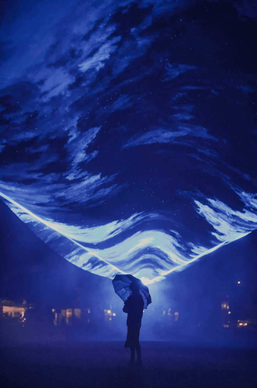
WaterLicht is a light installation. On Roosegaard’s website, its says of the project: “WATERLICHT is the dream landscape about the power and poetry of water. As a virtual flood, WATERLICHT shows how high the water level could reach. WATERLICHT is a collective experience to remind us of the importance of innovation and the impact of climate change.” I appreciate it’s beauty and the appreciation for the power of nature. What I admire of this project is that it aims to make people more aware of something we rarely think about (the water level).

For me, less successful interactive projects are those that have less of an impact. Projects that don’t cause the user or viewer to think. I think an interactive design must have a message- a purpose. It does not have to be received or understood by each user in the same way- their experiences can differ. However, it is important that an interactive design be more than just a short transaction.
For my project, I would like to create something beautiful, that has meaning. I want to create a thought-provoking experience.