Deciding on a Motif
When considering the different motifs available to me, many of the faces and masks stood out. First, I used The Art of Computer Design as my guide in the process. Naturally I’ve loved animals for most of my life so after scanning through the pages, I found myself drawn to the goat, fox, and tiger drawings. Below are the three images that I initially sourced my inspiration from. All three images are sourced from The Art of Computer Design.
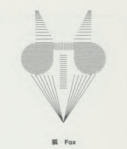
“Fox”
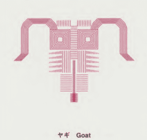
“Goat”
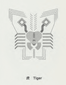
“Tiger”
I found it especially intriguing how the artist took such basic lines and shapes to form the animals. The fox almost looks like it’s wearing sunglasses, but then again it more-so looks like a fox. The symmetry of the image is also helpful in creating a consistent and clear image for the audience to understand. I think what marks these as great pieces is that even without the title I could most likely tell that they were animals.
After carefully considering these images, I thought about what was most prevalent in life. What symbols did I see everyday? A dragon. In Chinese society, the dragon is a symbol of good luck and power. And seeing that it is everywhere made it an easy choice to try and emulate. I searched around on the internet and found two images that showcased different aspects of the Dragon motif.
The first image is more traditional in China and used for festivals such as 端午节 (dragon boat festival), 春节 (Spring Festival), or just for overall decor.
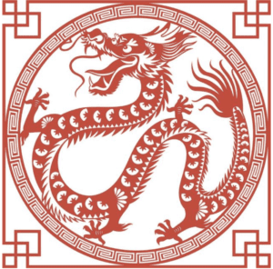
Sourced from Astrology Bay
I liked this image because of the simplicity of the color scheme, similar to the other animals I first looked at. I think it gives off a powerful look which can also showcase the detail put into the symbol. I also appreciate the authenticity of the dragon in detail. The artist didn’t try and do too much to over-detail the frame or the dragon itself. It’s a Chinese dragon, nothing more and nothing less. But, I also wanted to incorporate some more color into my own motif so I looked elsewhere for inspiration. The following image is a less traditional color painting of a Chinese dragon.
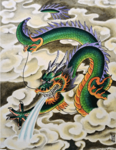
A painting sourced from Mark Stopke
I enjoyed this image too because it differentiates current day from traditional. It’s not so much a traditional motif as it is a creative piece of art. The colors are certainly untraditional which I also like. It almost looks as though the dragon is flaming around the mouth and underbelly compared tp the rest of its skin. The color contrast creates an incredibly interesting subject compared to the more traditional motif. Each piece has its own strengths, so I decided to pull colorful inspiration from the second image and traditional schemes from the first image.
My Own Process
It was difficult at first to find a starting point. I wanted something similar to a dragon, but wasn’t sure how to find the sweet spot between the two images in combo with my own processing abilities. Seeing as I had never used processing before, I decided to create an abstract design of the dragon to the best of my abilities. The image can be viewed below.
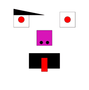
“Dragon”
It doesn’t carry the same artistic ability as the images above, but I felt as though I achieved something similar to the initial images I used for inspiration. To start, I tinkered with making squares for the eyes. I had to troubleshoot and guess a little for the initial measurements, but after understanding these I aligned them in a row. I then added the background color of white by inserting background “(255);”. I thought this was a good color selection in order to authentically pop the eye color in contrast. Just as had been done in the second dragon image. After, I added the two ellipses within each square and colored them red to have a similar symbol of power. Red, especially for eyes is menacing in my view. Following the ellipses, I added another square for the nose and two more ellipses within that square for nostrils. Normally I wouldn’t have added nostrils, but in many dragon paintings and symbols there is usually steam coming out of their nostrils so I decided to adjust my motif accordingly. To get the interesting color pop I was looking for, I picked a random color of hot pink/purple. I think it throws the audience off and creates a disco feel to the dragon. Now that I understood how to create dimensions of a square, creating the rectangle for the mouth was easier. I used a black background because one again, I think it represents a menacing figure with a never ending black hole for a mouth. And I choose red for the tongue because it draws attention through a color contrast. When I see this image, I want to look everywhere because each color and shape represents something so unique. The left eyebrow is a result of my incoherency in processing. As the recitation was running out of time, I wanted to add an unorthodox flair to the image by undermining the symmetry. I don’t necessarily like how the eyebrow looks now, but it does represent my goal of uniqueness.
A Good Medium for Artwork
The code for my processing work can be viewed below.
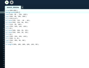
I feel that using processing for explaining my motif was a good start to the design work. I think for simplicity purposes, it showcased the raw edge of my art work. Because I was limited in such a skill set, I felt that it almost made my piece look more aggressive. I enjoyed using it because it limited my ability in the process. By this I mean that for the sake of creating something powerful, yet simple, processing was the perfect medium for my art.
Sources
https://drive.google.com/file/d/17Y-OfpFE_H20WyCjn07dyO_XvjSWO_gN/view
(The Art of Computer Design)
https://astrologybay.com/blue-dragon-in-chinese-astrology
https://pixels.com/featured/chinese-dragon-mark-stopke.html