Alexander Cleveland
Context and Significance
When taking into account my past group project, I thought mostly about the relationship between the user and the machine. What was the end result when the user interacted with the machine? In click wall, the audience would tap a panel on the wall and it would change color as a result. Thus, someone could eventually use this to create a piece of artwork such as a silly design by clicking the panels in a certain pattern. It had the potential to be used for an artistic medium, but also just for fun and games. This nature of a relationship played into my group’s definition of “Interaction is a continuous conversation between two or more corresponding elements.” We also analyzed fire wall, which was similar to click wall in the sense that one was physically touching a wall. The fire wall instead played music and rippled whenever it was touched. It wasn’t as black and white as the interactive relationship in click wall. In fire wall, there was room for improvisation from the wall depending on where one touched. It also depended on the amount of pressure applied to the wall. Different pressures corresponded with different values of sound and physical reaction from the wall. I think firewall significantly impacted our design because of the different reactive values it produced. Our project involved hitting a 3D printed “like” button, which would trigger three different sound and visual values based on how hard one hits the button. We taped a button to the vibration sensor which correlated with the three different ranged values. I think what my partner and I created was similar to a carnival game where one hits a target with a hammer and if they hit it hard enough, rings the bell at the top. Ours is different in the sense that even if one does not hit the highest value, there is still feedback of the red and yellow flashing lights along with the negative music. The feedback also came through a separate like button which was taped to a servo motor. The button would either be thumbs down, in between, or a thumbs up depending on how hard the target was hit. The carnival game only has positive feedback when hit at the hardest value. Our product is a game designed for all ages to test their strength; although, I think it is tailored to a younger audience.
Conception and Design
For the initial building materials, my partner and I used cardboard to encase the arduino board, speaker, and breadboards. We also used cardboard for the hitting target and drew a bullseye to indicate where the participant should hit their fist. The initial design of the hitting board on the left and the casing on the right can be viewed below.
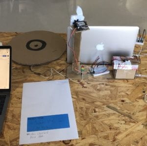
But, in the final version we used a 3D printed plastic like button as our target because it was sturdier than cardboard. We thought about using rubber as a target but the sensor wasn’t reading the correct values so we had to use thinner material. We also used laser cut wood for our final casing of the arduino board to have a more professional look and hide the wires.
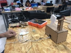
The original cardboard encasing for the speaker muffled the sound too much so we decided to build a small shelf on the outside of the wood case for the speaker. The speaker is on the left of the below image.
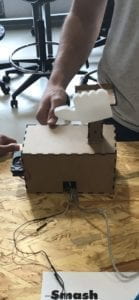
This was so the speaker could easily be attached to the arduino plus breadboard and still be on the outside to project quality sound. Originally, we also had a 3D printed like button attached to a servo motor hanging off the casing. But, we wanted a more independent look from it seperate from the casing so we built a small tower at which the like button and motor were atop of. This created a more significant and recognizable look for the like button.
Fabrication and Production
At first, my partner Kevin and I used a cardboard circle as our target to hit but through user testing we both saw that it was quite uncomfortable for most people to pound on. It was also too big so that many people missed the tiny sensor and it fell apart quickly. A video of people hitting the board can be viewed below.
As is visible, the cardboard target was unusable because it was too big of a target for people to hit the tiny sensor in the middle. The participant at hand could not even register an LED signal. So, we 3D printed a thin “like button” and used that as a target. The like button, made from plastic, held up better than the cardboard bullseye, and also presented a smaller target which led to more accurate hits from participants. It was also more accurate in reading the vibrations than the thicker cardboard. Another word of feedback we received was a better visual LED feedback. Initially during testing we only had the LEDs connected to the breadboard. Many people didn’t understand the results because the LEDs were not visible in tandem with the hitting board. As a result, we created a tower in which the three LED lights were situated like a stop light in a vertical manner. Above the lights was also the other 3D printed thumb connected to a servo. Thus, one could see two visual results right next to each other. An image of the tower and final casing for the box can be viewed below.

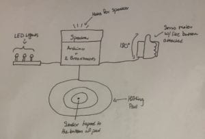
Many people also criticized our speaker placement because it was almost impossible to hear the music when it was covered. At first, we poked holes in the cardboard for sound to release out of it, but this was not enough. So we created a shelf on the outside of the final wooden casing for the speaker to rest on. This ensured clarity in the music that would play. Many of the participants were also confused as to where to hit their fist. Because of our title “hit that like button”, many thought that they should hit the like button on the servo motor. So instead of using a bullseye target as our hitting board, we eventually replaced it with another like button. A picture of our initial sketch design can be viewed below.
Conclusion
The goal of our project was to create an interactive relationship in which one tests their strength on a three point scale of color and sound. This relationship dealt with a participant hitting the sensor and receiving negative, moderate, or positive feedback from the speaker, LEDs, or 3D printed thumb. I think my results accurately reflect my original definition of “interaction is a continuous conversation between two or more corresponding elements.” The conversation is between the user and the vibration sensor. By using the physical hardware as a translator of energy, the conversation is continued through to the lights, speaker, and motor. Although, I think the project disagrees with my own definition in the sense that it is not necessarily a “continuous” conversation. My audience interacted with it how we predicted, by hitting the thumb over and over again until the lights went green and the star wars cantina music played. The more the audience played the game, the more they became enthralled with the fun of hitting it over and over again. The game creates a necessity for achieving the highest goal possible. I think our biggest setback was understanding which material would work best with the vibration sensor. We had to find the perfect medium which wouldn’t hurt the participant, but would also be thin enough to correctly read the vibration values. This was difficult, but a 3D printed plastic thumb worked well in the end. I think people should care about this project because we defined a different method of motivation from traditional carnival games. The hammer and bell game I described only rewards the participant if they reach the top prize. But our game motivates players to keep hitting it as hard as they can. If there were not a red or yellow LED light, then there wouldn’t be nearly as much interest in continuing the game. But because we rated the game on a scale, it presented this addicting factor which kept the player engaged throughout the whole game. Below is the complete code for the project and a video showcasing the finished product.
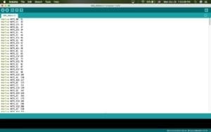 Music Notes
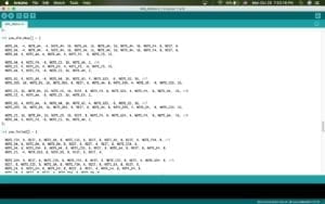 Music Notes
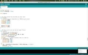 LED Code
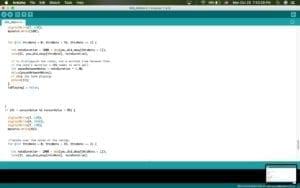 Speaker Code
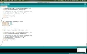 Speaker Code
The Final Product
Sources