CONCEPTION AND DESIGN
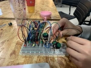
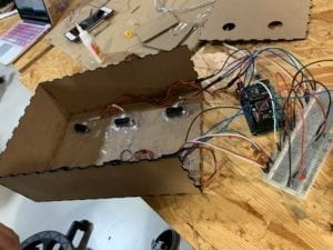
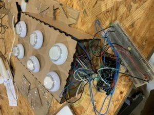
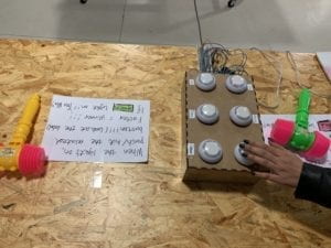
The way our users interact with our project informed the design decisions by making it a two-player game instead of a one-player game, meaning there would be double of the hardware for the project. We also needed to make sure the users could easily play the game, so instead of using sensors to play the game, we switched to buttons and mallets to provide a more intuitive way of participating in our game. We used the laser cutter to create the main form of the box, as opposed to the 3D printing device that initially gave us some troubles with the actual formation of the box. We used the biggest gaming buttons eventually, but before we prototyped with both infrared sensors and smaller gaming buttons. We found the smaller buttons hard to press for the users, and the sensors too sensitive towards any movement caused by the player. The biggest gaming buttons proved most useful for our project, as users could both easily hit it with their hands to play the game, or use the provided mallets to hit the buttons.
FABRICATION AND PRODUCTION
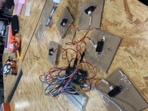
During the User Testing Session, we received many effective ideas in improving the overall design of our project. In terms of failures, our infrared sensors, used to detect the user’s input and change to the next light, were sensitive to even the slightest movement of the hand. By doing so, this made it easy for players to easily manipulate the game by waving their hand over the sensors, so that they would therefore “win” the game. In terms of successes, the players could easily play the game as each light corresponded to the correct sensor, making it a competitive update of the traditional Whack-A-Mole. The user testing process caused us to make significant changes in our prototype, taking it from mostly composed of cardboard to produce a more sophisticated box for our game. We also made it into a two-player game with buttons on both sides of the interface, allowing for players to participate in each game simultaneously. We added a “stop” time for the game, as compared to before when the game could theoretically continue infinitely. They were effective in that it made the game less likely for players to manipulate the game and “activate” all sensors every time. Instead, they had to physically smash the buttons in correspondence to their LED lights. We justified the various production choices we made for the project by seeing how they fared in comparison to before, or how the users were interacting with them. If they showed improvement in efficacy, we decided it would be more efficient to implement them in our game design.
CONCLUSIONS
The goal of our project was to create a fun, interactive game that allowed users to whack a button similar to the traditional arcade game, Whack-A-Mole. Our project results closely align with my definition of interaction, as it requires both an input from the user and an output from the game in order to fully function. The audience interacted with our project more competitive than expected, as both players typically had a desire to win, and therefore wanted to whack the buttons powerfully. If we were to improve the project in the future, we would start by hiding the wires of the physical project to improve the physical interface. We would also place the LEDs of the corresponding button directly in front of the button, as to avoid the user from looking between the LED light and the button itself. We took away that by learning from our failures, we can create an even better of our project design than if the project was “perfect” from the start. Failures are key to any project, as it locates any mishaps and gives the creator a chance to fix these mistakes, and improve further upon the development of the project.
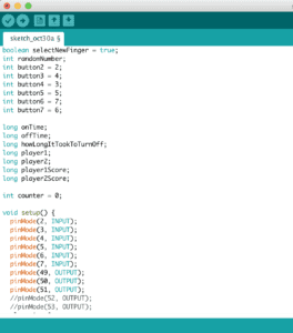
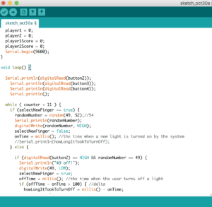
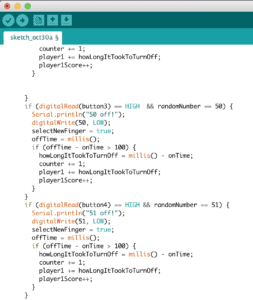
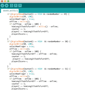
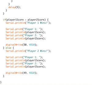
The code was written in a way to ensure a randomization of the lights, and therefore the buttons. It could also control the amount of times the lights would go off before determining the winner. There were 3 buttons on each side of the board, making it 6 buttons in total for our game.
