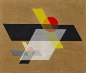
This painting is called A II, created by László Moholy-Nagy, one of the faculty from Bauhaus School of Art and Design. I chose this painting because not only its name but also its outlay is futuristic. This painting was finished in 1924 but the name reminded me of artificial intelligence (AI), which is somehow related to creating art with computers. So does its simple design. After nearly a century of the creation of this painting, the primary way for people to interact with the rest of world is through those abstract tiles on the screen, just like the ones we can see in this painting. Meanwhile, A II is different than AI since II also refers to ‘2’ in roman numbers. Does this mean that the two similar objects on the canvas, composed by parallelograms and circles, signifies our humans’ of company, even in the digital age? These endless interpretations of the artwork fascinate me about the image I chose.

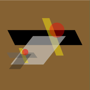
What I want to create in Processing is simply a replication of the Moholy-Nagy painting, making it a step closer towards the contemporary AI technology. As you can see, the components within this image are not complicated at all. The challenging part is the relative positions of each shape so as to maintain its original artistic expression of two objects attached together. During the recitation, I spent most of my time adjusting the position of each shape. In fact, I find it quite interesting that drawing parallel lines in Processing require some mathematical computation. Artists are seldom that rational when they paint, right? The other thing to notice is that, as you can see, the circles and parallelograms in the original painting are semi-transparent. I tried to adjust the alpha value but still cannot reach the feeling of texture in the original one. Generally speaking, I think my painting seems more digital than the original creation since the colors and shapes are all clearly defined. It really resembles the original image in content but is too flat so as to lack the sense of layering. Hopefully, I will be able to add more elements to this painting after I get more familiar with Processing.
From my perspective, the purpose of using Processing to draw is not to replicate the existing artwork but to help artists explore the possibilities they are unable to reach on the ordinary canvas. Computers are able to accurately copy the color, shape, and positions of the original painting but they can definitely do more. For example, in my work, if the two objects, big and small, can follow my mouse to move a little bit on the canvas to show that they are actually separate, it may help the audience better understand “Ah, there are two parts in this painting and it is trying to express their attachment.” In this way, the threshold of appreciation of artwork can be lower. We would be able to create the aesthetic appreciation “for the rest of us”.
Please find below the original codes for my work:
size (600, 600);
background (133, 97, 50, 150);
noStroke();

fill (0, 0, 0);
quad (50, 200, 100, 300, 550, 300, 500, 200);

fill (248, 231, 14, 125);
quad (280, 120, 375, 370, 425, 370, 330, 120);

fill (215, 215, 215, 150);
quad (220, 240, 70, 430, 290, 430, 440, 240);

fill (255, 0, 0, 100);
ellipse (380, 200, 100, 100);

fill (100, 100, 100, 125);
quad (45, 350, 65, 385, 250, 385, 225, 350);

fill (248, 231, 14, 125);
quad (125, 320, 165, 420, 190, 420, 150, 320);

fill (30, 30, 30, 100);
quad (135, 360, 60, 460, 135, 460, 210, 360);

fill (255, 0, 0, 130);
ellipse (168, 347, 42, 42);