- PROJECT TITLE
Pick Your Pokemon
- CONCEPTION AND DESIGN:
After the idea sharing process in class, me and my partner greatly changed our design for the project. From fun test to a more game-like project did we make. This was because we reconsidered about the testing process and thought it not engaging users’ efforts in thinking enough, thus making their information processing and output part weak. To improve this, we substituted the testing part with a game process: We let our users click on clues on the screen to eventually picture a sketch of a pokemon.
Our final design sets the clues as small gifs that picture blooming flower, popping mushrooms and lighting candles, placed carefully on screen. When the game starts, only one clue will be moving, and the next clue will start moving when the previous one was mouse-clicked on. When a clue is clicked, a curve appears between it and the previous one. Eventually, the curves will picture the pokemon.
We took inspiration from the “Guess who I am” interlude in Pokemon anime, where sketch of pokemon is presented for the audience to guess which pokemon it is. By observing and clicking on the clues, our users would be forced to focus on the information given on screen, and searching their heads for what pokemon it is / where is the next step of the sketch going. This intensifies the input and information processing stage in interation.
We made our picture materials by original photoshop and processing drawing. Because the clues had to be placed according to our needs, materials for sketching and background had to be our originals.
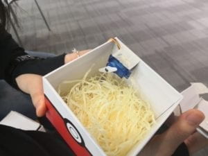
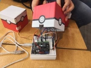
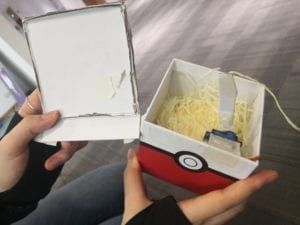
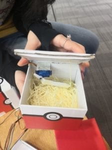
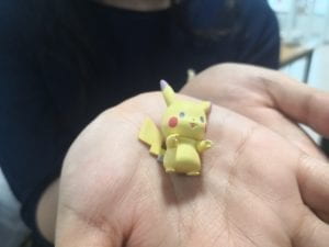
We retained the box-opening and gift part in the primitive design. For this part, we purchased Pokebox and refit them to meet our demand, mainly by cutting and assembling them with survos. We did not use digital fabrication because that would make it hard to dress them as the pokemon theme.
- FABRICATION AND PRODUCTION:
Besides the great changes we made in idea sharing session, we also made another big progress in the fabrication process. We took advice from Eric, who suggested us to add a timer to the interactive process. If the user cannot solve the sketch puzzle in a certain period of time, the screen will show “failure” and tell the user to try again from the beginning. By giving the users a time limit, we added the notion of success and failure into the project, and thus increased the sense of gaming.
We originally set the time limit to 30 seconds. However, after the user test session, we adapted it to 20 seconds to prevent the success rate from being too high – Users are cleverer than our expectation!
Another change we made after user testing was text and image optimization. We shortened the instruction text and made the “BACK” button less confusing by deleting “Click BACK to get to the home page” from the screen. However, we did not stop the clues from moving after they were clicked once as suggested by some users who thought them being to distracting, because that distraction was intended: We did not want our users to figure out the result that easily.
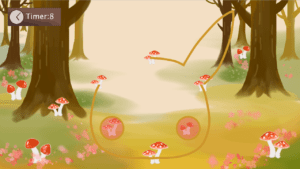 Drawing Pikachu
 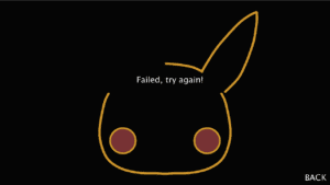 Time goes out
 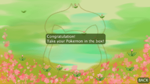 Success in drawing Balbasaur
 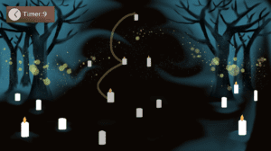 Drawing Charmander
 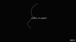 Time goes out
The fabrication of gift boxes was time- and energy-consuming. We spent a lot of time on figuring out how to fasten the servo on the wall and use it to open the lid. As the final result, we cut 3 of 4 edges of the lid, lenthened the arm of the survo to open the lid, and use strings to pull the lid down to restore the position. After confirming the design, we made another two refit Pokebox, for there were three types of pokemon and sketches. We also made a container box to hide the arduino and the circuit. A lot of cutting and pasting work was done.
- CONCLUSIONS:
Through reconsideration, me and my partner decided to make a more game-like project. This strengthened the information processing stage in our basic definition of interation, and kept the part we put emphasis on: the sense of final reward. However, in retrospect, I wondered whether we depended too much on delivering gifts to users to make that final reward. It certainly worked very well – but it somehow lacked a sense of design. Moreover, another part that we valued in definition of interaction, “randomness”, was also limited because we could only make limited choices of pokemon.
Even so, our users gave very positive feedbacks for our project: It was very fun and engaging, and quite clear to learn. Most importantly, they got a strong sense of goal in the interactive process, especially when the imaginative context were introduced: We intended to make this project a cinema-site activity, where people going for Pikachu film could get a chance to win gifts through playing a theme game.
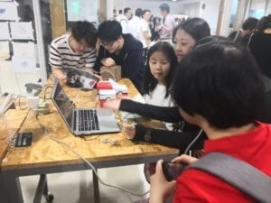
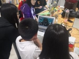
For improvement, I would like to make different modes of the game.In the session night, I observed that while adult users could complete the game within several attempts, young users at early ages had clear difficulty in solving the puzzle within the 20-second time limit. If we could make a children mode which lifts the time limit to 40 seconds or more, the project might provide children with better experience. Also, if we have enough budget, we could by more kinds of pokemon as gift to increase the randomness and colorfulness of the game.