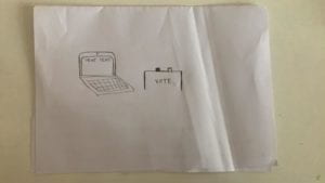
The development of the project involved a lot of back and forth, trying to balance the strong and sometimes abrasive message and the technological aspect, which needed to be simple enough to let the interaction speak for itself. For the survey, I originally had a list of 20 statements, which I edited down to 14 after some users said that the experience stretched on a little long. The goal was for them to be relatively short and simple, both so they could hold users’ attention and so they were answerable by the target demographic, most of whom could be assumed to have a basic working knowledge of the subjects. Within this process, I determined how the monitor should respond to certain answers, and the most effective ways of subtly giving users the sensation that they were being surveilled or that there were “right” or “wrong” responses. I wanted this idea to build over time to create feelings of unease and panic, without ever outright stopping a user from answering as they wished. Although the camera light comes on immediately, most users don’t notice, and the most dramatic reminder of surveillance is when a live video feed is actually flashed onscreen. This made people duck out of view and even want to stop the simulation. This is the danger of self-censorship–that varying methods and degrees of conditioning will push someone to omit, adjust, or change their opinion entirely. In the final step before beginning to code, I sourced images to flash in between statements, some of which were pulled from news coverage, and others that I took myself while in Hong Kong.


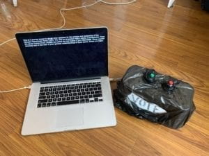
As far as other design choices, I knew early on that I wanted the response mechanism to be relatively simple, something where a user can choose only between a yes button and a no button. This is, first, to mimic casting a vote, although I wrapped the ballot box in trash bags to show that an individual opinion does not particularly matter when the CCP is creating policy. This is also to show the lack of much gray area in China in terms of what is acceptable to discuss. It seems that, more often than not, issues are clearly divided into safe topics and taboo topics, and there is very much a right or wrong stance to take. I originally coded the replies with keyPressed just to get everything working, then moved to the push buttons. I also had to adjust the code so that users could only record one answer for each statement, and added a counter so that the “safe” and “warning” tallies would correspond with the responses. For the processing interface, I used simple, black and white typewriter text as well as red flashes, photos, and live video feed (without really storing data) to, again, reinforce the “safe” or “warning” answers. The other consideration was to use more physical elements to drive the interaction, like placing little protestor or police figurines on pressure sensors in order to express an opinion. Ultimately, I decided that less was more, because I didn’t want to distract from the intensity of the statements and the need to make definitive, perhaps controversial, responses to them.
In the end, my project did align with my definition of interactivity as something that goes through multiple cycles of input and output between audience and product, and ultimately challenges the user in some way. Based on my observations of people using it, the experience was intuitive in its design and impactful in its message. It could be argued that the project is not interactive enough, and that the yes and no push buttons could be changed to something more meaningful or engaging. If I had more time to develop this idea, I would like to make it even more immersive, incorporating sound or light displays to draw attention to the user for “wrong” answers.
The most challenging moment of development was when my computer crashed and I lost the majority of my code. This happened on the Friday morning of user testing, which meant I was unable to get the full experience, although I did have a few people try my rewritten code on Monday and Tuesday. All in all, though, I learned a lot about the nuances of Processing, serial communication, and developing an interactive experience that blends technology and social issues in order to challenge an audience.
As I said in my earlier essay, I think this project is unique in that it addresses a particular group of people, who face all the nuances and challenges of attending the first joint US-Sino university. Our student body is in a position to both observe the affairs of China and to bring international perspectives and standards into our considerations of these issues. We have a distinct ability on our campus to discuss and debate topics that are taboo in wider Chinese society. Therefore, my goal was to take real-world current events and issues that are of huge concern to students in our position and force users to reconsider not only why they believe what they do, but how strong those beliefs really are when they are challenged, explicitly or implicitly. Watching people go through the survey, I believe my project did achieve its goal.