- CONTEXT AND SIGNIFICANCE
My previous group project “Dreamie Beanie” taught me the importance of prototypes: especially since back then we did not have to explicitly make the prototype work, managing our expectations despite having no technical limitations taught me how to be more realistic when going into the midterm project. We needed to brainstorm with four other people how to technically make the project work even though we could use our imagination to recreate the functionality — so for example despite only having to make a beanie and a cardboard TV, we still had to figure out how hypothetically the beanie would connect to the monitor, and how the beanie would connect to the user’s brain. Working with four other group members also helped me learn how to compromise my expectations along with my partner so we could make a working project.
The last group project taught me that interaction required repetitive feedback, so our project “Briend” or “Bird Friend” focused a lot on that: the bird was supposed to be able to respond to user interaction, not only through simple command but through repetitive action from the user. Briend was created as sort of a spin on the “emotional support animal” people have today, except it was electronic. Our project was mainly intended for kids — just someone who would get anxious without a companion and could pet it to receive some kind of validation or comfort. I feel the responses the bird could give simulates a type of comfort you would get from petting a real bird or a real dog: we wanted to make it as lifelike as possible, which is why I felt our audience would appreciate our product.
- CONCEPTION AND DESIGN:
In what ways did your understanding of how your users were going to interact with your project informed certain design decisions you made? Account for several such decisions. In addition, what form, material or elements did you use? What criteria did you use to select those materials? Why was it/were they best suited to your project purpose, more than any other one/s? What might have been another option? But you rejected it—why ?
If we are being honest, our first design conception was a flower. We were going to attach a light sensor to it so that it would open and close based on bright the light was. We at first were going to use 3d printing to print the flowers, and use wires to each flower attached to a main stem so the main mechanism would push the flower open and closed. This design was based on one we found on the internet, and we decided it would be easier if we replaced the metal hinges with straws.
Here are some of the initial drawings we made in designing the flower:
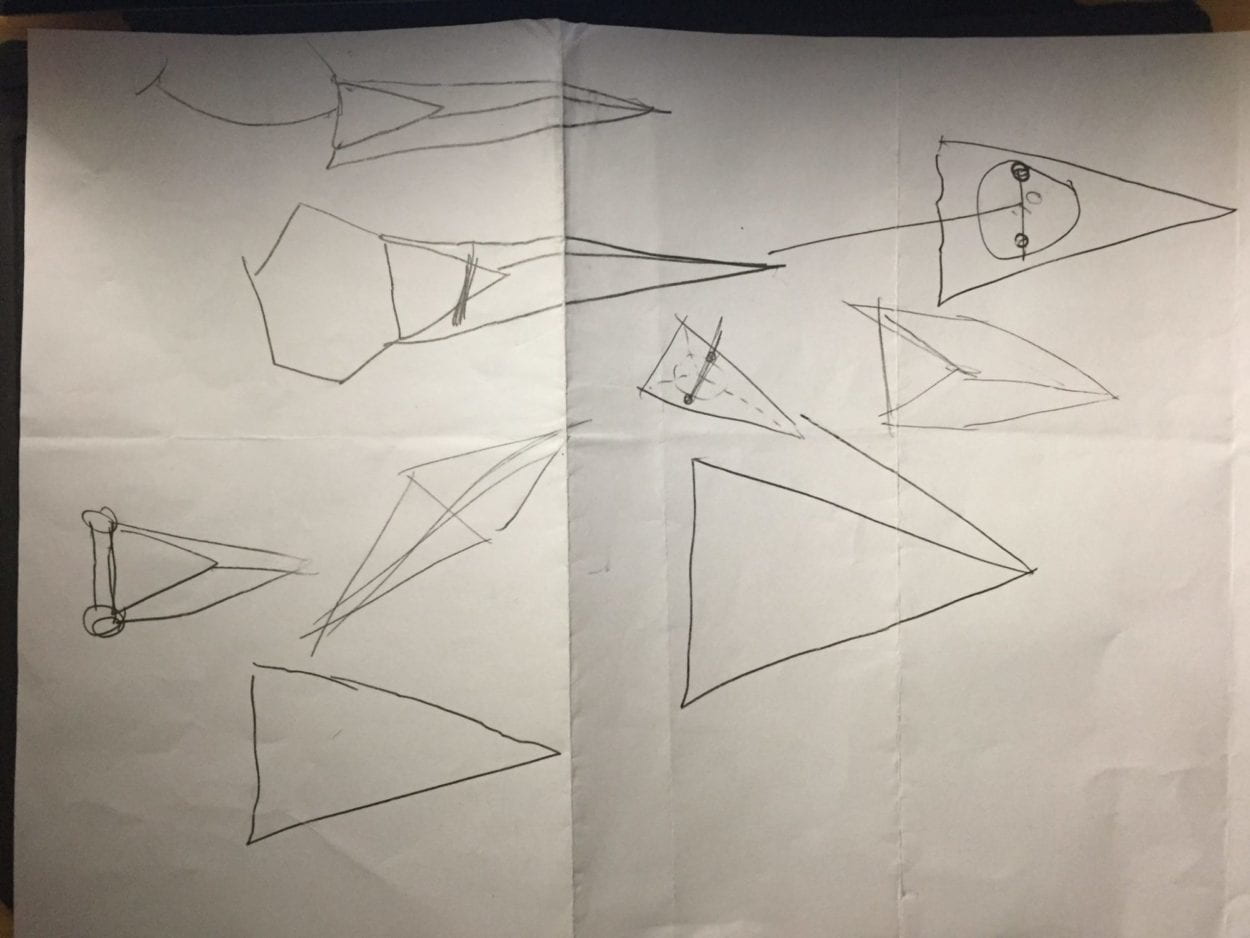
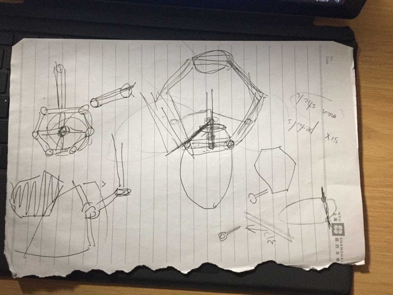
We wanted to create a design that was simple, polygonal, and easy to 3d print, yet was sturdy enough to withstand the swinging motion needed to make the flower move. Here is the mechanism we wanted to recreate, a design we got from the initial website.
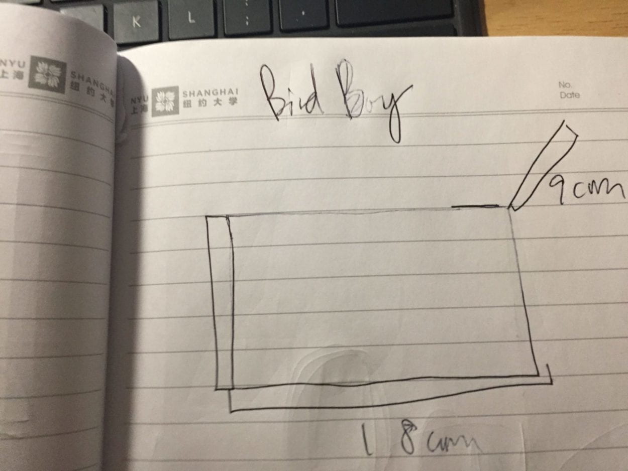
However, when our plan had to change (as I will detail in the Fabrication and Production section of the blog post) we wanted to create a bird design that was simple and resembled that of a music box (we initially wanted the bird to play music when the person came near it). We came up with the music box design firstly because it would be easy to laser cut, and secondly because we felt that music boxes gave us a lot of comfort when we were younger and wanted to recreate that feeling through a singing bird.
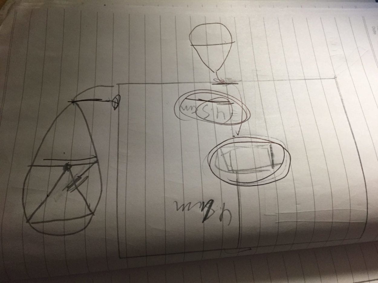
We also wanted to maintain the same up down mechanism we were going to use with the flower, but this time it would be much more simple because it would only be controlling two “petals” or “wings” instead of six interlocking petals that had to open and close smoothly at the same time. Other than the box shape we wanted the bird to be as lifelike as possible, and wanted the bird to light up to bring a visual sense of happiness when the user interacts with it. We wanted to use feathers because it would make it seem more like a real bird. Here are some initial drawings and designs for both the laser cut box and the bird itself.
- FABRICATION AND PRODUCTION:
In this section, describe and assess the most significant steps in your production process, both in terms of failures and successes. What happened during the User Testing Session? How did your user testing process influence some of your following production decisions? What kind of adaptations did you make? Were they effective? In short, keeping in mind your project goals, how do you account for and justify the various production choices you made for your project? Include sketches and drawings.
Our biggest failure for sure, as mentioned above, was having to completely scrap the flower idea. For two days out of the week before the midterm project we were 3d designing the flower petals, trying to make the stem using wire. The first flower petal turned out way too big and the 3d printer could not print it out. The second one however the shape wasn’t right for our hinges to attach to, as shown below.
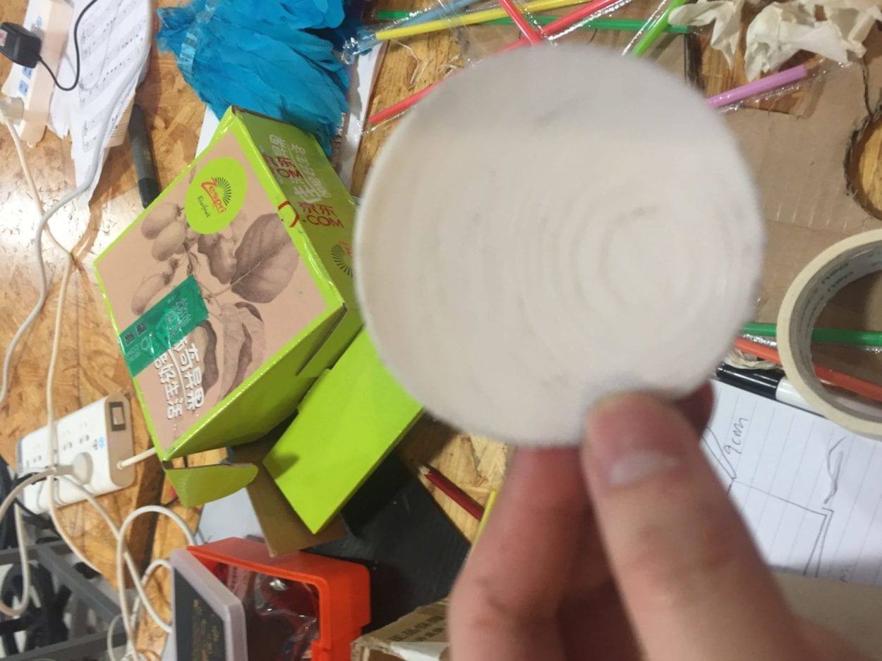
And when we realized we still didn’t fully understand how the mechanism worked, we tried to recreate the mechanism using cardboard instead. It did not work and we could not even get the wires attached to the motor.
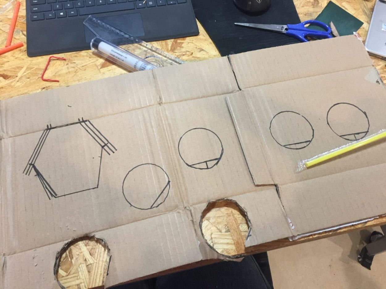
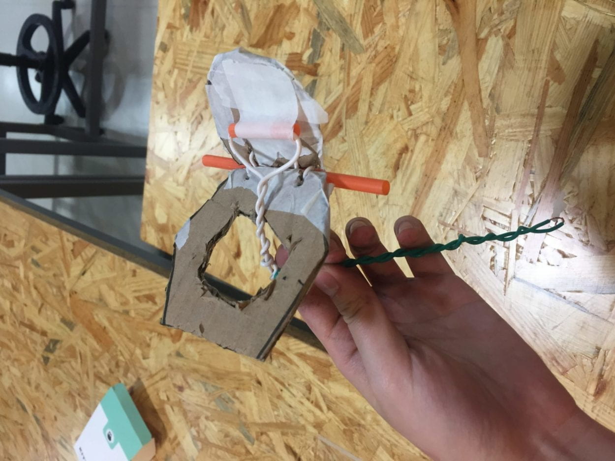
Once the flower wouldn’t attach to the motor we fully gave up, and asked Rudi for help. Rudi, in helping us try to recreate the mechanism of the original flower, showed us a way we could easily recreate the mechanism of the flower moving up and down but in a much simpler way: by taping straws to cardboard and having the motor push the wire through the straw.
Here is the video of our first prototype:
The motors moving two wires through straws gave us the idea for a bird box, in which the motors moving the two straws would be the wings. Once we finally had the idea for the main mechanism, we went to design the actual box it will be in.
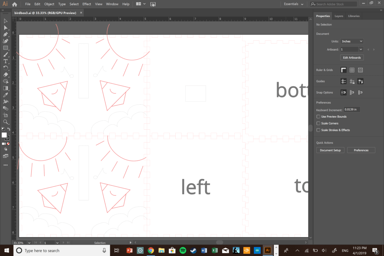
We decided to have the bird box be smaller, firstly so the wings would move more fluidly secondly because it would be more convenient to carry. The box ended up being a 13x10x10 cm box, and we laser cut a bird design pictured below:
We wanted the wings to be light, small, yet big enough so the motion of the up and down wings would be visible. We still used the wires, creating two big loops at around 5 cm in length, and glued feathers onto them. We attached the wings to the motors, and at first when the bird moved, the wires kept getting caught in each other. So then we realized we had to move the wires closer to the middle so they wouldn’t get tangled, and had to make the motor move faster. So while we wouldn’t get the range of motion we got before, the speed would make up for it. Ultimately, we finally got the bird to make an up down motion with the touch sensor motor.
The birdbox shown was what we brought to the initial user testing. Making the bird flap its wings in time with the LED lights shining took us all week, so we did not have enough time to figure out how to make the bird sing or chirp. So during the user testing much of the feedback had to do with the interactivity: the bird was too robotic — the touch sensor was visible and all the bird would do is respond to the user’s button press and it would flap its wings. Despite us cutting holes in the box for the LED lights to be visible, the lights did not show through clearly at all, so really all it looked like is the bird would flap its wings once the user touched it. One feedback we really liked was using the feathers to cover the wings and instead having an arrow or a sign that said “Pet me!” which would make it more toy like. Another was that when you came near the bird the bird would react in some way, like chirp or flap its wings faster. We implemented those two comments into the design after user testing.
Firstly, we used a smaller breadboard and attached the LED lights to the top of the bird instead of putting them inside. Secondly, we used toneMelody in combination with the distance sensor to create a bird chirping sound: we wanted to create a song but did not have enough notes or memory for it, so we instead decided to do a two note chirp. We also added a face to the bird so it would look a lot cuter: if you put a face on anything a human being will attribute emotions and feelings to it, so we felt it made the bird look a lot more personable.
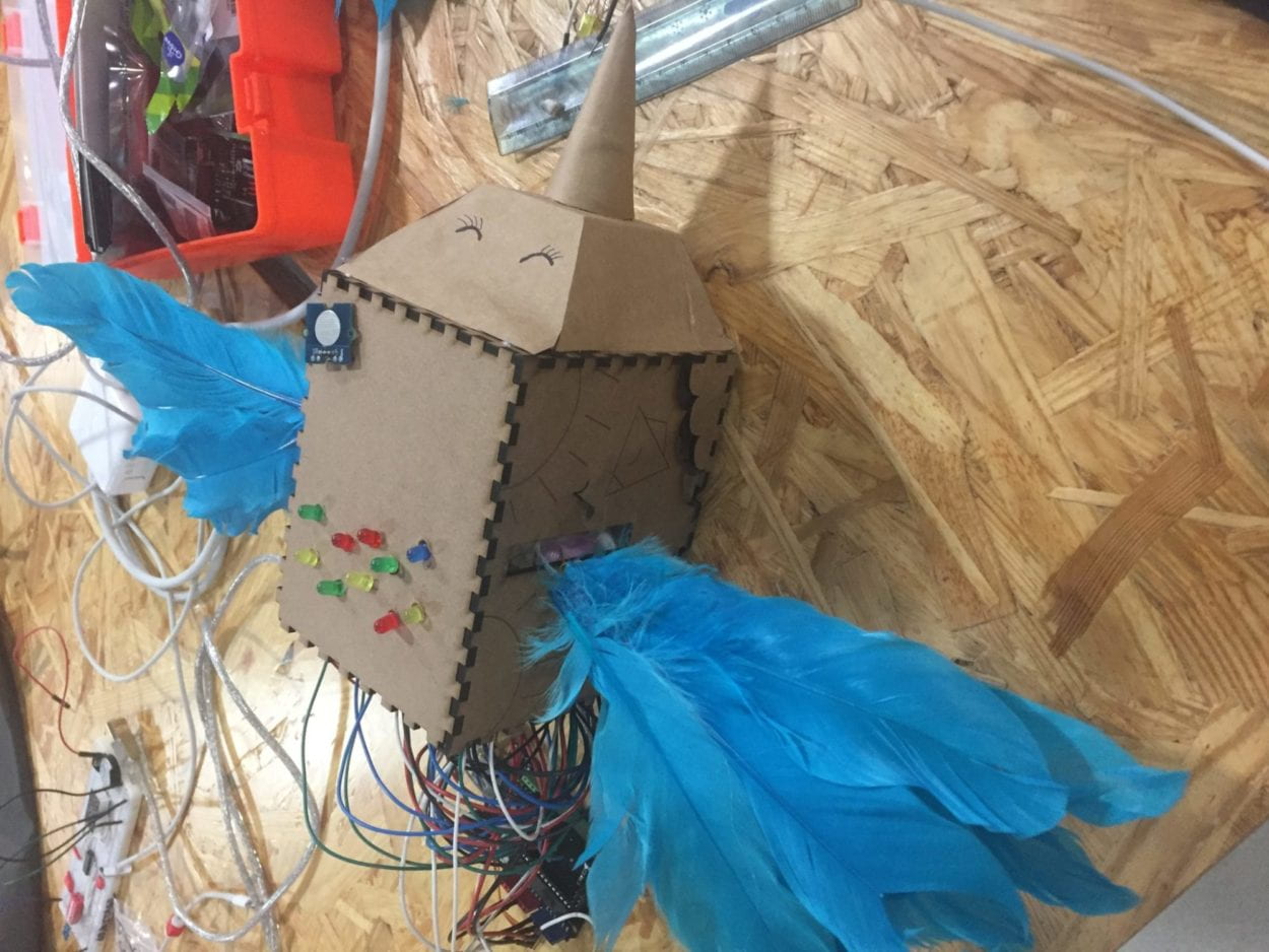
The final video product is shown below:
- CONCLUSIONS:
Begin your conclusion by restating the goals of your project. How do your project results align with your definition of interaction? How do your project results not align with your definition of interaction? Based on both your definition of interaction and your expectation of your audience’s response, how, ultimately, did your audience interact with your project? How would you improve your project if you had more time? What of value have you learned from any setbacks and/or failures? What do you take away from your accomplishments?
The wrap-up of your conclusion delivers your final say on the issues you have raised previously, demonstrates the importance of your ideas, and insightfully synthesizes your thoughts about key elements of the project experience. As such, your conclusion should close by reflecting on the crucial questions “So what?” and “Why should anybody care?”
Ultimately, our goal was to make continuous interaction with the user: we didn’t want a simple computer that would input and understand commands, and we felt like we achieved that. The bird responded in a lifelike manner, and the interaction didn’t stop with a simple command such as “on” or “off.” However, we still felt like we could’ve done more with the motion of the wings and with the sound of the chirp: if we wanted to make this project more life like and more “align” with our definition of interaction being a continuous communication, we would’ve made it so the wings would move faster if it was “happier” or if it was petted more often. We also would’ve changed the tone so it sounded less robotic and would change depending on its “mood.” Like if you approached the bird from behind the bird would make a scared noise, but if you pet it it would make a happy sound.
At first during the user testing, the audience’s interactions with the project were very robotic: they simply touched the touched sensor and the bird responded: there was no sound or no visual cues of their interaction, so they felt the interaction was a little cold. However, once we added the feathers, the lights at the top, and the sound, interaction with the project felt a lot more fluid, as users felt like it became more lifelike under the changes. This entire project really taught me how to manage my expectations: at first my partner and I wanted to make a fully functioning robotic flower, but it wasn’t until Tuesday night when we had to change our entire project that we realized that we couldn’t just simply based off of the knowledge we had. But I felt like we adapted really well to the failure and still used core aspects of our original project yet made it simpler and more unique based off our experience, and this project really taught me how to adapt from failure to make a cohesive product.
Overall, this project taught me a lot: it taught me how to engineer a product not only on the software side, but also on the hardware side, ensuring each piece could function off of the other. It also taught me that it was important to adapt from failure and use that failure to expand creatively, and that there is never an end to any project. Even when I was so relieved when we finally made the bird flap its wings up and down, at the user testing people were still dissatisfied and had a lot of good feedback for how we can continue to improve the bird. My experiences with the midterm project taught me how to continuously improve, and for that I find this project very valuable.