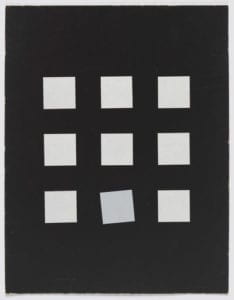
This week we embark on processing basics using the Processing software. We will be working alone drawing an image using this software. The image I chose is an untitled picture by Vera Molnar. It is inspiring to me since the significance of it is unfathomable—nine similar squares on a black background and one of them is slightly tilted. What could it mean? An eccentric in a mundane world? A mistake in a pool of success? It’s very interesting to think about.

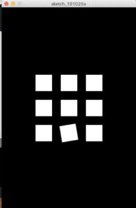
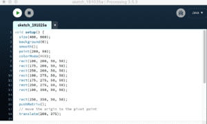
For my work, I wanted to draw the exact same image. So I sketched the image on a piece of paper and roughly measured the lengths. The background is black, 400×600 pixels. Each square is 50×50 pixels, with a 25-pixel distance between each. The square in the center is in the center of the whole background. Screenshots of my result and the code are as such. It is mostly the same except for the color of the squares. I am also thinking that I could’ve used boolean structures to prevent long lines of similar codes.


In my opinion, on one hand, Processing is a good software for drawing in that it is efficient and eco-friendly, especially for complicated drawings and designs. On the other hand, Processing is a not-so-good software for drawing in that there isn’t an obvious connection between the code and the result, so the fun of drawing is partly deprived.