Continuing the exploration of of interactivity, Kyle and I discussed our experiences during the Group Project. We began by exploring the way the users were meant to interact with the 2119 inventions (our separate projects, as well as the ones we saw) and narrowing down the concepts that were affective in our opinion. Simplicity is key – by having a clear idea of how the user is interacting with a prototype and what is being outputted was our main focus. What we gathered is that by taking a preexisting concept and adding our own functions to it would be a great way in exploring our newly found interest in hardware prototyping. Since we had practiced coding sensor related functions, we wanted to base our project on a particular sensor and how it interacts with a user.
The concept of a mood ring, that based on your body temperature defines your mood, is a simple and very inaccurate measure of feelings – this was inspiring to us! We had discussed upon the idea of human compatibility and how easily people are swayed to believe their horoscopes or any other belief has an effect on their connection. These two components set us off in making the MOOD MIND MATCH.
The MOOD MIND MATCH is a device that scans your finger print and produced a colour output, by using it with a partner you may compare the colour compatibility – thus obviously determining your personal compatibility. The concept for their prototype is clearly paying on the idea of irony and in a cynical way mocks all outlets that are supposedly predicting your future. We had fun in developing the underlining purpose, but now for the production of this masterpiece.
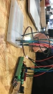
Just like the mood ring, our MMM takes a users temperature through a temperature sensor. The range of temperatures were then converted into a colour gradient as an output through a RGB led. Initially this gradient produced colours very similar in tone, but we did not want to convince our users of their true love that easily. The next step was converting the decimal values to produce very far apart colours for very close range temperatures – meaning only the ‘to the decimal matching temperatures’ would be compatible. We actually noticed a lot of complains of ‘it not working’ due to the lack of ‘pure matches’ (same colour outputs), but in my opinion I thought it was wonderful so many people expected compatibility considering the global scale of population on this earth. User testing did allow us to make changes in our representation to better appeal to our targeted audience.
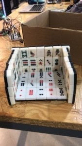
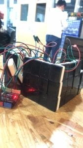
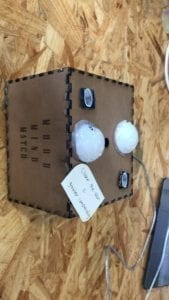
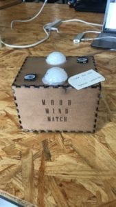
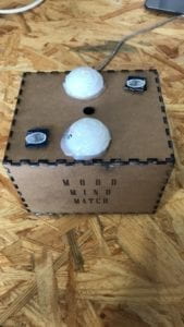
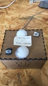
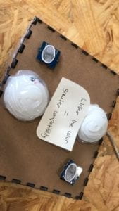
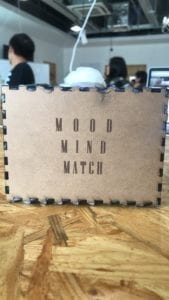
As we were satisfied with our satirical concept as well as the functioning input output circuit, we moved on to the design display – which was much more challenging to tackle. Some on the challenges had to do with the malfunctioning of the digital fabrication machinery, and thus we had to improvise by attempting to build a prototype out of a Chinese board game. Lucky for us, the laser printer was working once again and we were able to use Illustrator to design a slick-looking box with the project name on the front. This was a huge turn around that encouraged me in the last stages of production. We were able to fit our circuit inside, as well as accompany it with ping-pong ball sphere cut outs covered in hot glue for aesthetic appeal. The final step we were not able to achieve was the 3D printed heart design that would have contained a simple line of instructions – we added this with a paper instruction at the top.
The goal of the project was to create a fun, two-user prototype that would ultimately decide their faith based on a finger scan. We created what we set out to do, even with some minor set-backs, although there is always place for further development. Now speculating on the improvements, I think the installation of a reset button would be very affective in allowing the users to interact with our device without our interfered. Another great suggestion we hear during our presentation, was for the lights to be slowly fading in and out till the output colour to signify ‘loading’ – which I think would further contribute to the experience without our contributions. The greatest concept I am taking away from this experience is how the user responds to a particular type of interaction. I do not think we emphasised (or wanted to emphasise) our initial inspiration for this project, thus allowing our testers to take it partially serious – this to me showed the impact of representation and the extent of interpretation that an audience convolutes. I can now confidently say I have a much greater understanding of what ‘interactivity’ means not only form the side of the user but a creator as well.
