Date of Recitation: March 29, 2019
Documented On: March 31, 2019
Chosen Motif:

Reflection:
Why Did I Choose This Image?
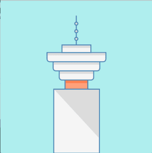
The image is a simplified icon of Harbour Centre, a skyscraper located in Vancouver, BC. I chose this specific image, furthermore, this icon is an allegory for my hometown. I was both born and raised in Vancouver, Canada, in total, I’ve spent 18 years of my life residing in the city. I am aware that Vancouver is a city widely known for its luxurious lifestyle, fresh seafood, and beautiful mountains, however, it does lack the symbolic infrastructure that labels Vancouver as Vancouver.
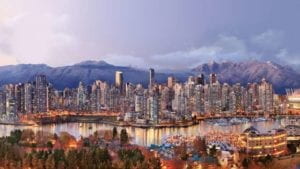
While Shanghai has the Pearl Tower, New York has the Eiffel Tower and Toronto has the CN Tower, Vancouver is left in the dark. This sense of lost identity is also visible in the film industry. Vancouver is known for its vast cinematic scene, making it the third largest film city in North America. It is now ordinary to spot celebrities scattered around the city filming various movies, commercials and tv shows. Although Vancouver is provided various opportunities to appear on the big screen, Vancouver never plays itself in these settings. The city has played as New York, Chicago, Toronto, San Francisco, Seattle, Santa Barbara in hundreds of movies and tv shows, notably: The Interview, Deadpool, Riverdale, White Chicks and many more, but in none of these films, does Vancouver play itself. Filmmaker, Tony Zhou, recently created a video depicting and theorizing the possible causes behind this phenomenon.
Within the video, he quotes Jerry Wasserman, a professor of theatre and film at UBC, “Vancouver doesn’t have any iconic symbols that make it a recognizable city worldwide, It’s very photogenic but what does it have that distinguishes it?.” Only those who truly understand the city will know that the Harbour Centre is a monumental skyscraper located in the central business district of Vancouver.
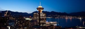
The 44 tower building stands as one of the city’s tallest skyscrapers, making it a prominent structure in the city’s skyline. Since its opening in 1977, the tower has housed hundreds of companies and continues to house the “Top of Vancouver Revolving Restaurant,” a dining experience that allows customers to indulge in a full-course meal while appreciating the beautiful city on top of a revolving platform. It provides diners with a 360 degree perspective on the city’s extravagant nightlife.
I want to recreate this image through processing in order to inform more people that Vancouver is Vancouver, not Seattle nor New York. I hope to achieve this by providing Vancouver its own “iconic building” that give the city its landmark and its own identity.
Re-creating the Image
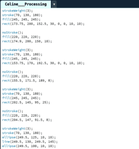
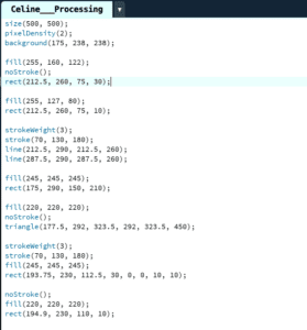
In processing, I was able to recreate the Harbour Centre by combing my knowledge from last week’s lectures with research within the processing reference site. When choosing the image, I kept in mind that I needed to choose a motif that consisted of geometric shapes but was complicated enough to give myself a challenge. I first set the size of the canvas to 500×500 (a mistake: canvas was supposed to be at least 600 x 600) and its background to a sky blue to match my motif. Remembering Young’s tip, I also included the code: pixelDensity(2) to improve the quality of the final product. I then used a variety of functions such as fill, rect, stroke, noStroke, strokeWeight, ellipse, triangle and line to create the image. I searched online for all RGB values in order to find the colors that I wanted in my recreation, which I used in all of my fill() functions. As I wanted my image to be centered and as clean as possible, I had to make a series of calculations. The rectangles and lines were significantly easy to create, but once it got to the rounded edges on top, I was quite stumped. I asked for help and learned that I could round the edges by changing the corners’ radius values within the code. I also learned to use the noStroke function to my advantage as I colored in certain shadows on the Vancouver building. I also discovered the importance of order within processing. When I implement certain code after one another, the results can change significantly, this little tip, confused me a lot, but also made me slow down and reflect upon my progress with care and undivided attention.
Reflection
I made sure to take my time, and I can now say that I am quite satisfied with the final product, given that this was only my second attempt at processing. I believe that my attempt definitely shows resemblance to the motif due to its structural appearance and the preciseness of its measurements. There is, of course, improvements to be made and noticeable differences between the original and my own creation. For starters, mainly due to time, I was unable to add the windows on the main rectangle at the bottom of the image. I was also unable add a skyline to the background, making the image very simple and static. I do believe that creating the image in Processing was a good means of realizing my design, however, it was definitely a difficult and stressful time due to my own amateurism. In the future, once my skills have been improved upon and polished, creating my own designs through processing will definitely have much more efficient and valuable results.
